Headlines
|
|
Nasdaq analogs show rising probability of higher prices:
Trading activity in recent weeks has a similar feel to 1998, and the price chart of the Nasdaq Composite now compared to then is similar. Using an objective process, though, 1998 doesn't show up on the highest-correlated 6- or 12-month periods. The stretches that do mostly saw positive outcomes going forward.
|
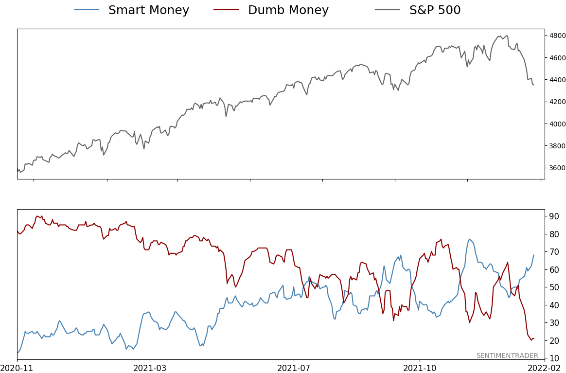
Smart / Dumb Money Confidence
|
Smart Money Confidence: 68%
Dumb Money Confidence: 21%
|
|
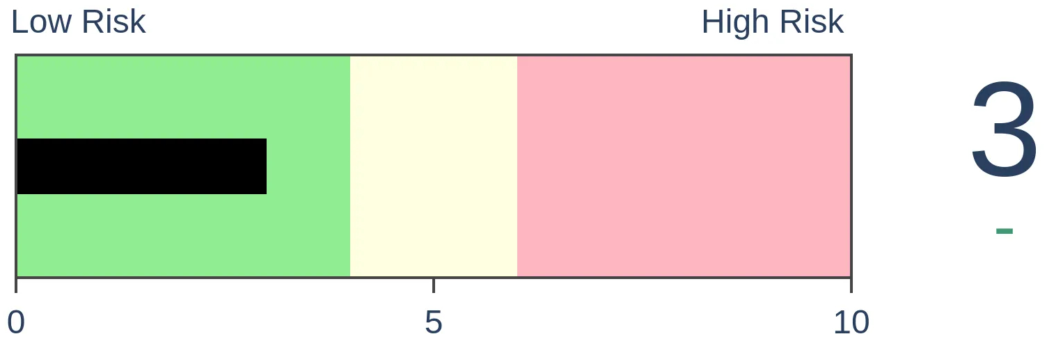
Risk Levels
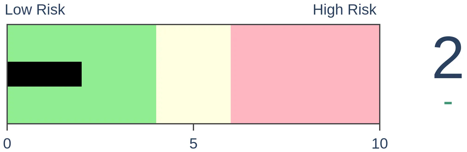
Stocks Short-Term
|
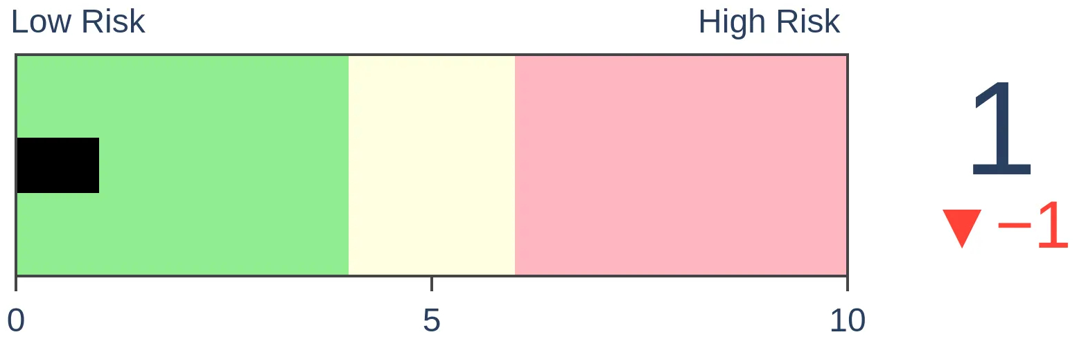
Stocks Medium-Term
|
|
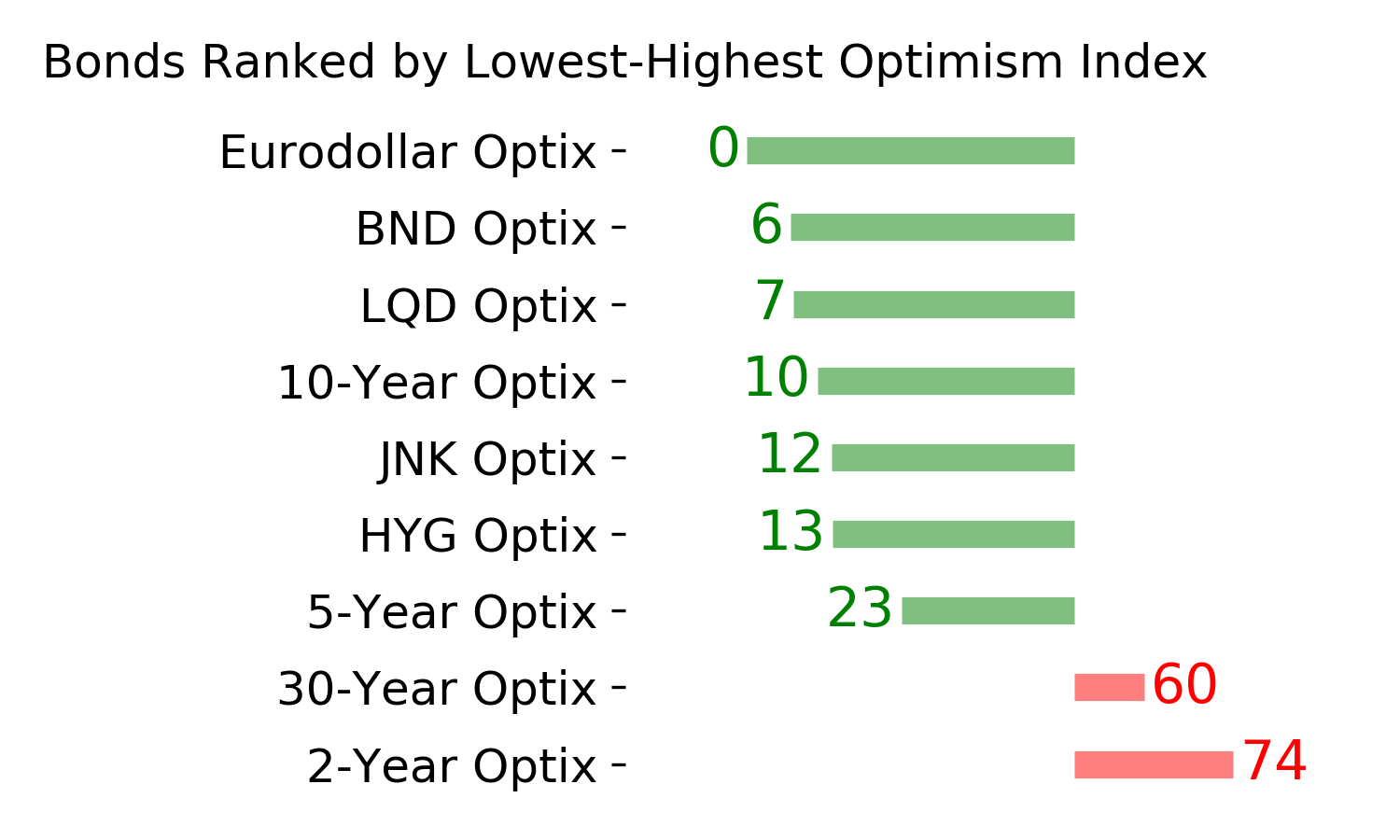
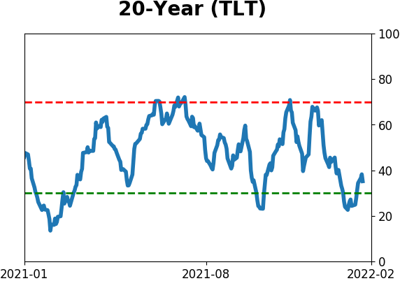
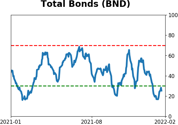
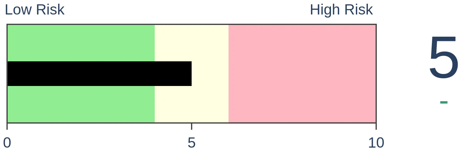
Bonds
|
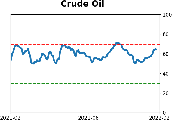
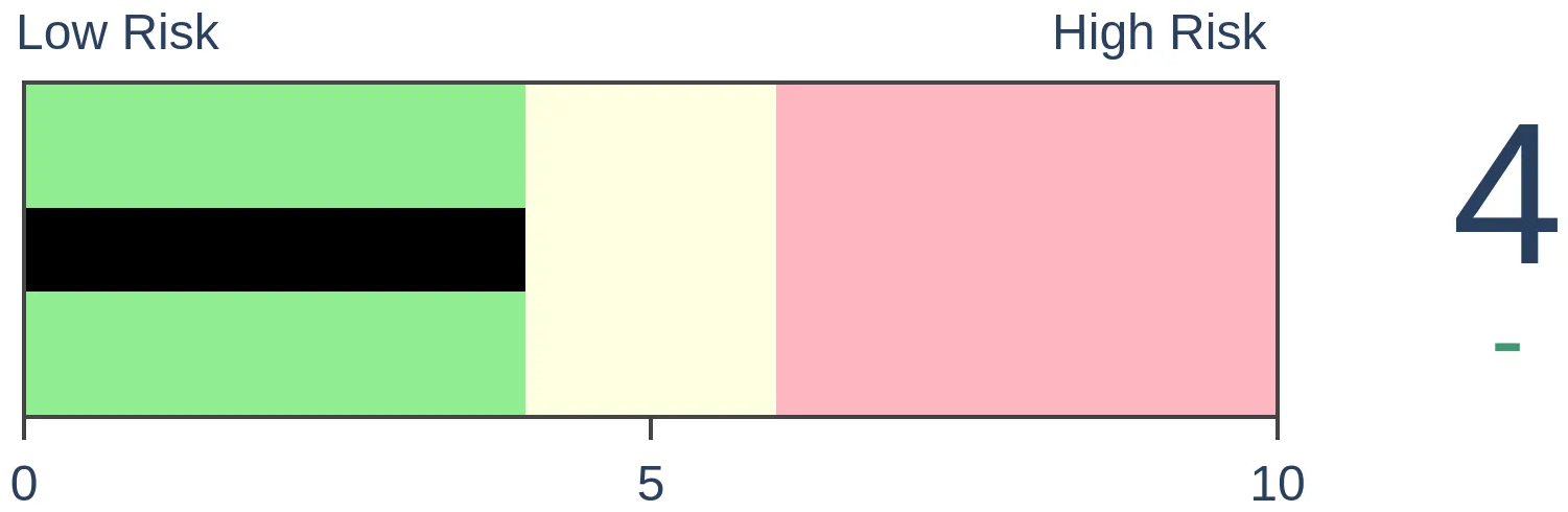
Crude Oil
|
|
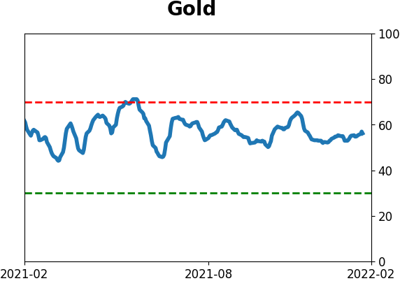
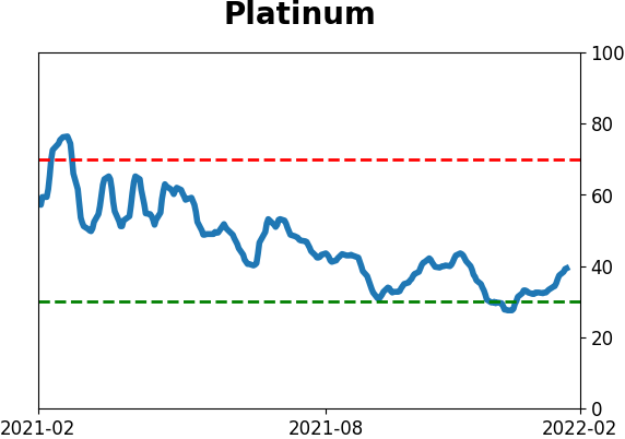
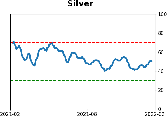
Gold

|
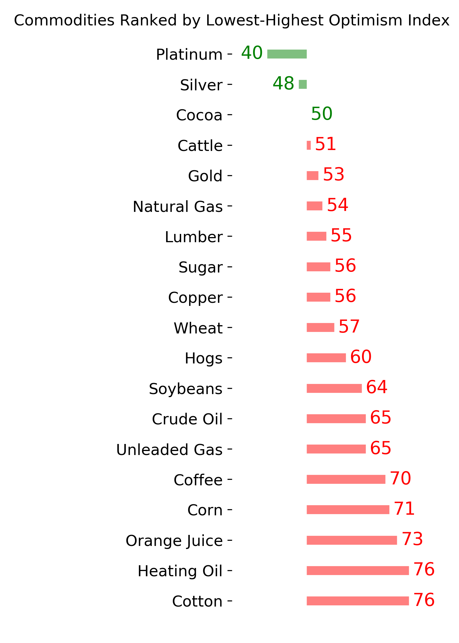
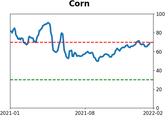
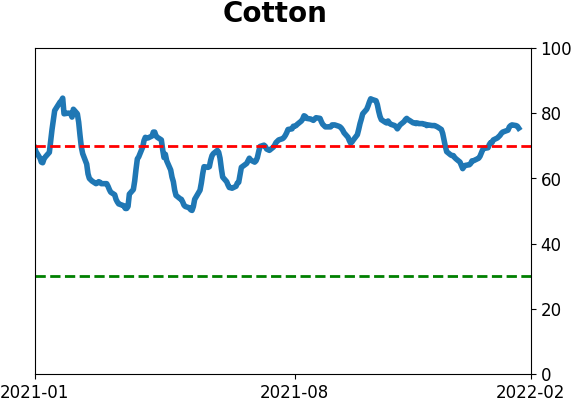
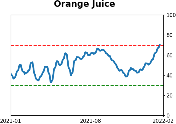
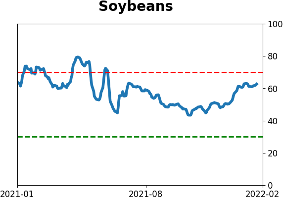
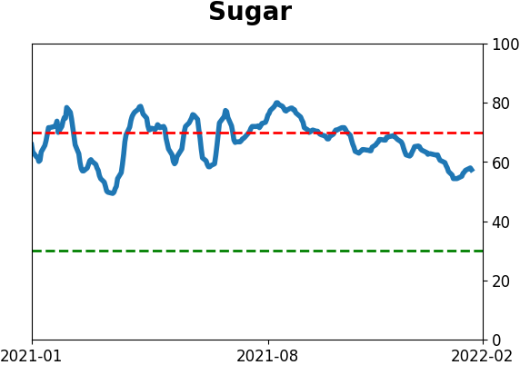
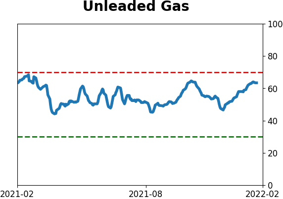
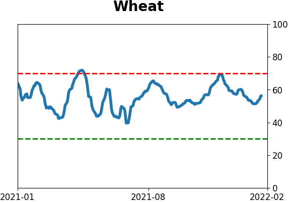
Agriculture
|
|
Research
By Jason Goepfert
BOTTOM LINE
Trading activity in recent weeks has a similar feel to 1998, and the price chart of the Nasdaq Composite now compared to then is similar. Using an objective process, though, 1998 doesn't show up on the highest-correlated 6- or 12-month periods. The stretches that do mostly saw positive outcomes going forward.
FORECAST / TIMEFRAME
None
|
Key points:
- Over the past 6 months, the Nasdaq Composite has the "feel" of 1998, but objectively not so much
- The highest-correlation 6-month periods saw a few severe declines going forward, but most of them rose
- Using one-year analogs, the precedents to the past year mainly saw positive returns going forward
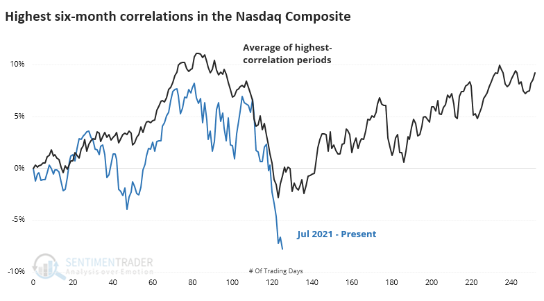
The periods most like the last 6 months
Trading activity over the past week has the feel of 1998 when stocks suffered a mini-crash. The Russian connection from then (they devalued the ruble) and now is coincidental. It's more that the price moves have a similar feel. I distinctly remember the panic our margin clerks felt when unable to reach clients who were under their equity requirements, and it's not hard to imagine similar feelings happening this week.
The charts are relatively similar, at least in that the Nasdaq went up, then down quickly.
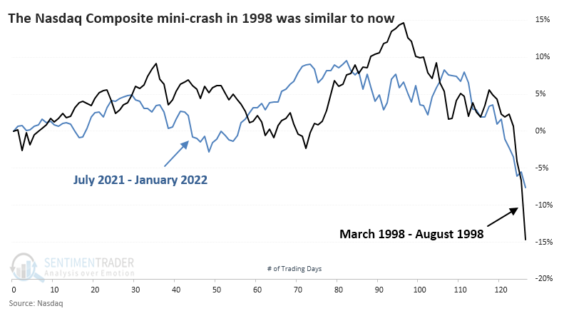
We've learned over and over again over the years that memories and eyeballs can be deceiving. Just because the price action feels similar doesn't mean it necessarily was.
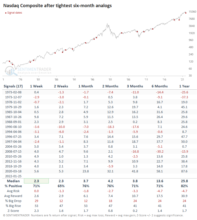
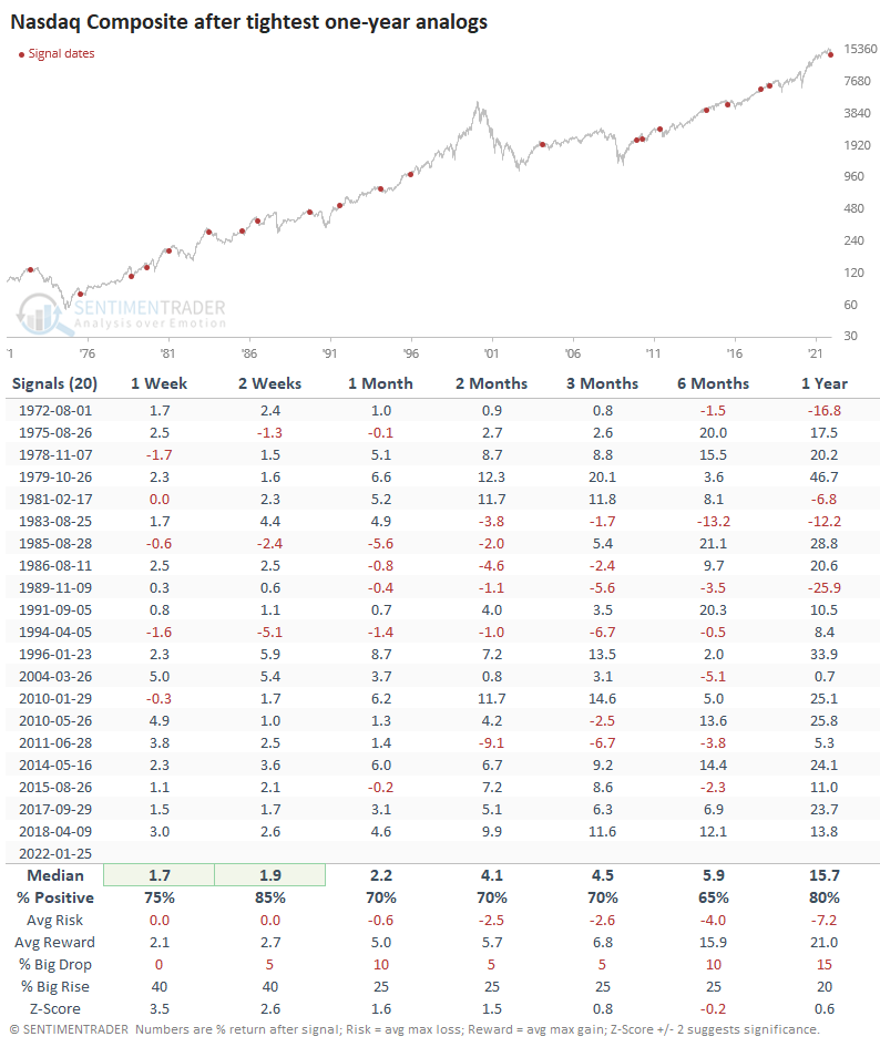
When we use our objective analog calculations to search for the highest-correlated periods since the Composite's inception in 1971, the year 1998 doesn't show up on the radar. It was close but didn't make the cut of highest-correlated 6-month analogs.
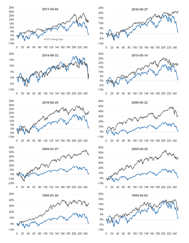
Thumbnails of the 10 most recent signals are shown below.
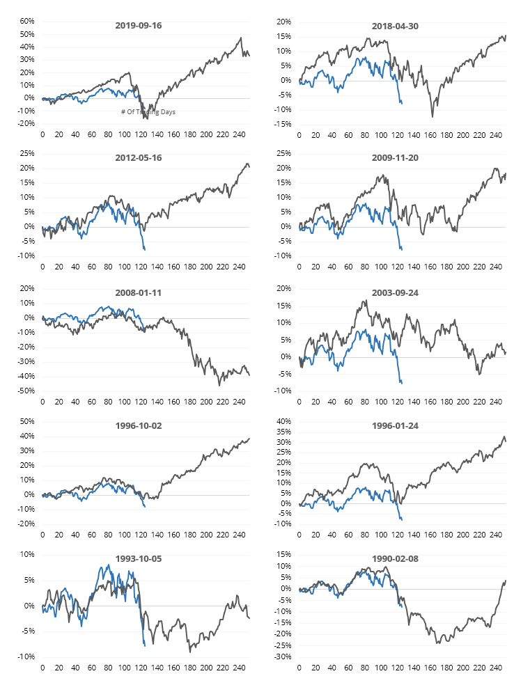
We're less interested in charts that happen to look alike and more interested in what they indicated for future performance. In that sense, it was mostly positive...except when it wasn't, and the Nasdaq crashed harder. Similar price behavior happened right before the Nasdaq lost another 10% or more within the next 3 months in 1973, 1990, 2008, and 2018. Those were the outliers, though, as the more common outcome was a lasting rebound.
Extending the time frame to one year
Maybe our comparisons will change if we extend the time frame. Instead of 6 months, the analogs below look at the tightest one-year patterns. By definition, these were years (using trading days, not calendar dates) when the Nasdaq Composite rose for months on end and then usually saw a significant retracement.
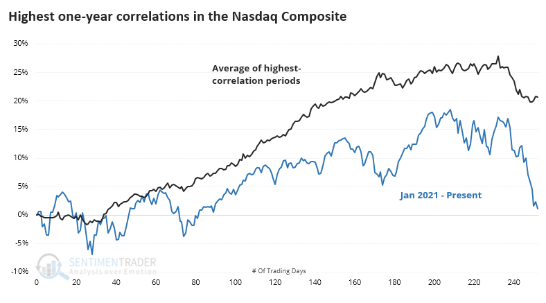
Because much of the past year was dominated by a rising trend, it's no surprise that quite a few recent years show up in the correlations.
Again, we're more interested in future returns. And again, those were mostly positive. There was less chance of a significant decline in the months ahead; over the past 30 years, all showed a positive one-year return.
What the research tells us...
Using price analogs is fraught with danger, as it's too easy to cherry-pick some charts that kind of look like the recent past. Using a more objective process has been helpful over the years, and when we do that, there are a few scary precedents but mostly positive outcomes. We wouldn't rely on analogs as a primary factor when weighing the evidence of risk vs. reward, but we'd consider a small addition to the "reward" side of the ledger.
Active Studies
| Time Frame | Bullish | Bearish | | Short-Term | 2 | 0 | | Medium-Term | 13 | 2 | | Long-Term | 14 | 5 |
|
Indicators at Extremes
Portfolio
| Position | Description | Weight % | Added / Reduced | Date | | Stocks | RSP | 10.8 | Reduced 9.1% | 2022-01-20 | | Bonds | 32.7% BND, 7.1% SCHP | 40.1 | Added 8.3% | 2021-10-26 | | Commodities | GCC | 2.4 | Reduced 2.1%
| 2020-09-04 | | Precious Metals | GDX | 4.6 | Reduced 4.2% | 2021-05-19 | | Special Situations | 8.1% KWEB, 3.6% XLE, 1.7% PSCE | 13.4 | Reduced 3.9% | 2022-01-18 | | Cash | | 28.0 | | |
|
Updates (Changes made today are underlined)
Not impressed at all with the market action since there was a breadth thrust at the end of December, with selling pressure hitting consistently since then. The drawdown is beyond what we've typically seen after similar thrusts. More and more indicators are showing risk-off sentiment, and the market environment is sketchy. I've reduced risk because of it. Bond sentiment is trying to recover from a recent bout of pessimism, and gold stocks are doing their thing which is not much at all. They've been flat for six months. Chinese tech stocks were doing exactly what they're supposed to do, then did *not* by plunging to new lows. This is troubling on a shorter-term time frame, but this was never meant for a trade, rather a multi-year investment. Recent behavior is troubling and I will not be adding any exposure as long as that's the case. RETURN YTD: -1.5% 2021: +8.7%, 2020: +8.1%, 2019: +12.6%, 2018: +0.6%, 2017: +3.8%, 2016: +17.1%, 2015: +9.2%, 2014: +14.5%, 2013: +2.2%, 2012: +10.8%, 2011: +16.5%, 2010: +15.3%, 2009: +23.9%, 2008: +16.2%, 2007: +7.8%
|
|
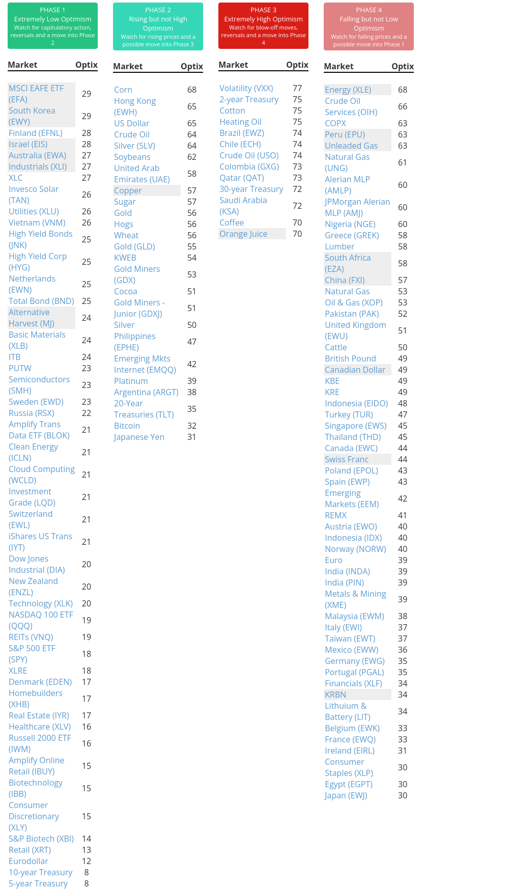
Phase Table
Ranks
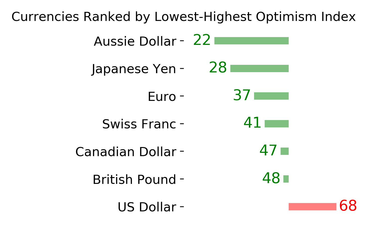
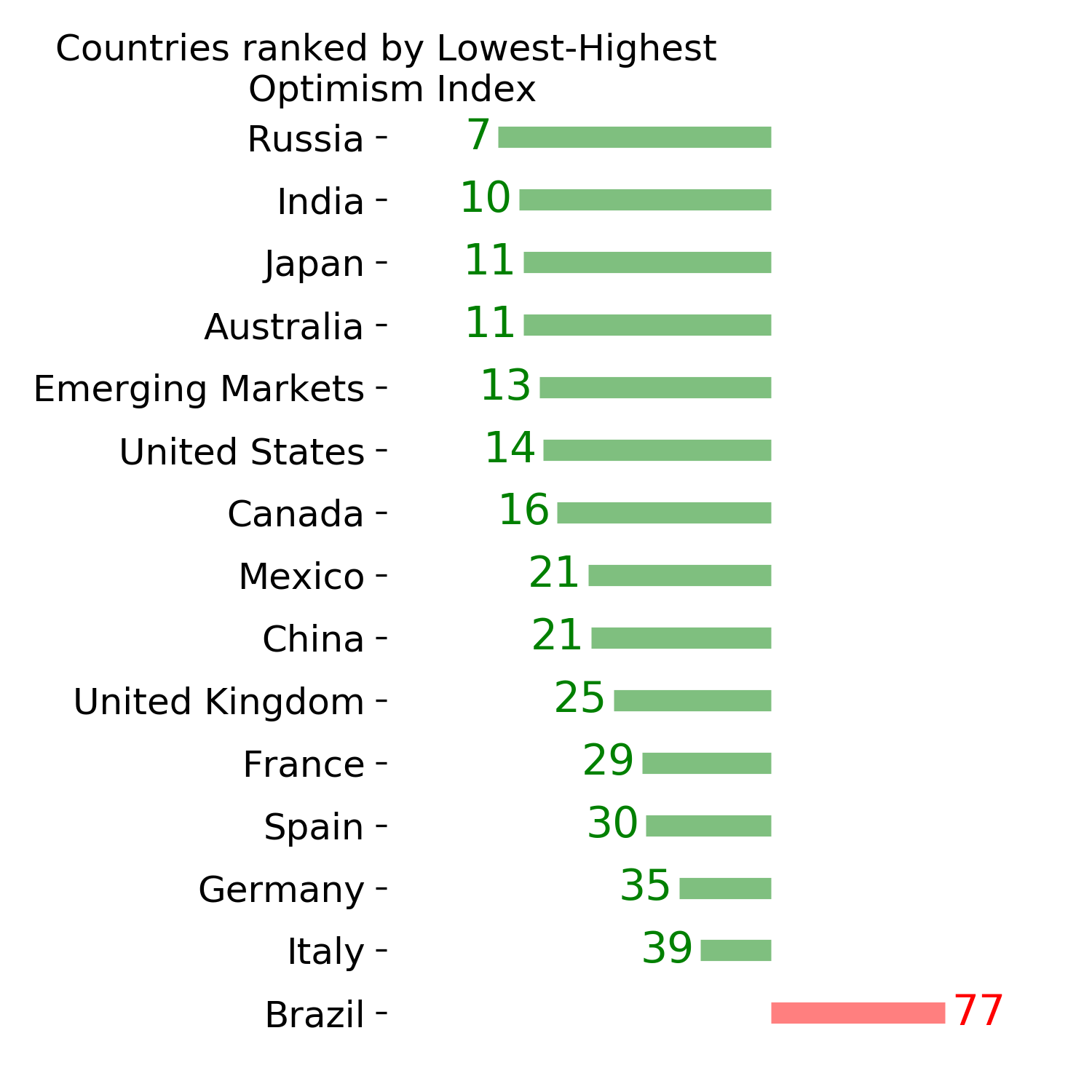
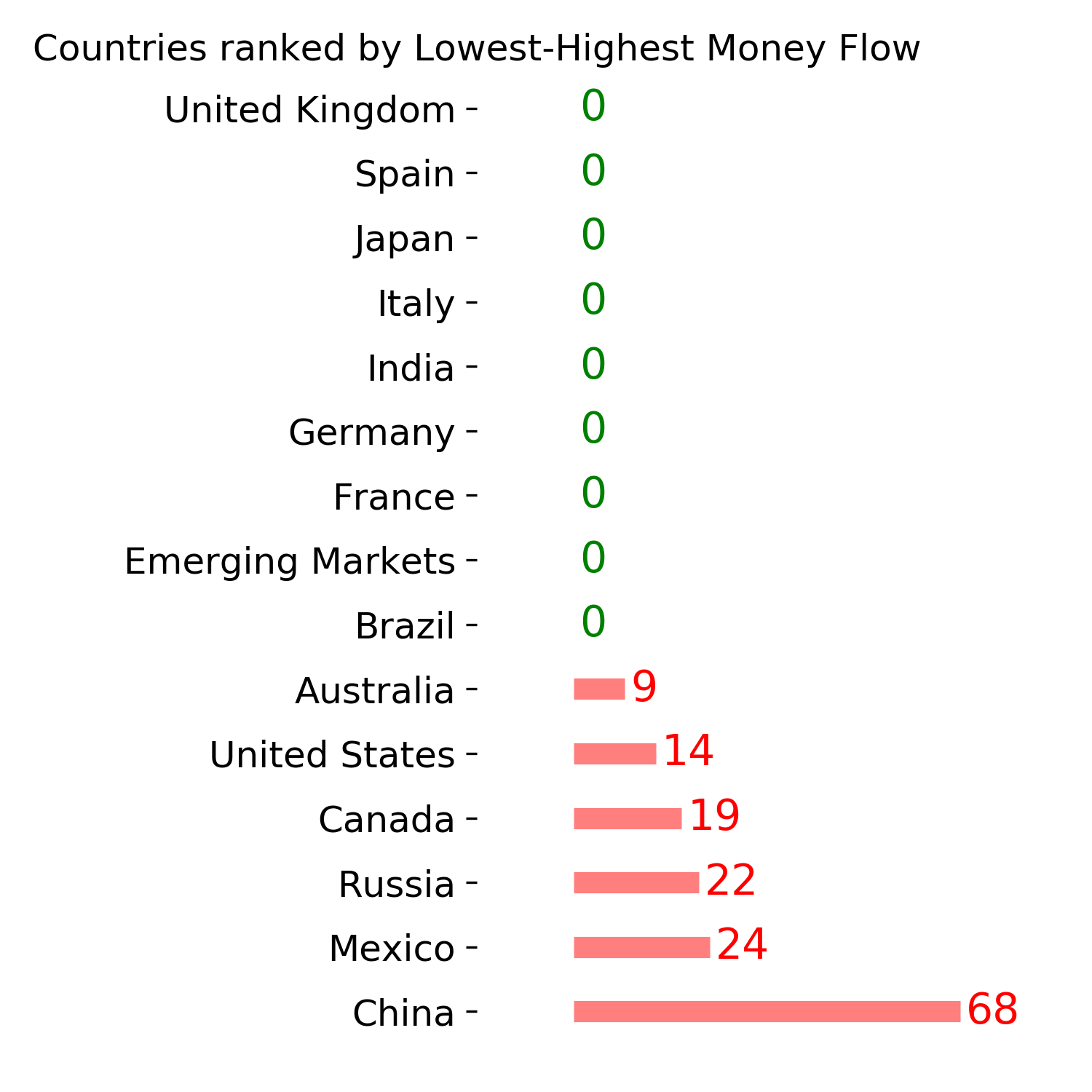
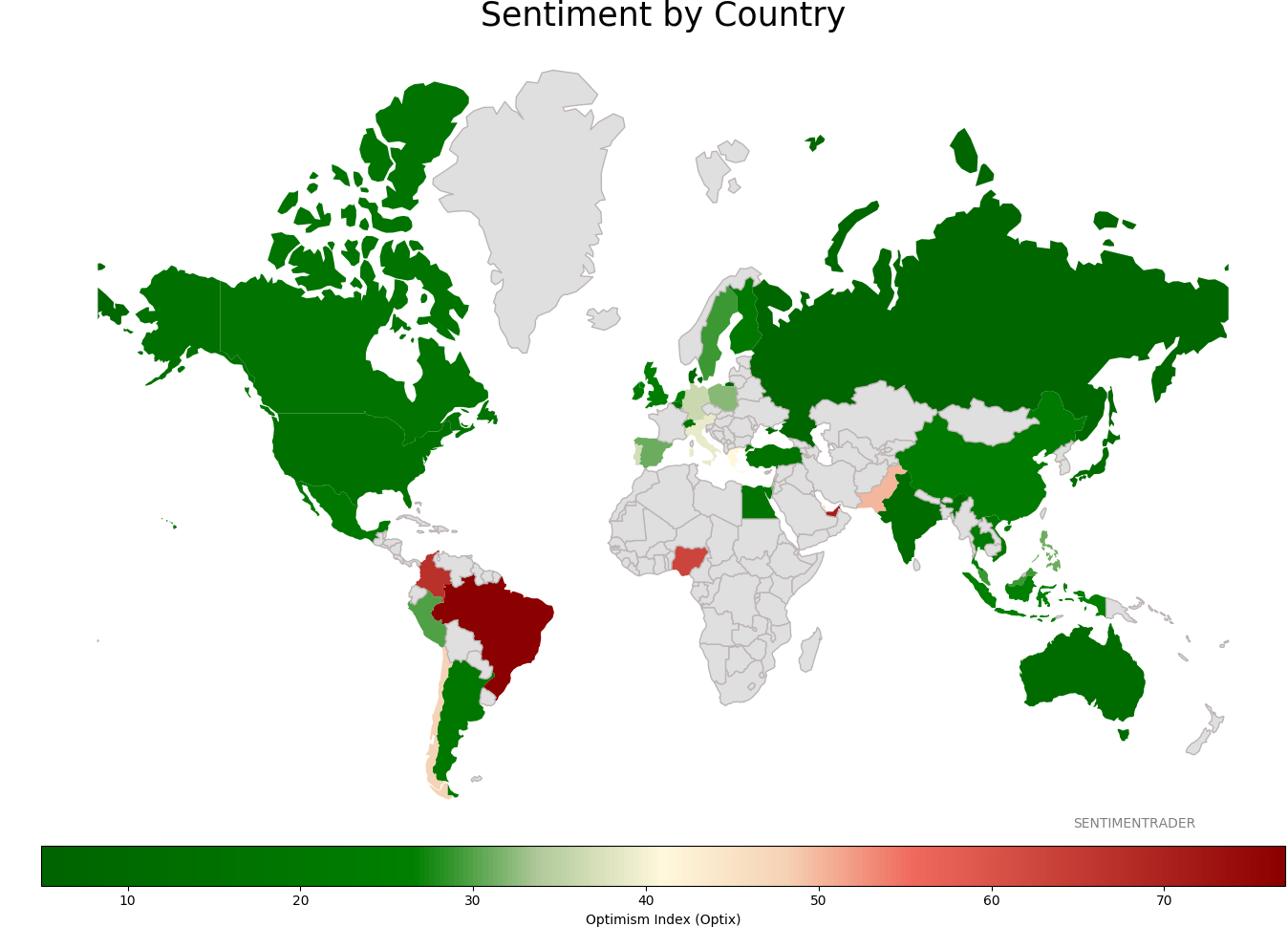
Sentiment Around The World
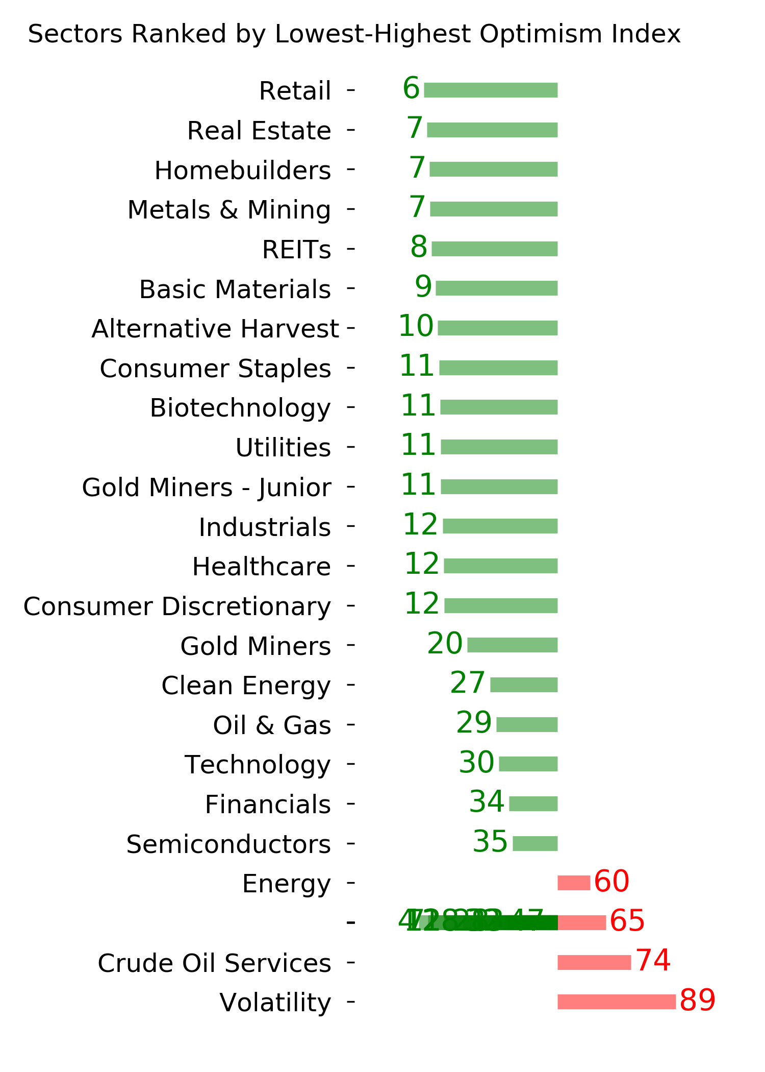
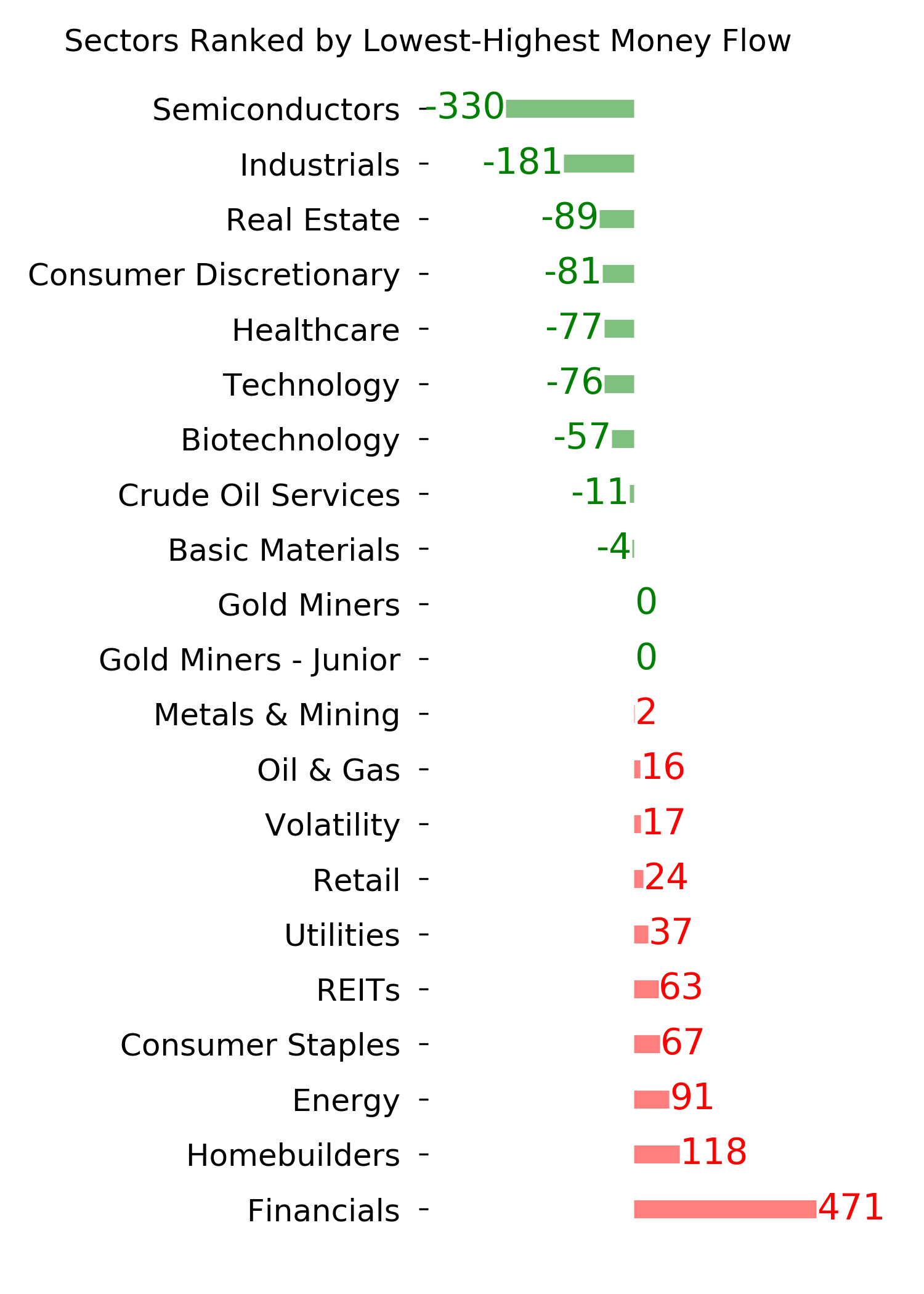
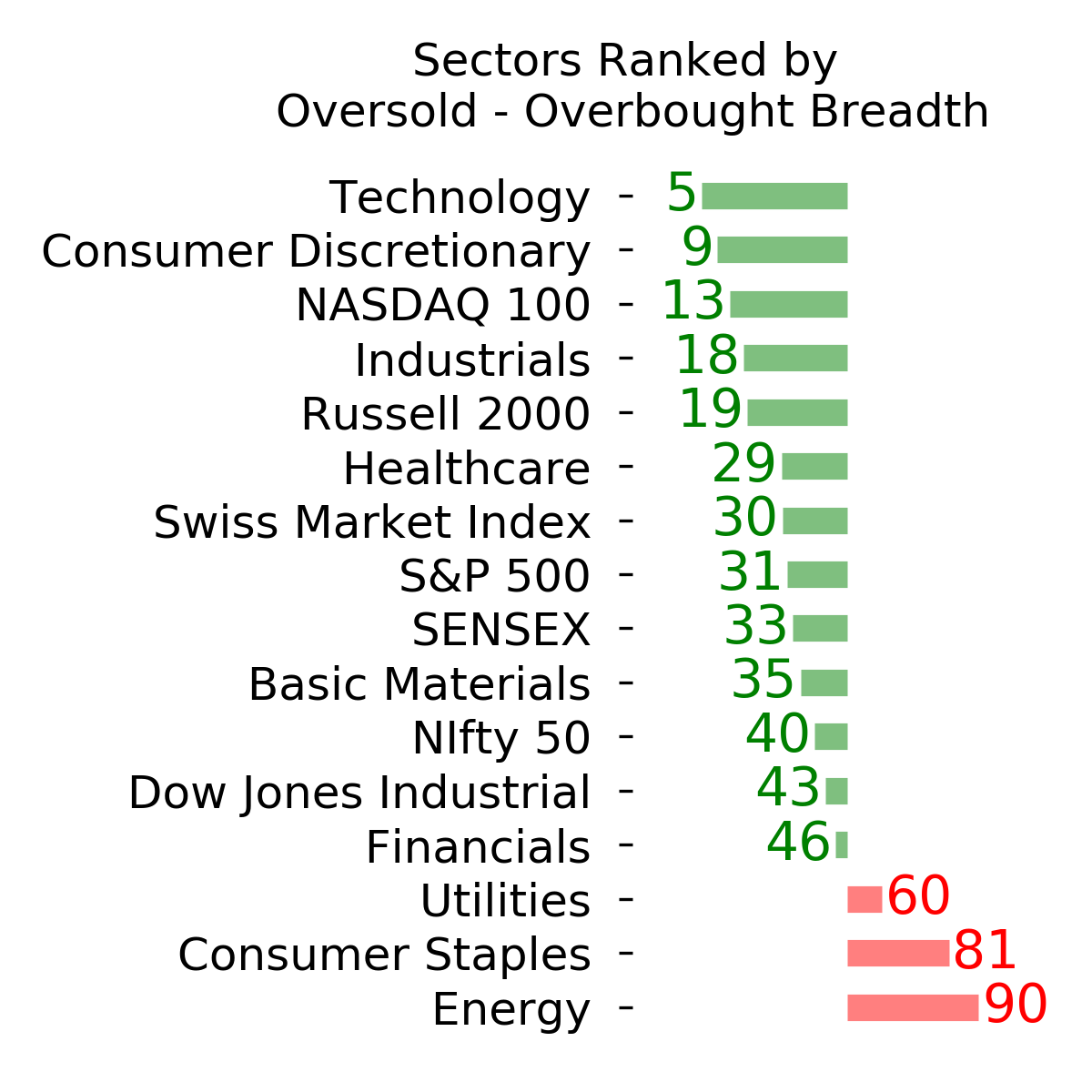
Optimism Index Thumbnails
|
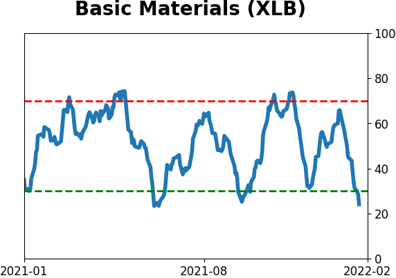
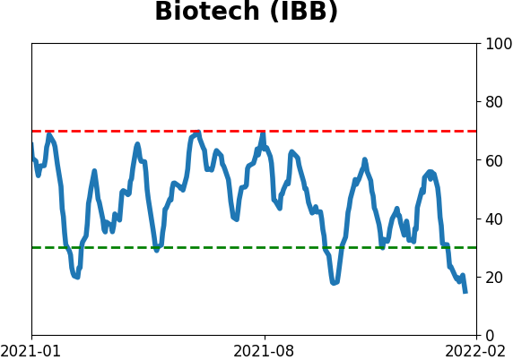
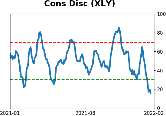
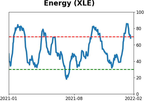
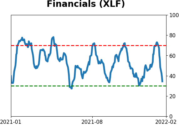
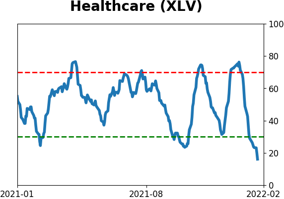
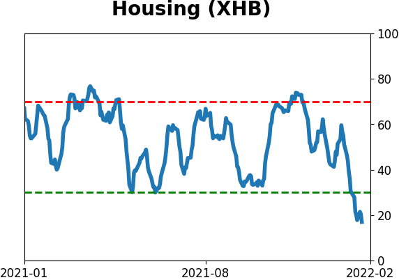
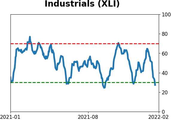
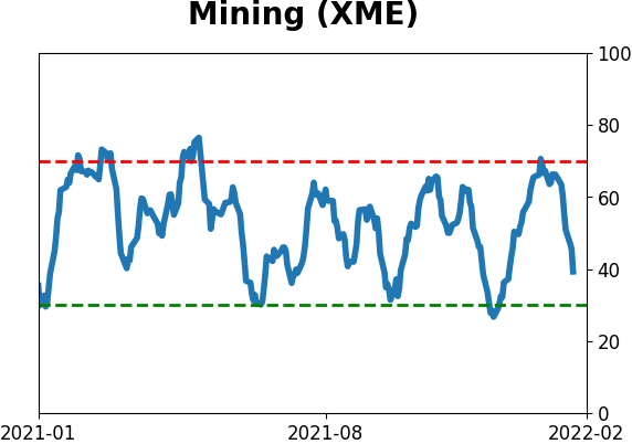
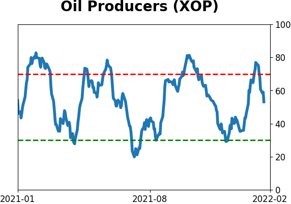
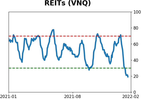
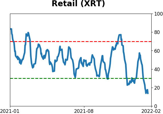
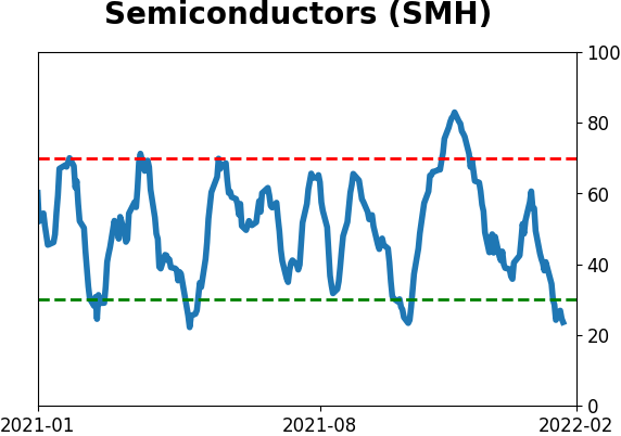
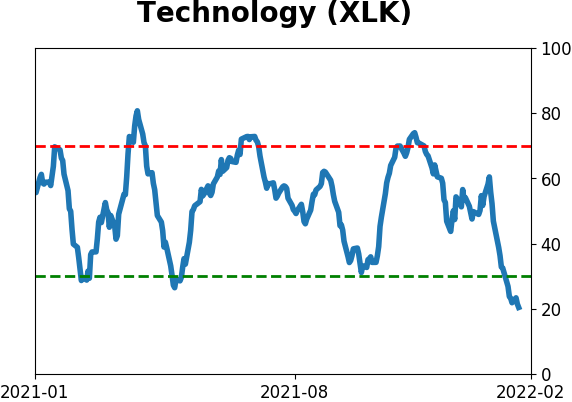
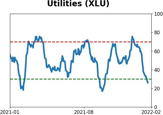
Sector ETF's - 10-Day Moving Average
|
|
|
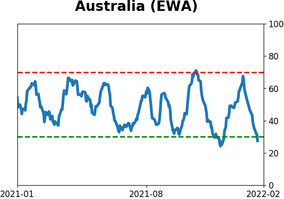
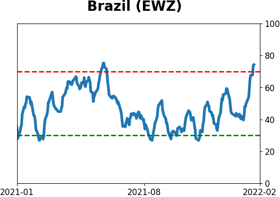
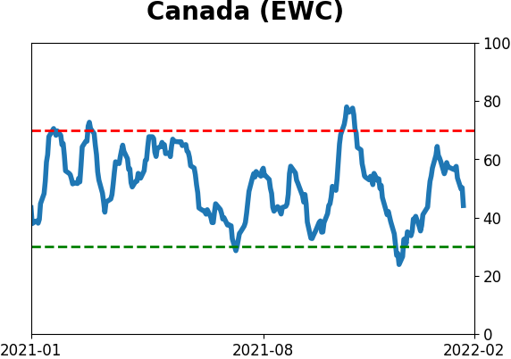
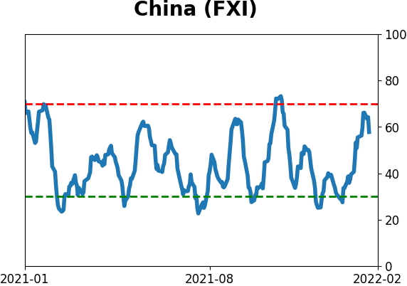
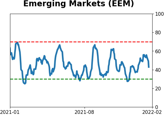
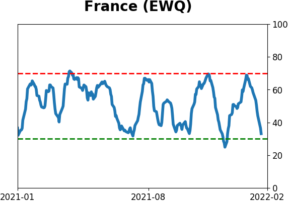
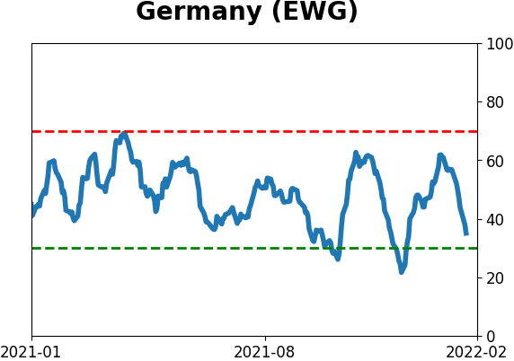
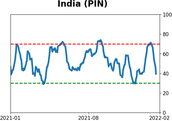
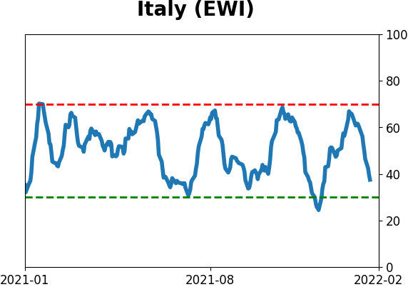
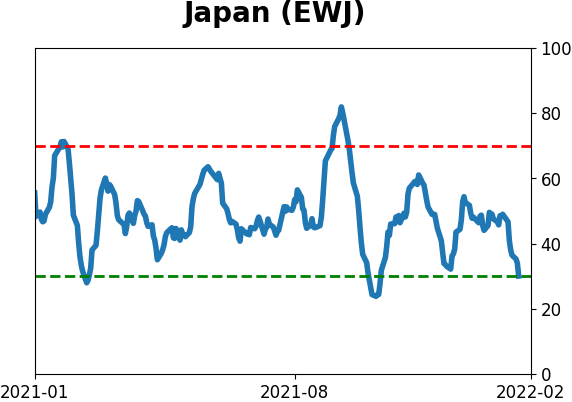
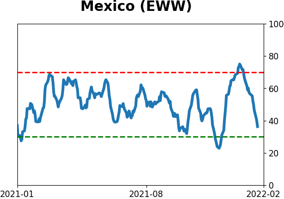
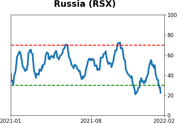
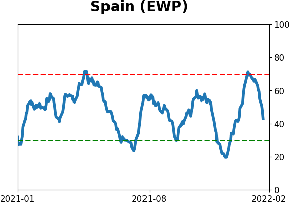
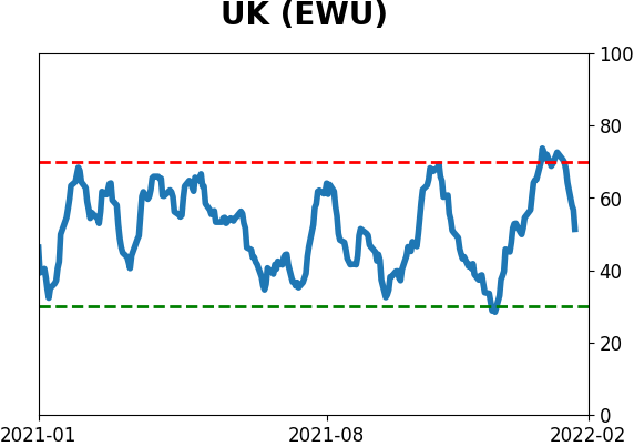
Country ETF's - 10-Day Moving Average
|
|
|
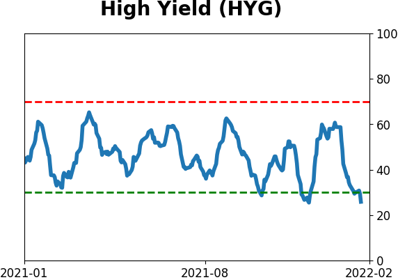
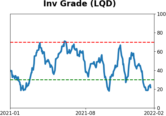
Bond ETF's - 10-Day Moving Average
|
|
|
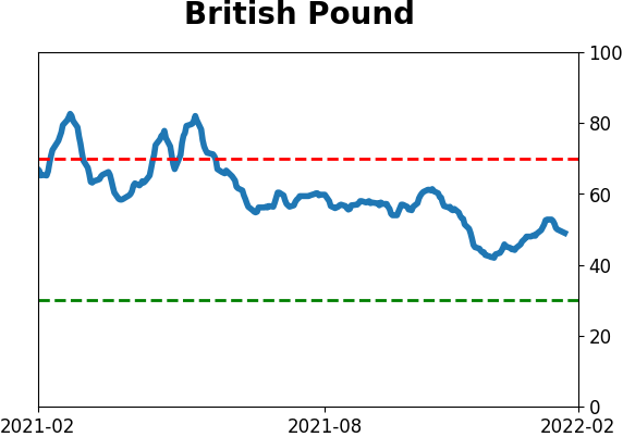
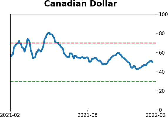
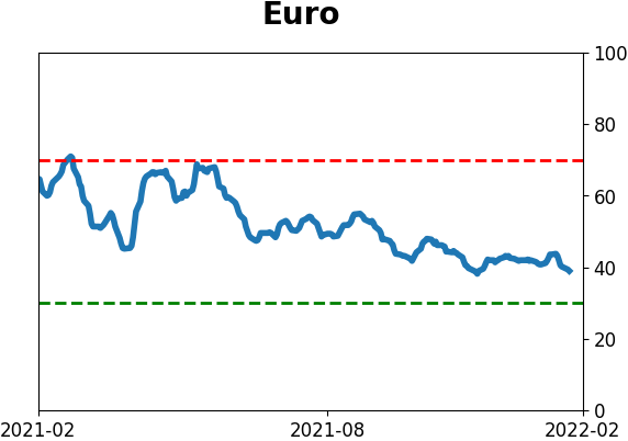
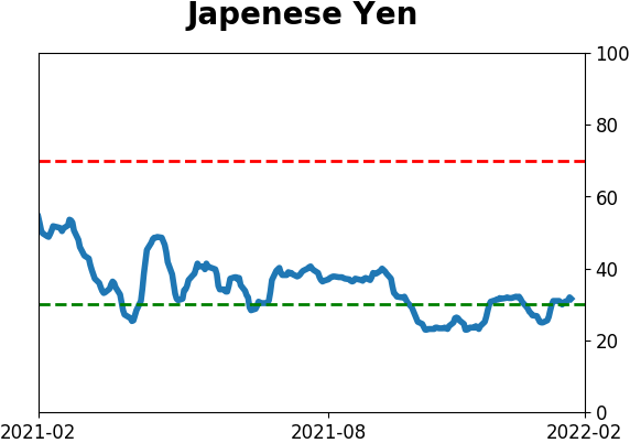
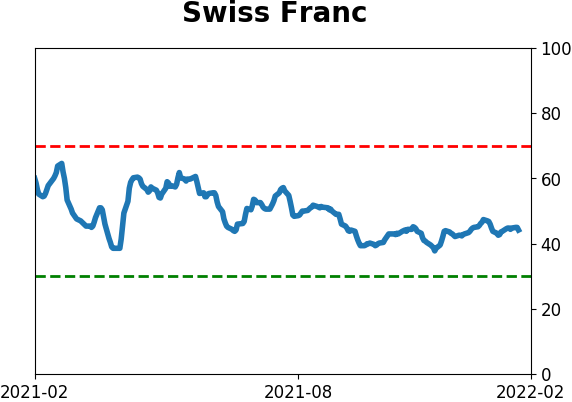
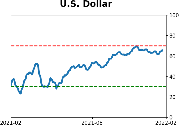
Currency ETF's - 5-Day Moving Average
|
|
|
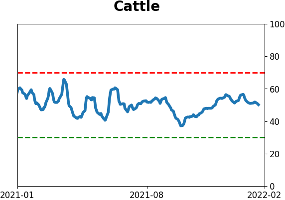
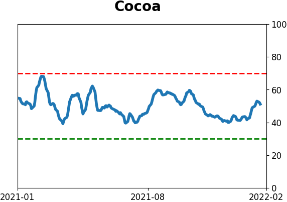
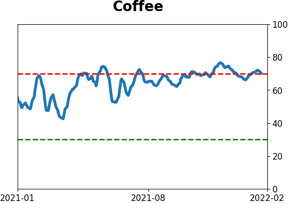
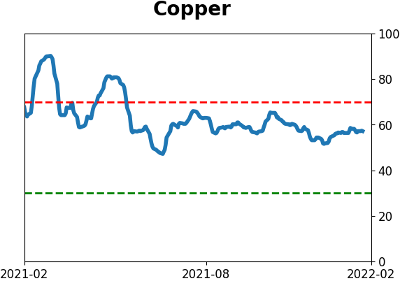
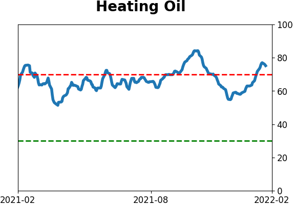
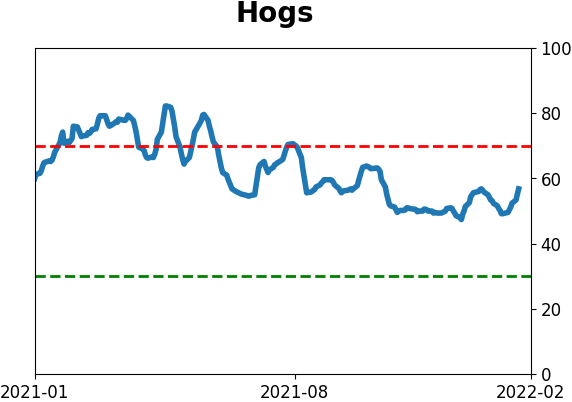
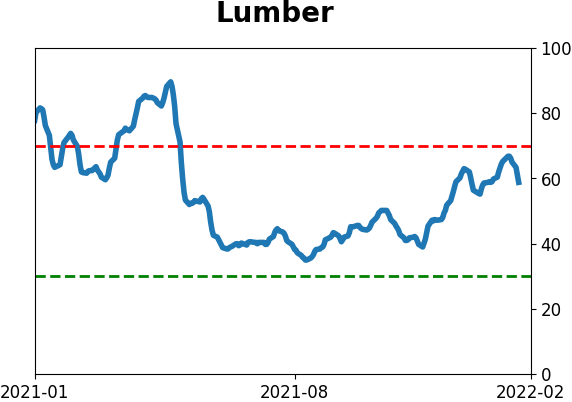
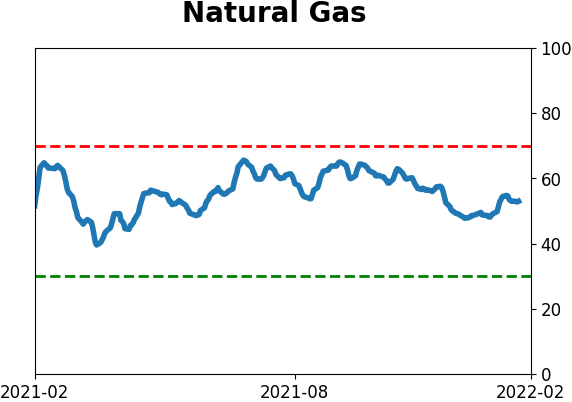
Commodity ETF's - 5-Day Moving Average
|
|