Headlines
|
|
Other than the stock market, few signs of a thaw:
Stocks, and internal breadth measures, have been extremely positive over the past week. But outside of the broad market, there have been fewer signs of a thaw in the panic and concern among investors.
S&P's technical sell signal lacks punch:
The S&P 500, along with some sectors and individual stocks, has triggered a Death Cross sell signal. While it did precede some weak short-term returns, it was not a good signal longer-term.
|
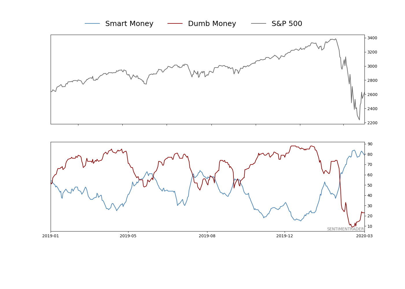
Smart / Dumb Money Confidence
|
Smart Money Confidence: 79%
Dumb Money Confidence: 23%
|
|
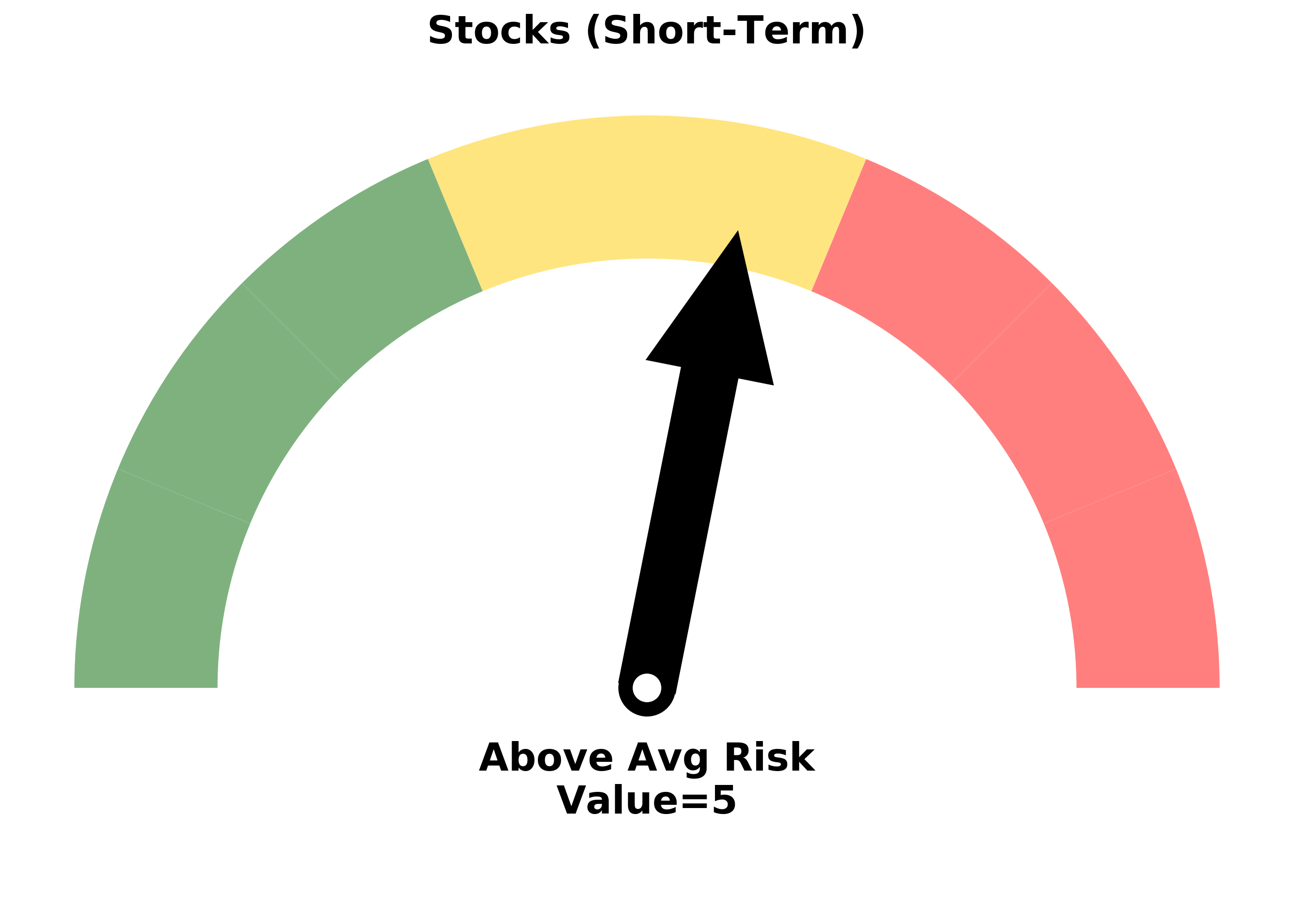
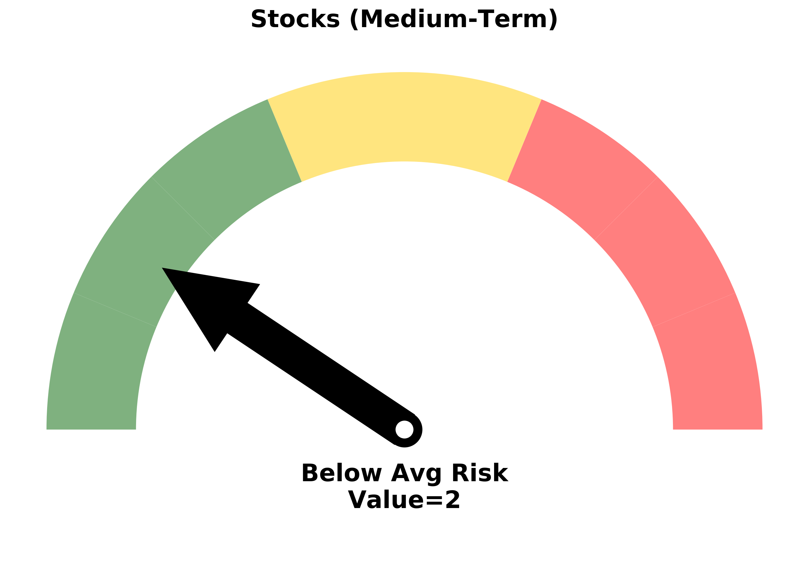
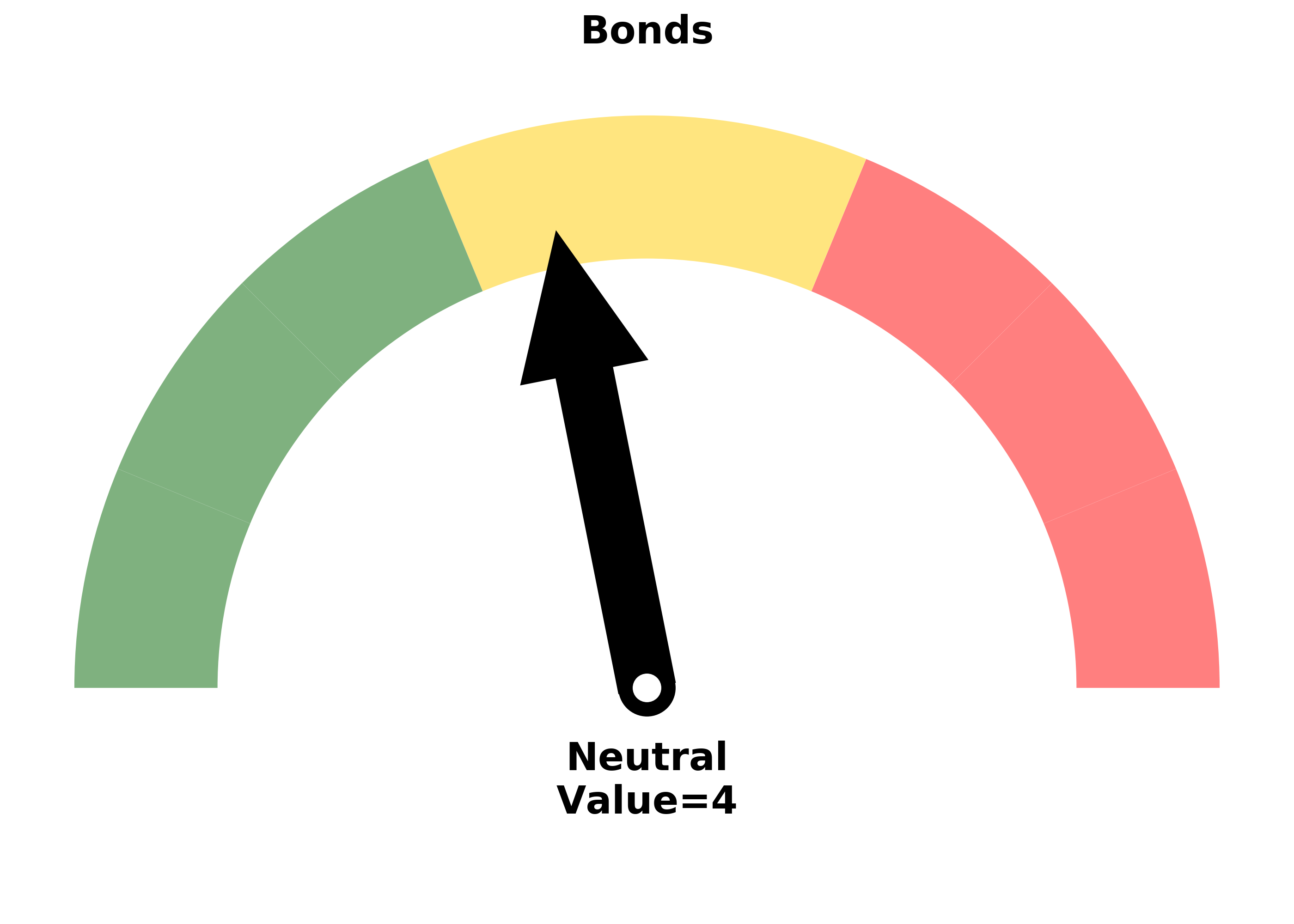
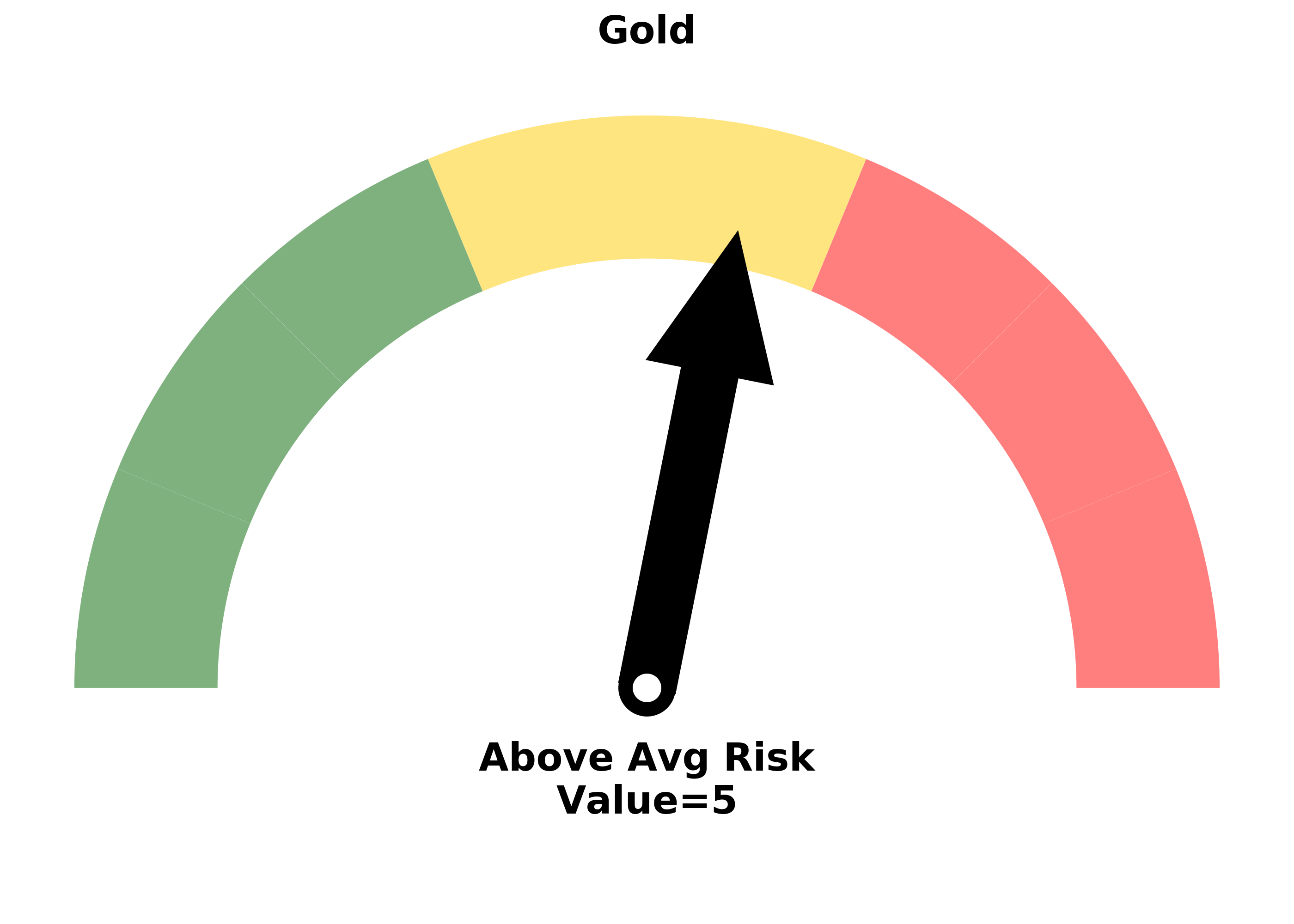
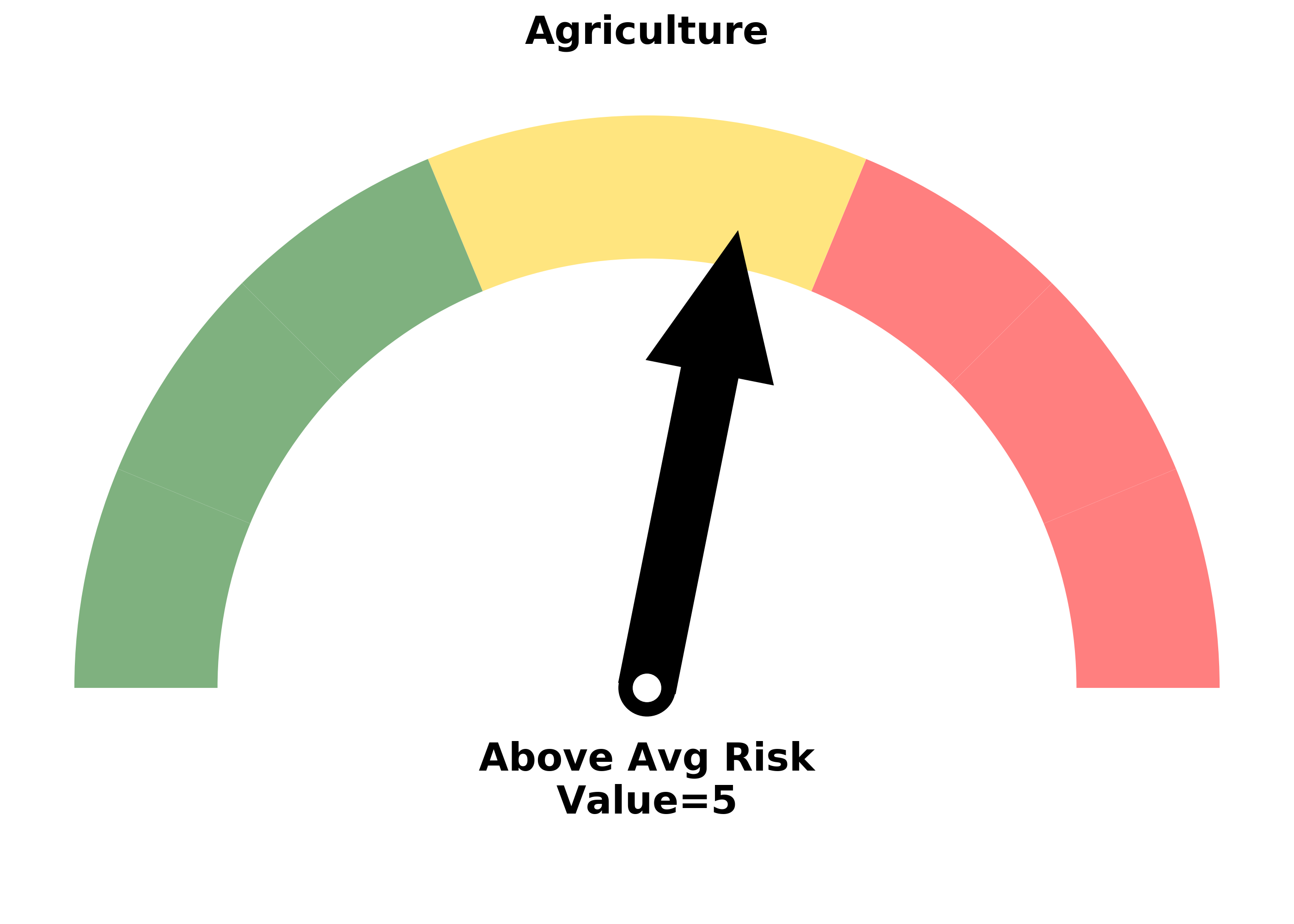
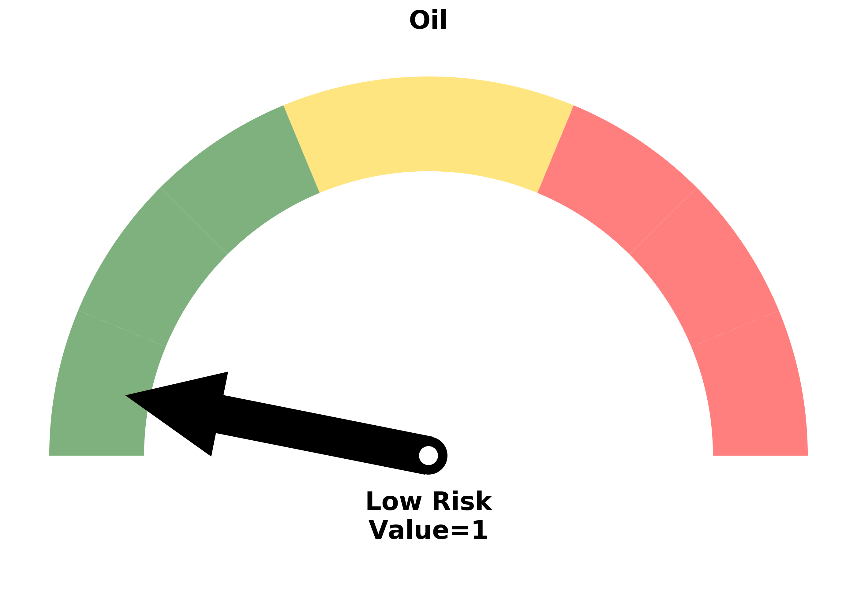
Risk Levels
Research
BOTTOM LINE
Stocks, and internal breadth measures, have been extremely positive over the past week. But outside of the broad market, there have been fewer signs of a thaw in the panic and concern among investors.
|
Because equities make up the bulk of most investors' allocation, they get most of the attention, as they should. And most use the S&P 500 as the benchmark against which their allocation is measured, which also makes sense. That's why we spend most of our time using that particular index and its components.
The last few weeks have caused a tsunami of volatility, but not just in stocks. We've already looked at how it has caused a rift across bonds, currencies and commodities.
As stocks try to recover, perhaps we can look beyond the usual equity metrics and see if there are any signs that this recovery is for real. The most compelling development so far is the buying thrust from last week, and the bigger-than-usual retracement of the decline.
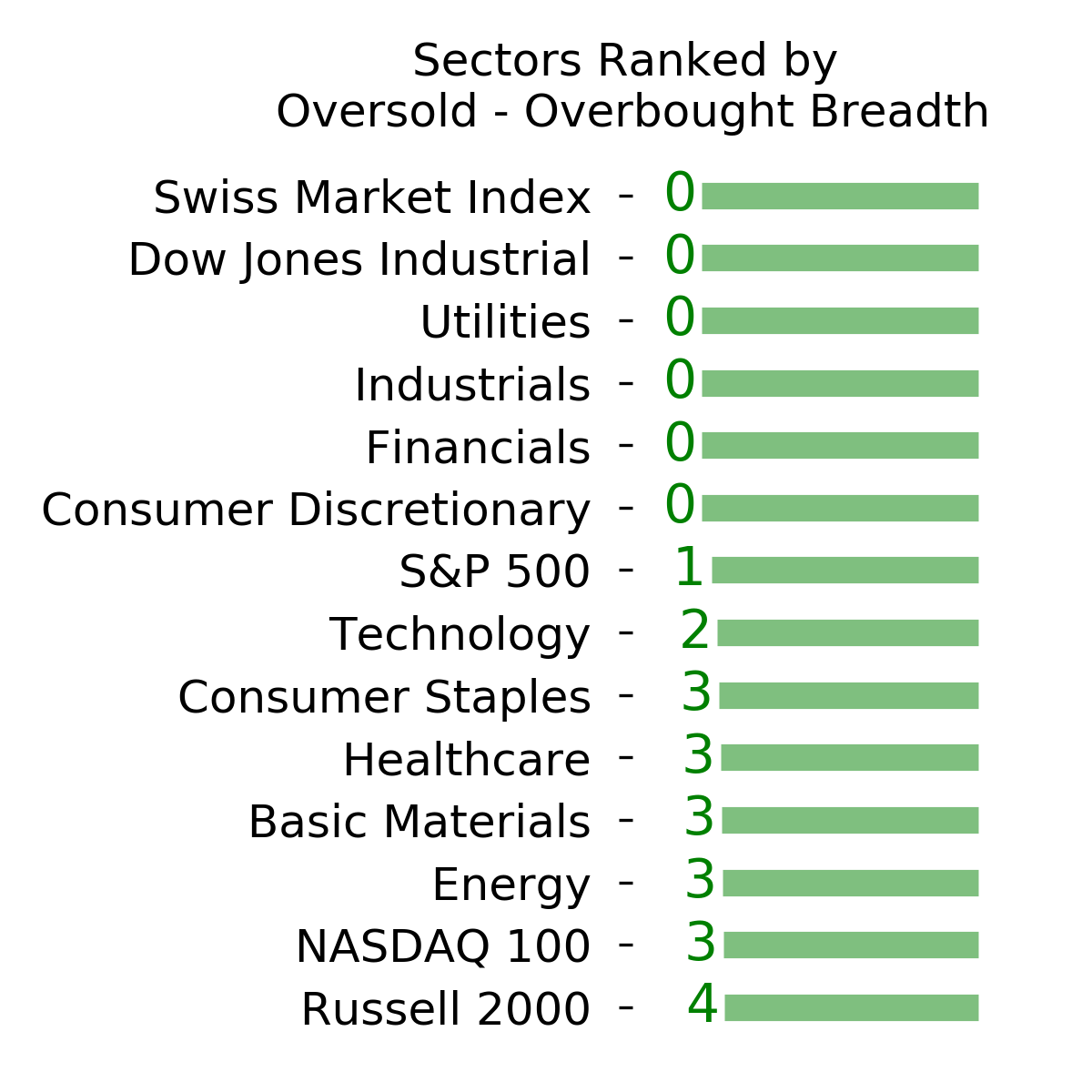
Before stocks hit bottom, we looked at what types of stocks tend to lead out of the "true" bottoms versus "false" ones. Most of the true lows saw industrial, technology, and discretionary stocks led during the first week of the rebound off the low. The false bottoms that went on to a lower low in the month(s) ahead tended to see more defensive stocks leading.
That's a little bit discouraging now, since utilities, health care, and staples are leading this rally. Industrials and tech are up there, but not taking the lead like we should want to see. It's not a huge knock against the rally, just a little concerning.
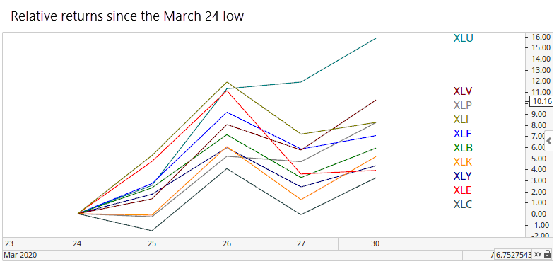
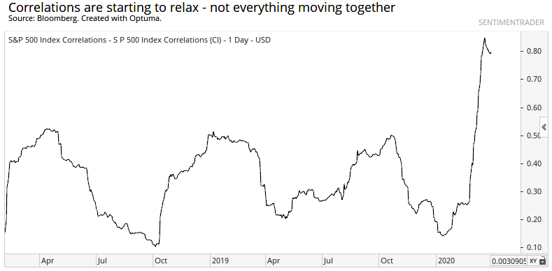
At least correlations are starting to relax, though they remain elevated. Bulls should want to see this continue to decline, with stocks trading on their own merits instead of everything up and down at the same time.
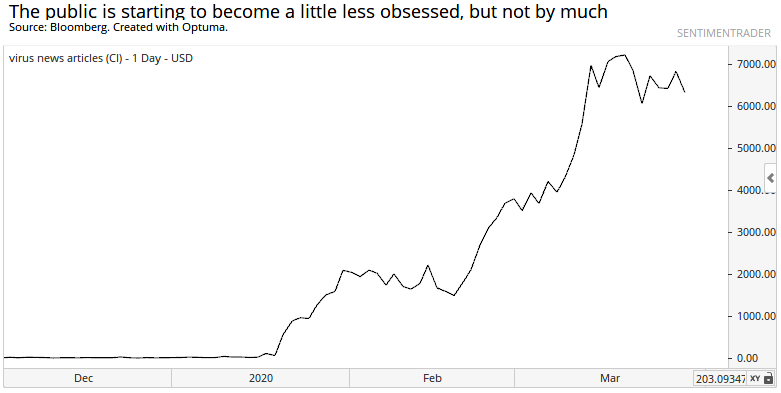
After other news-obsessed declines, stocks bottomed when articles mentioning the worst of peoples' fears abated strongly. We haven't seen that yet. Articles mentioning "virus" have plateaued, but haven't dropped by 40% or more, which would indicate the news bubble has popped.
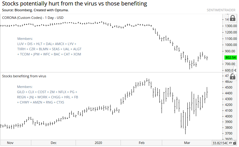
Because the news flow has been so horrid, and most of us have to actively seek out good news, it would make sense to see stocks that have been struck hard by the virus continue to struggle. If those stocks rebound harder than the market - while those stocks enjoying a panic bump start to peak - then it would also indicate that fear is ebbing.
Not much sign of that yet. Stocks hit hard by the virus are continuing to lag. It seems crass to talk about stocks benefiting from this disaster, but some truly have, and they're not showing much sign of letting up yet.
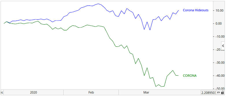
Year-to-date, those "hideaway" stocks are still holding up much better than the hard-hit ones.
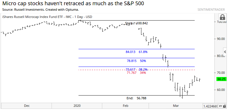
In a more general sense, some of the more vulnerable stocks are the smaller ones that might not have easy access to capital. Micro-cap stocks got knocked down by about 44% from their highs, and have not been able to make up much of that ground. Their retracement is far below the 34% that the S&P has made up.
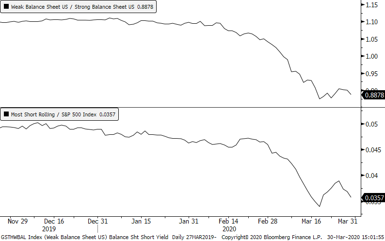
Companies that have a weak balance sheet have been targets by short-sellers. Those stocks have grossly under-performed stocks with stronger balance sheets, and stocks that have heavy short interest have been struggling relative to the broader market. That hasn't changed much yet, still showing signs of risk-aversion.
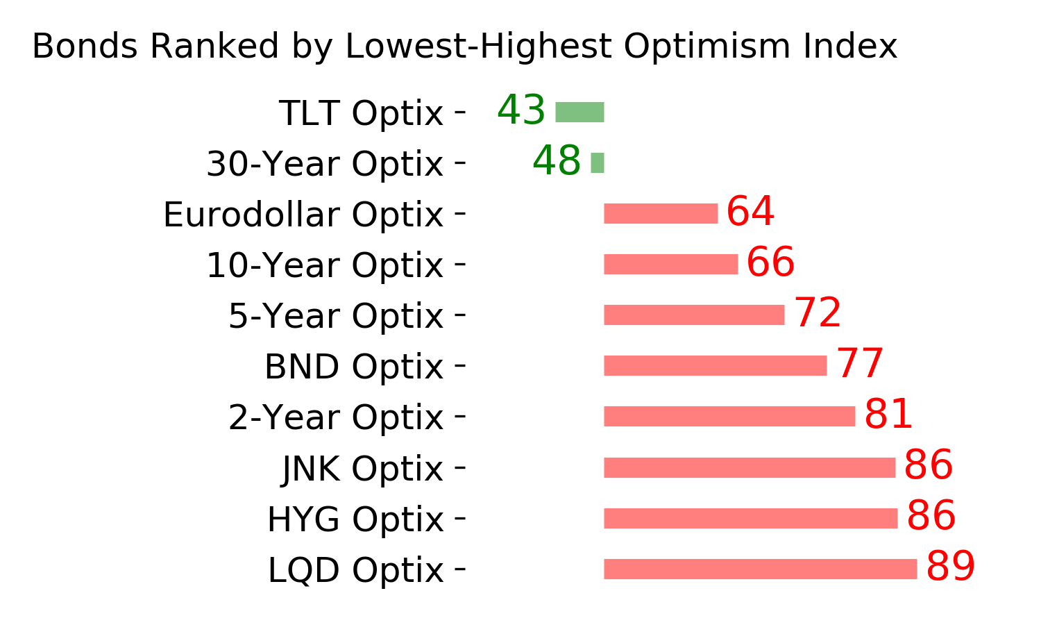
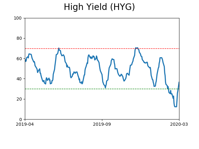
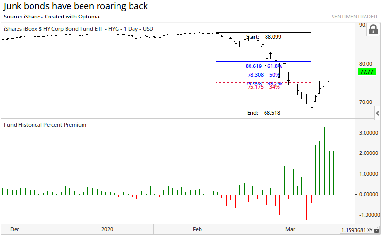
The bonds of junk-rated issues also got hit hard, but funds like HYG have retraced an impressive 50% of the decline, which should be a good sign. We might need to take that with a grain of salt, however, since the fund is still trading at a relatively massive premium to its underlying value.
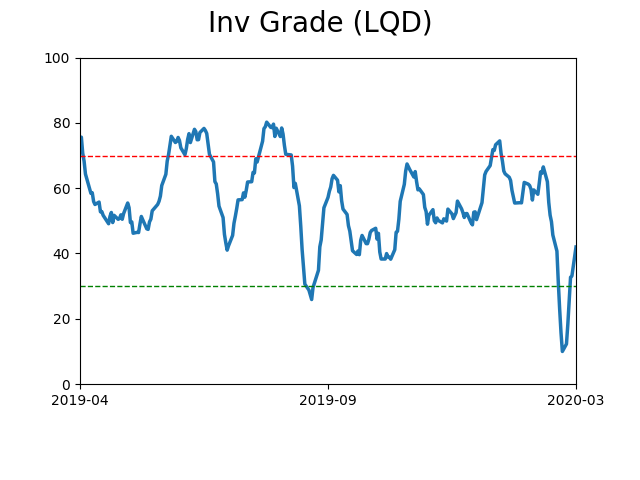
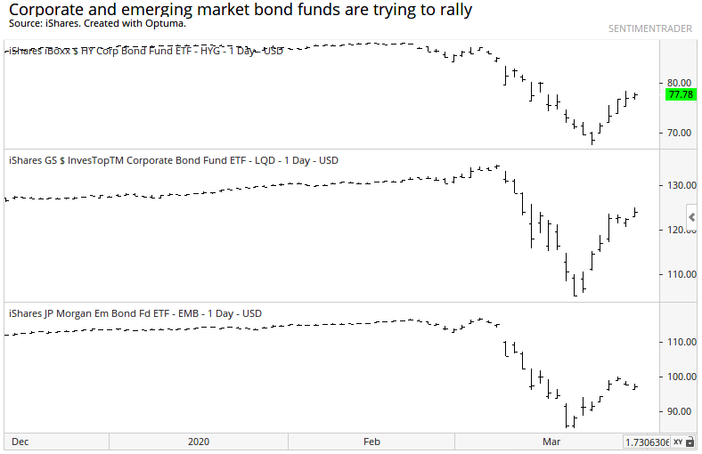
Investment grade corporate bonds have also bounded back well, but emerging market bonds are still struggling.
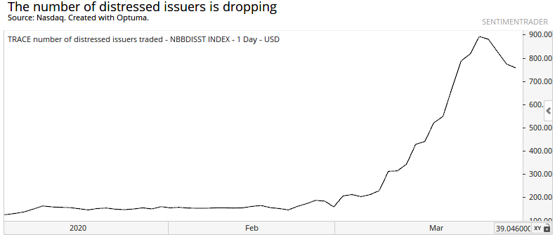
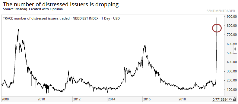
It's good to see the number of distressed issuers declining, as well.
Historically, though, it's still at an extremely high level - higher even than 2008.
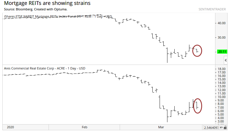
Some experts are most concerned about a corner of the market most of us rarely consider - mortgages, especially commercial. Some funds that are leveraged to that space are not doing well, even on Monday. This bears watching.
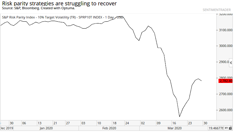
A lot of folks are also worried about some of the strategies out there that are employed by hedge funds and large, sophisticated investors, that could blow them up under the wrong conditions and cause systemic risk. One of those is risk parity funds, but there seems to be some stabilization there.
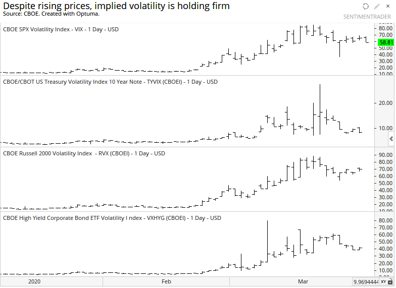
It's also a little weird that implied volatility isn't dropping more. The VIX is still high, for both large-caps and small-caps, and it's not letting up much for Treasury bonds or high-yield corporates. Bulls should want to see these measures quickly revert back to more normal levels.
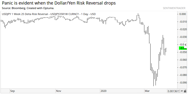
At least some signs of strain and panic are easing nicely. The dollar/yen risk reversal that we looked at on March 20 is trying hard to normalize.
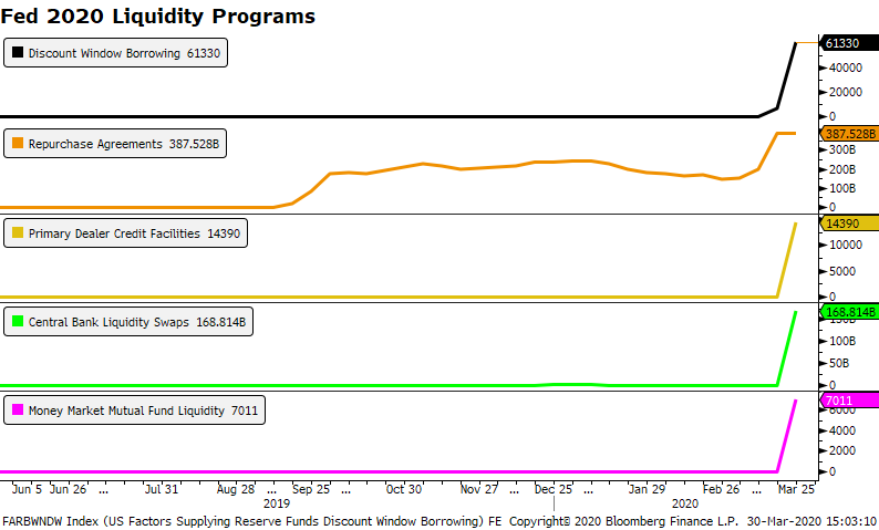
We should continue to see panic indicators like that ease as banks and other investors have access to the tools introduced by the Fed. As noted by Bloomberg, all of them are being utilized. In the weeks ahead, ideally we would see these ease if markets start to return to normal but that's a big "if."
Overall, there isn't a whole lot outside of stocks that strongly suggests the worst is behind us. Some of the biggest signs of panic are just starting to ease, and even then they haven't eased as much as stocks suggest they should have. Maybe that's just lingering concern and it could actually be a good sign, but bulls should want to see more signs of risk-taking, not risk-aversion. At least until that risk-taking becomes extreme.
We'll keep watching these measures, and note if we start to finally see a thaw, which would be a very good sign for stock bulls.
BOTTOM LINE
The S&P 500, along with some sectors and individual stocks, has triggered a Death Cross sell signal. While it did precede some weak short-term returns, it was not a good signal longer-term.
|
The most benchmarked index in the world has suffered a technical sell signal.
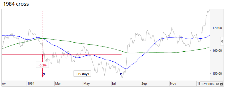
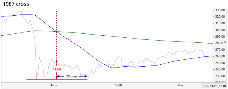
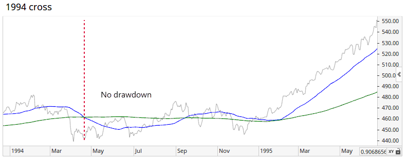
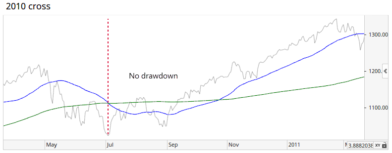
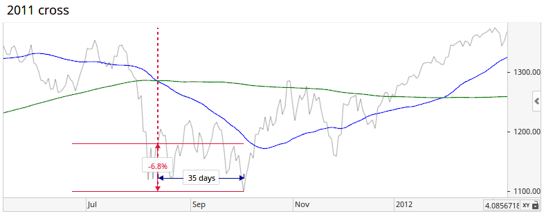
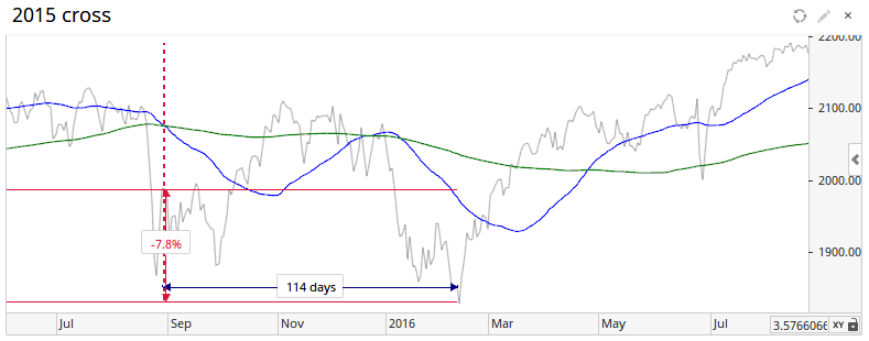
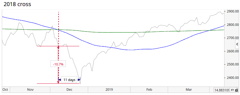
For the first time in well over a year, the S&P 500 is seeing its 50-day moving average cross below its 200-day average. The Death Cross tends to get quite a bit of attention, even though its record is spotty. Back in September 2015, we looked at what happened when all four major indexes succumbed to this sell signal, and results were not exactly negative.
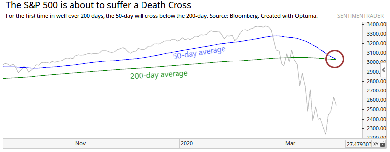
Sometimes the crosses occur in rapid succession, but this one is happening after the averages were positive for at least 200 days. This one is also a bit different in that it was triggered by a severe, quick decline. If we restrict our study to those crosses that were precipitated by the worst one-month declines, then we can narrow down the field to those most similar to the current one.
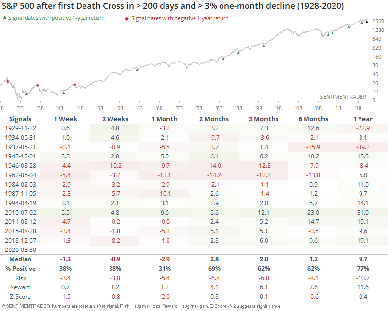
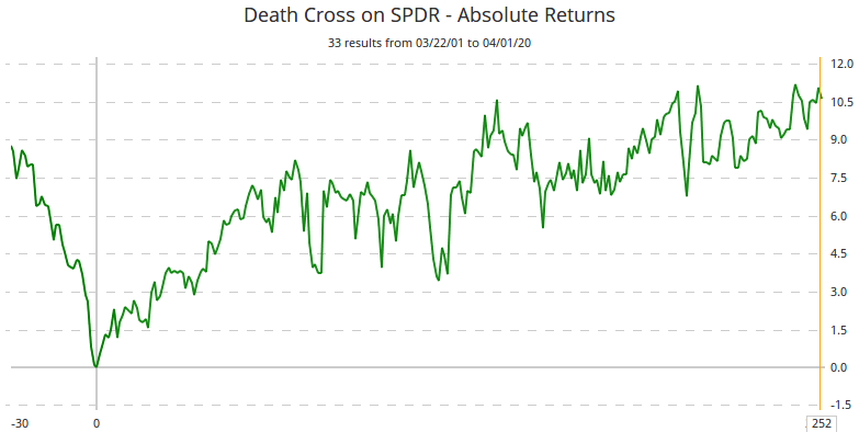
Since 1950, longer-term returns improved dramatically.
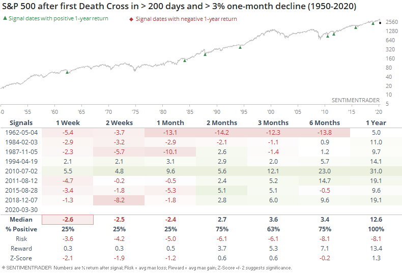
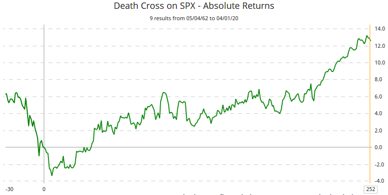
There was consistently some weakness in the short-term as traders digested the volatility, but then stocks quickly worked higher. Below, we can see the price path in the S&P from 30 days before the signal to 252 days after.
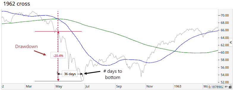
Below, we can see the individual instances and how long it took to bottom, as well as the risk to get there.
This isn't just a phenomenon in the S&P 500, either. Using the major sector SPDRs, it's the same general pattern, with even less of a tendency for short-term weakness. Below, we can see the average price path in the sector SPDRs after the first Death Cross in at least 200 days, and that were triggered by heavy losses over the past month.
Looking at all current stocks in the S&P 500, there have been over 1,800 of these signals over the past 50 years. The distribution of forward returns is very positive.
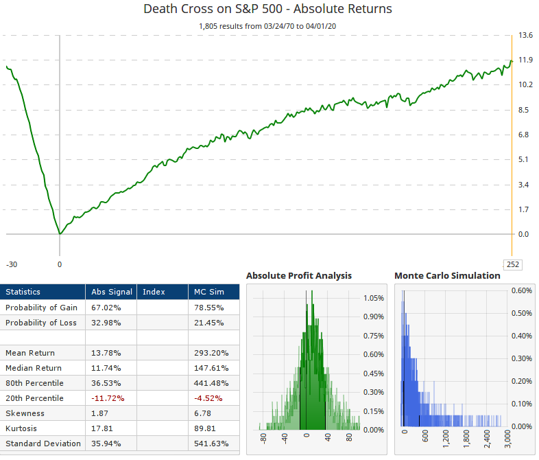
The returns across stocks, sectors, and the S&P 500 index itself suggest that this is not a robust sell signal. If anything, it's the opposite over a medium- to long-term time frame. The only caveat is that quite a few of the recent signals saw a testing phase of the initial low, though that has become such consensus opinion right now, it seems unlikely for the market to accommodate so many similar opinions.
Active Studies
| Time Frame | Bullish | Bearish | | Short-Term | 0 | 2 | | Medium-Term | 16 | 14 | | Long-Term | 31 | 3 |
|
Indicators at Extremes
Portfolio
| Position | Weight % | Added / Reduced | Date | | Stocks | 73.2 | Added 31.3% | 2020-03-17 | | Bonds | 0.0 | Reduced 6.7% | 2020-02-28 | | Commodities | 5.5 | Added 2.4%
| 2020-02-28 | | Precious Metals | 0.0 | Reduced 3.6% | 2020-02-28 | | Special Situations | 0.0 | Reduced 31.9% | 2020-03-17 | | Cash | 21.3 | | |
|
Updates (Changes made today are underlined)
In the first months of the year, we saw manic trading activity. From big jumps in specific stocks to historic highs in retail trading activity to record highs in household confidence to almost unbelievable confidence among options traders. All of that has come amid a market where the average stock can’t keep up with their indexes. There were signs of waning momentum in stocks underlying the major averages, which started triggering technical warning signs in late January. The kinds of extremes we saw in December and January typically take months to wear away, but the type of selling we’ve seen over the past month has gone a long way toward getting there. When we place the kind of moves we saw into March 23 into the context of coming off an all-time high, there has been a high probability of a multi-month rebound. The volatility we’ve seen lately is extremely compelling from a medium-term point of view. Virtually everything we’ve looked at suggests a strong probability of gains over the next several months, even within the context of a potential bear market, and even from what had been higher prices. After stocks bottomed on the 23rd, they enjoyed a historic buying thrust. While other signs are mixed at best that panic is subsiding, that thrust is one of the most encouraging sign we've seen in years. There is often a test of a panic low in the weeks after an initial recovery, but that thrust we saw, combined with the larger-than-usual retracement, have me less convinced a test is necessary. For now, I see no overwhelming reason to add or reduce exposure.
RETURN YTD: -14.9% 2019: 12.6%, 2018: 0.6%, 2017: 3.8%, 2016: 17.1%, 2015: 9.2%, 2014: 14.5%, 2013: 2.2%, 2012: 10.8%, 2011: 16.5%, 2010: 15.3%, 2009: 23.9%, 2008: 16.2%, 2007: 7.8%
|
|
Phase Table
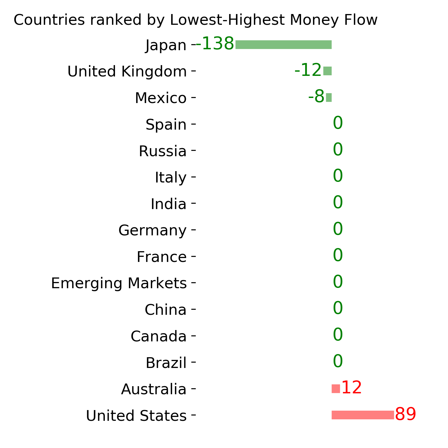
Ranks
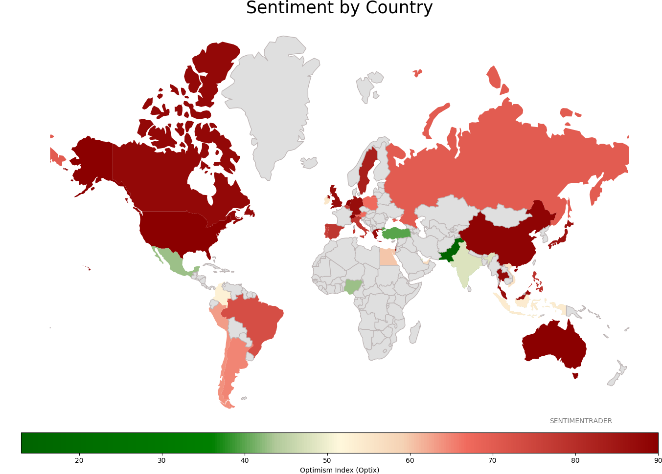
Sentiment Around The World
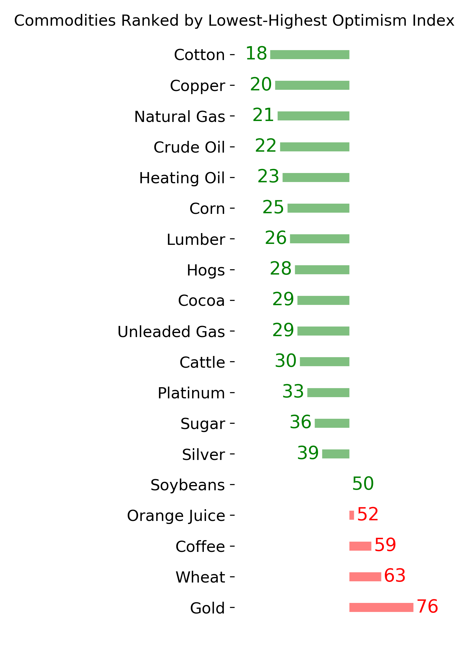
Optimism Index Thumbnails
|
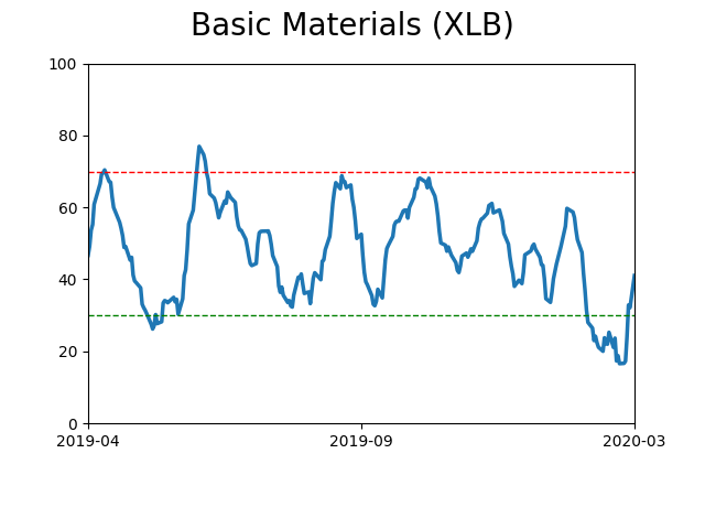
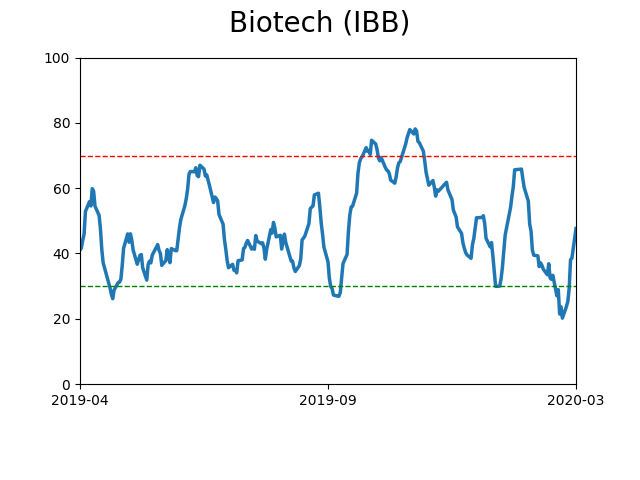
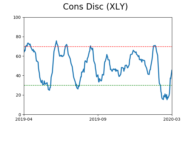
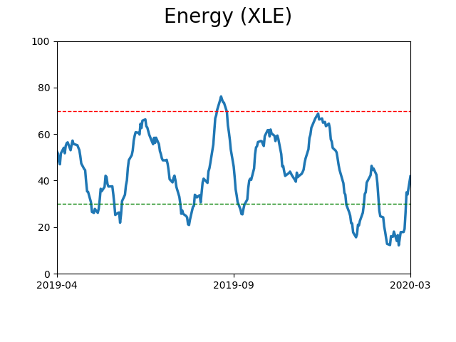
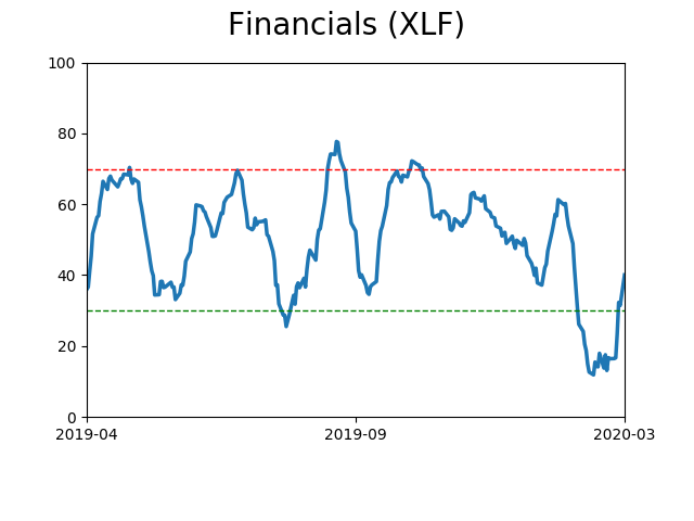
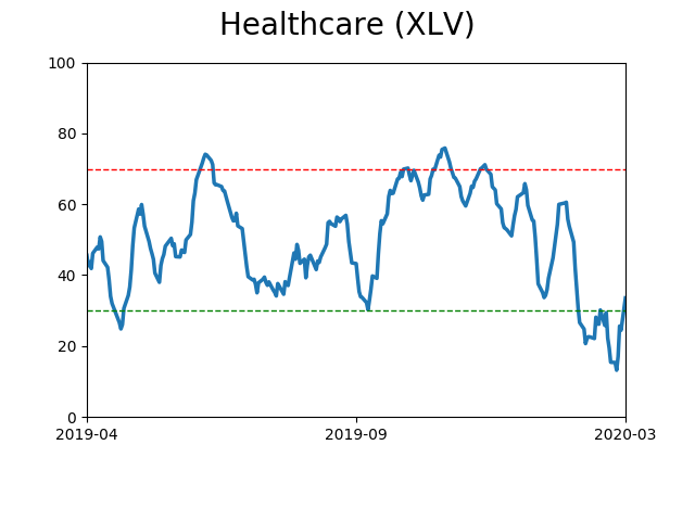
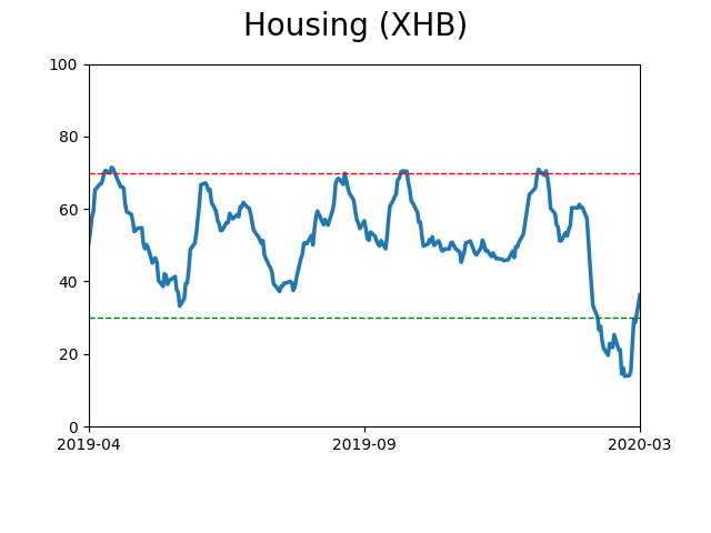
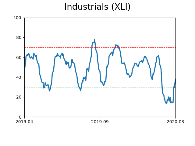
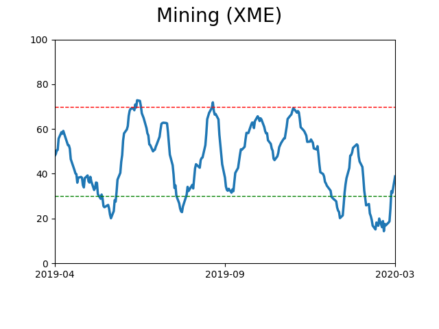
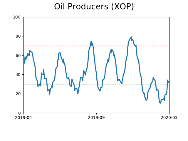
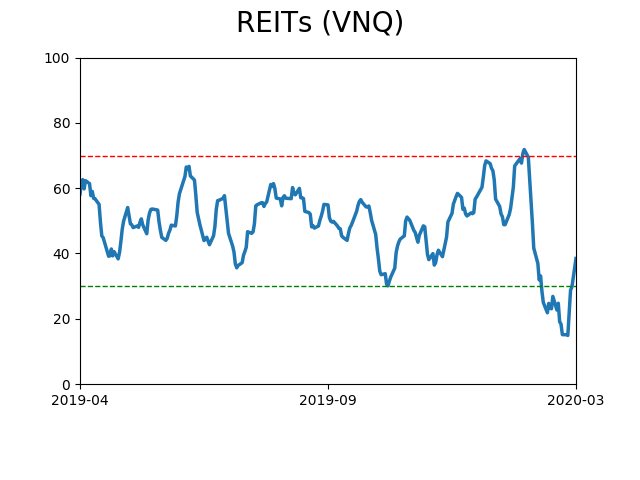
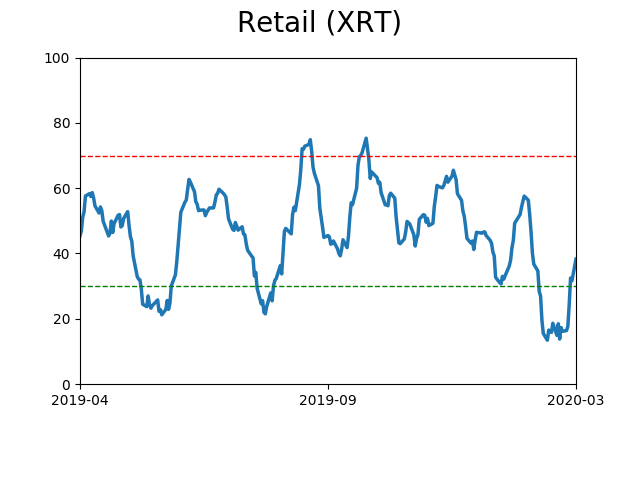
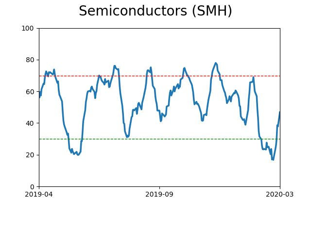
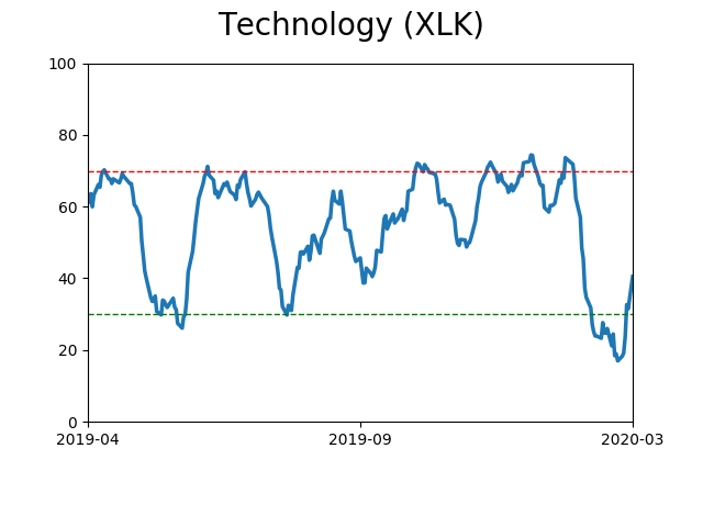
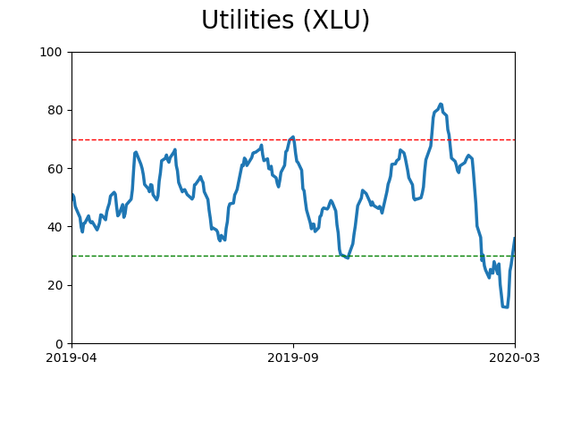
Sector ETF's - 10-Day Moving Average
|
|
|
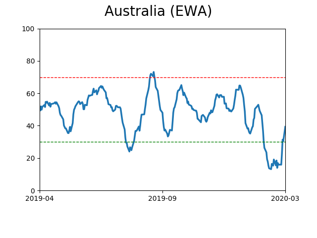
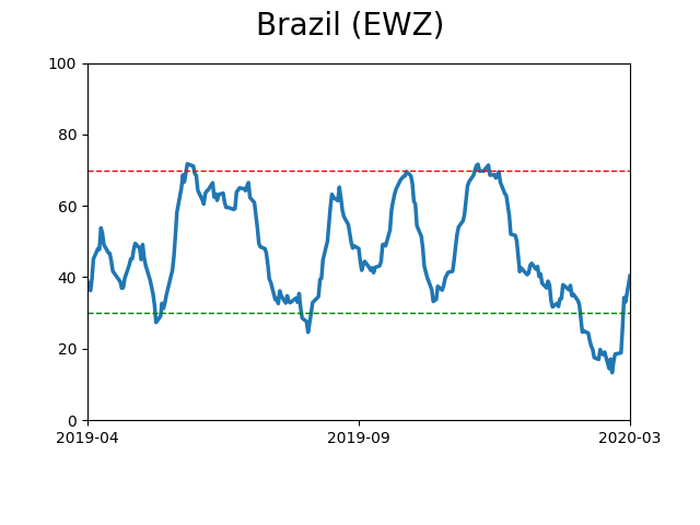
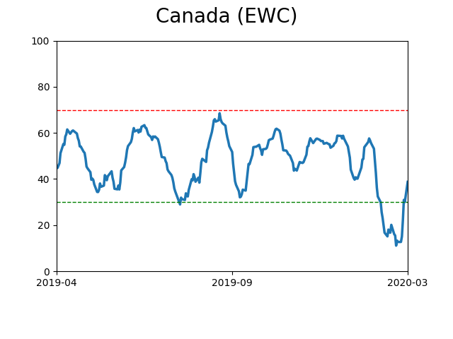
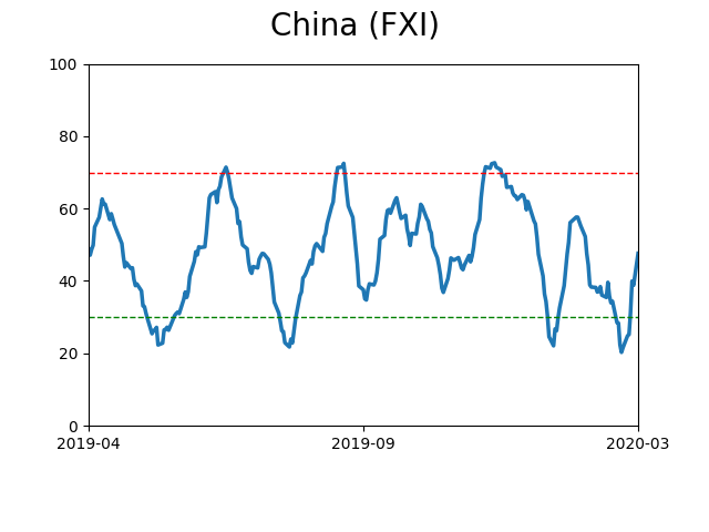
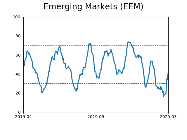
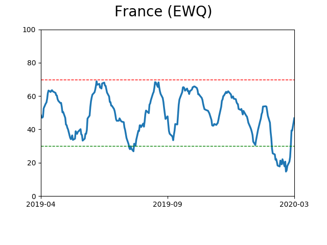
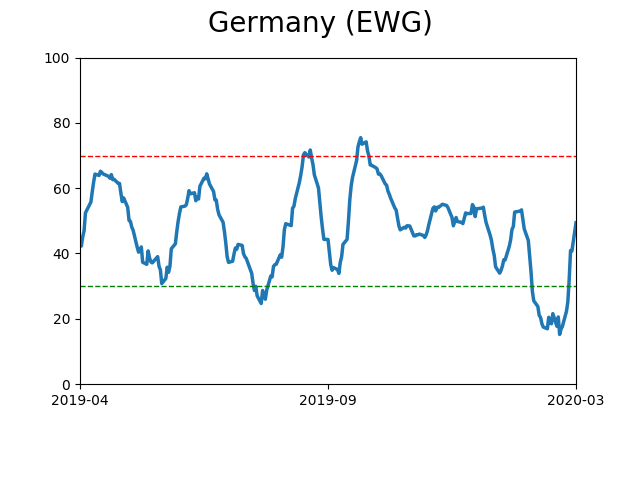
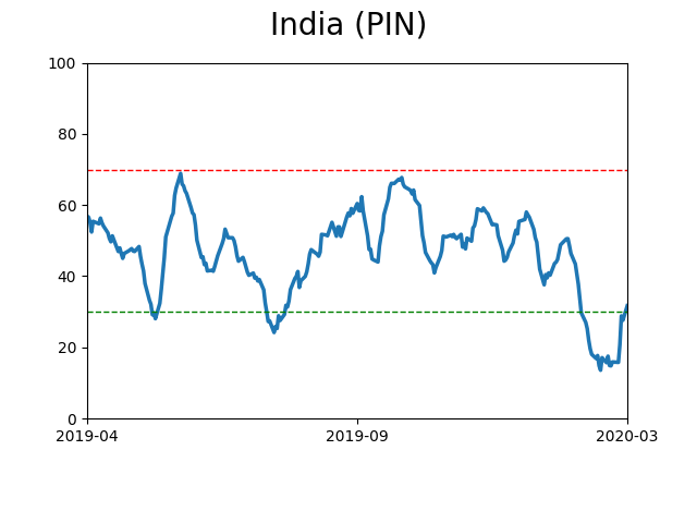
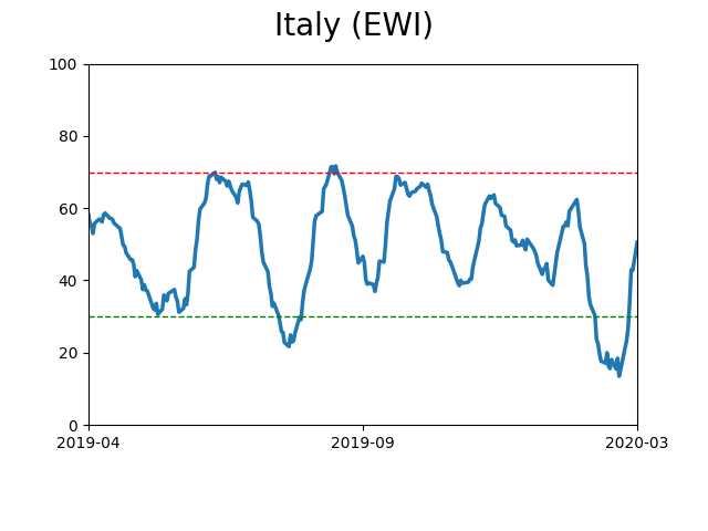
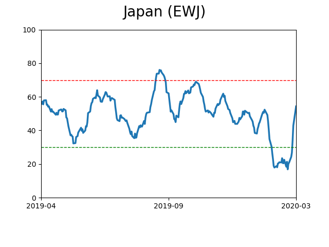
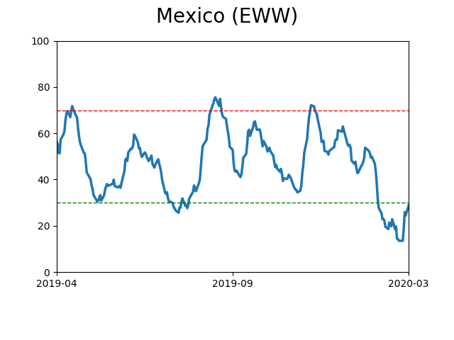
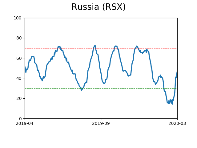
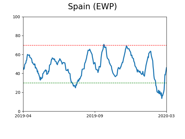
Country ETF's - 10-Day Moving Average
|
|
|
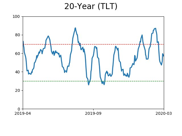
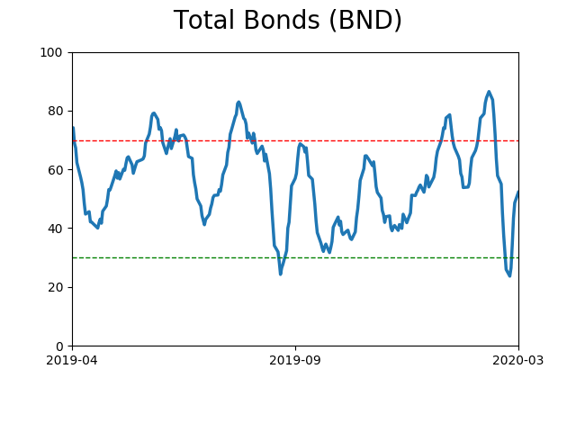
Bond ETF's - 10-Day Moving Average
|
|
|
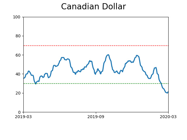
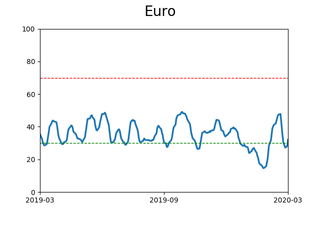
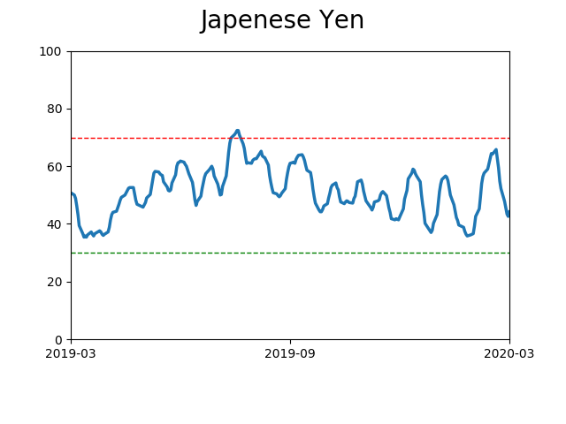
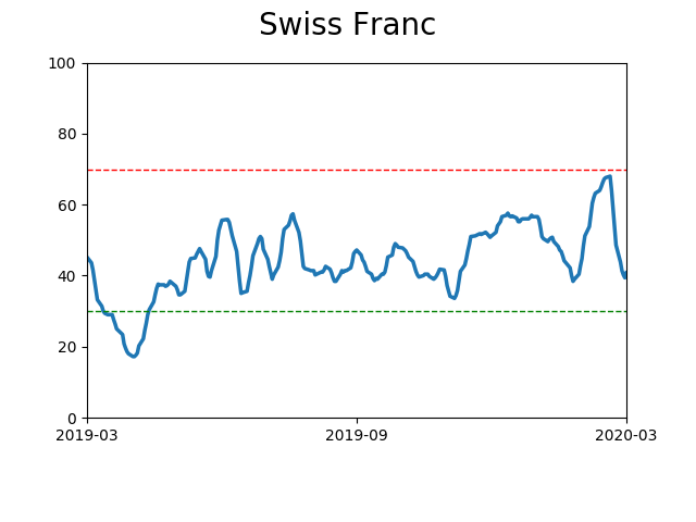
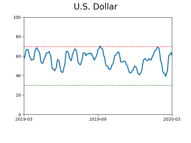
Currency ETF's - 5-Day Moving Average
|
|
|
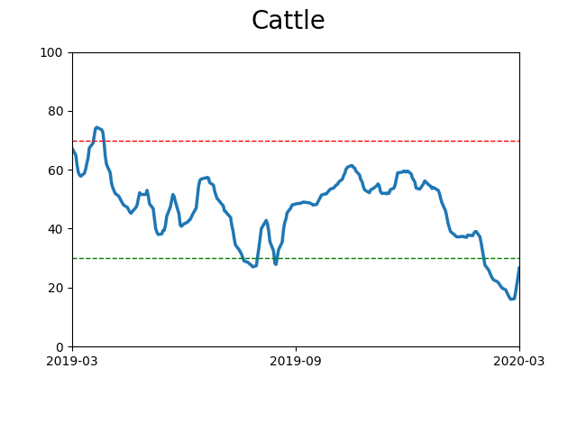
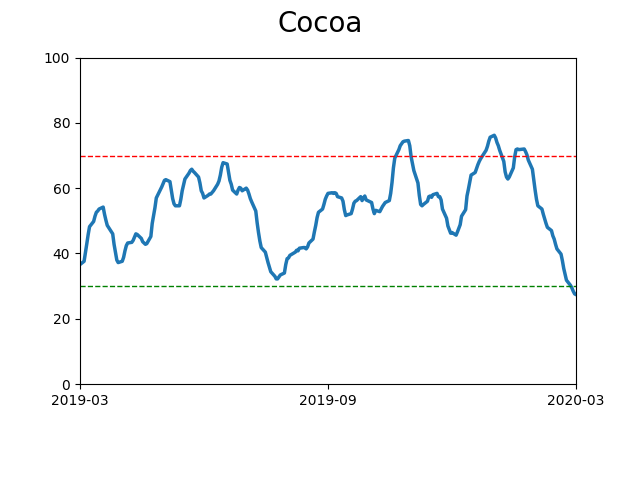
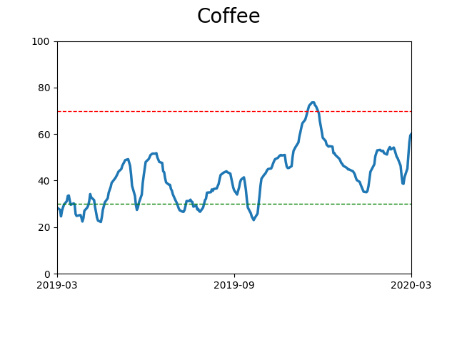
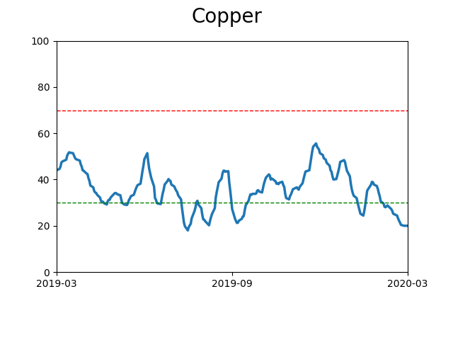
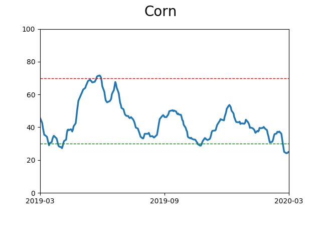
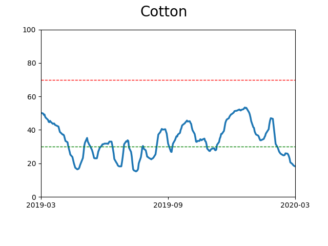
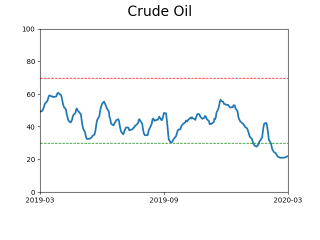
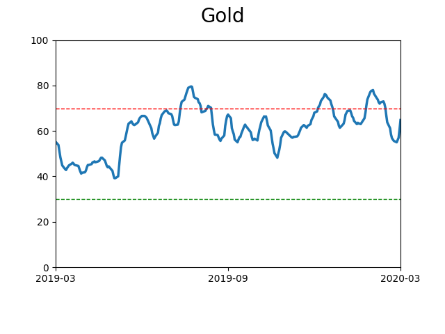
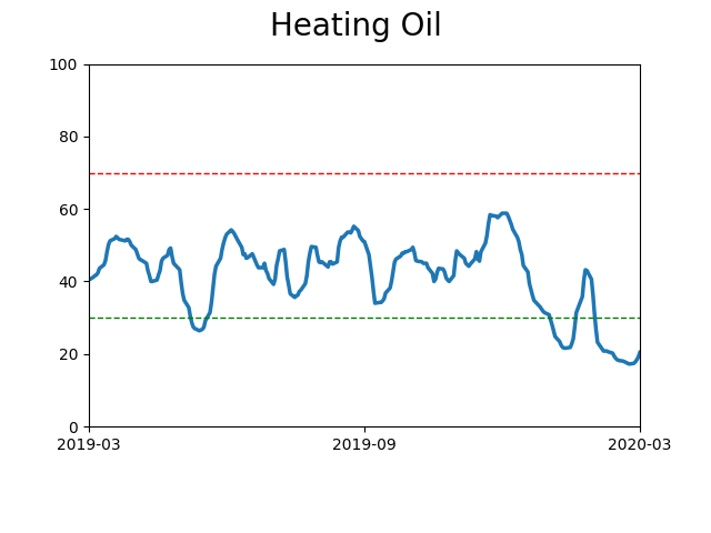
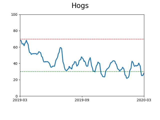
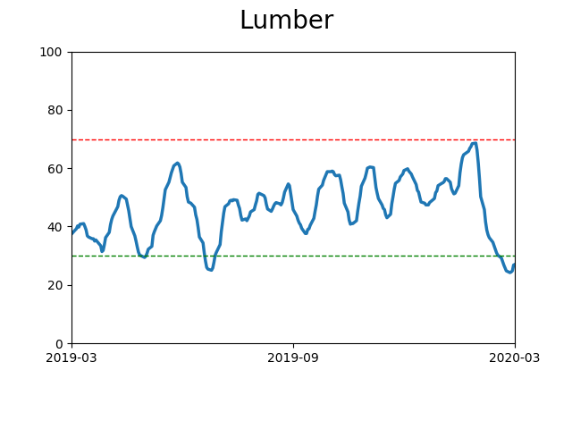
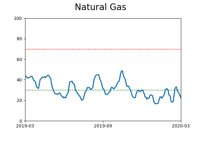
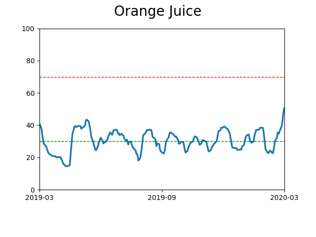
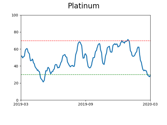
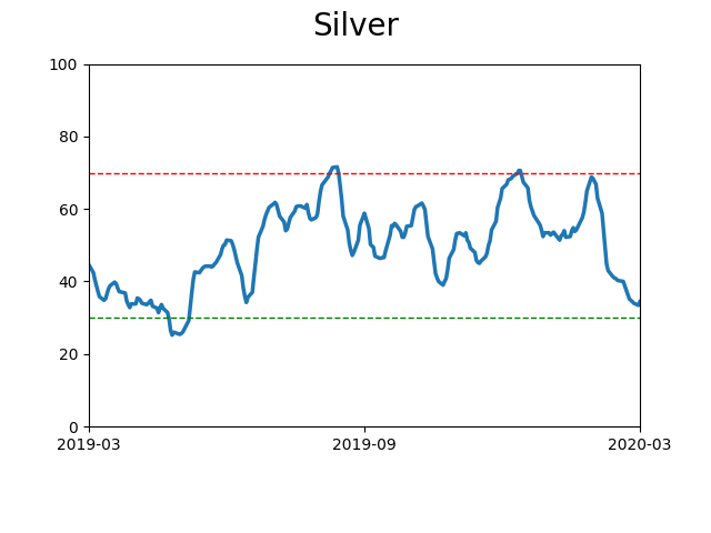
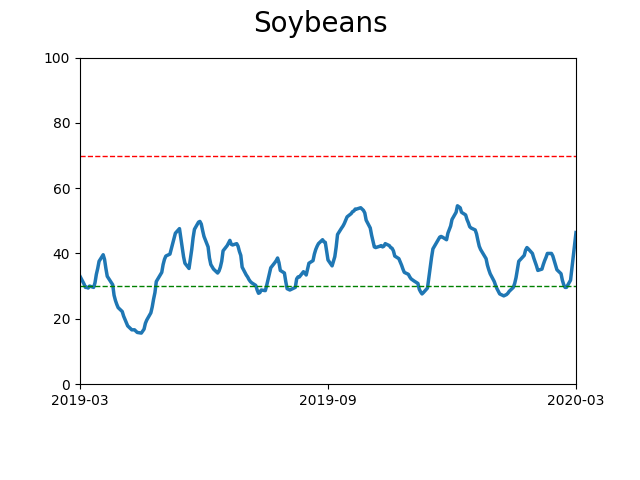
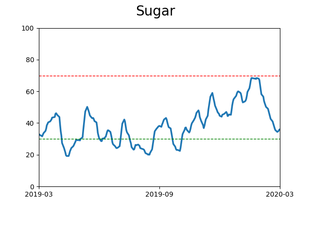
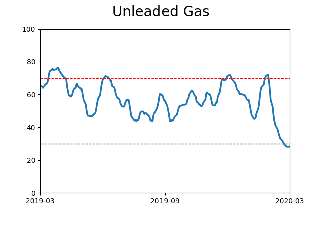
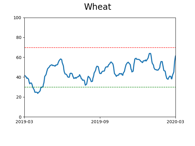
Commodity ETF's - 5-Day Moving Average
|
|