Headlines
|
|
Just how bullish are Robinhood traders?:
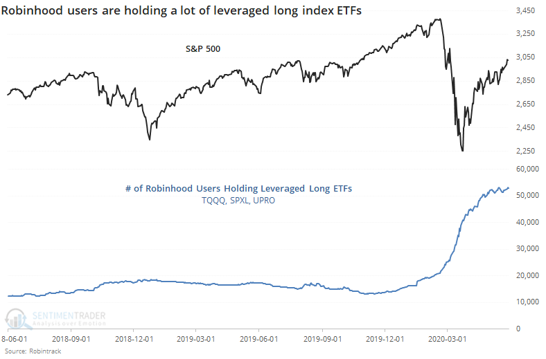
Robinhood has become an increasingly popular outlet for stay-at-home investors - or more likely "gamblers" at this point. The growth in accounts holding leveraged long ETFs has risen quite a bit faster than those holding leveraged short ETFs though that's tapered in recent days.
Farrell Sentiment indicator suggests a good year:
An indicator that looks at sentiment in the AAII survey over a long time frame shows continued pessimism. The Farrell Sentiment indicator looks at a 10-week average of individual investor attitudes, and it's currently at a very low level, despite the rally in stocks. It doesn't have a perfect record and is acting strangely.
The latest Commitments of Traders report was released, covering positions through Tuesday: The 3-Year Min/Max Screen showed that "smart money" hedgers didn't move to any new extremes of note in the past week, just extended ones already in place, notably in corn and stock index futures. The story remains the same in stocks - it's extremely unusual for hedgers to buy more (or even hold) as stocks rise. Over the past decade, such a large long position has been an excellent buy signal for stocks. The only worrying thing is just how out of character it is now.
|
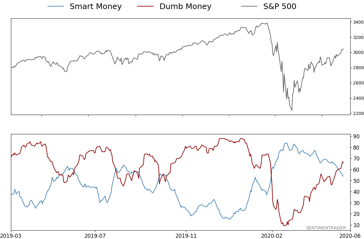
Smart / Dumb Money Confidence
|
Smart Money Confidence: 54%
Dumb Money Confidence: 66%
|
|
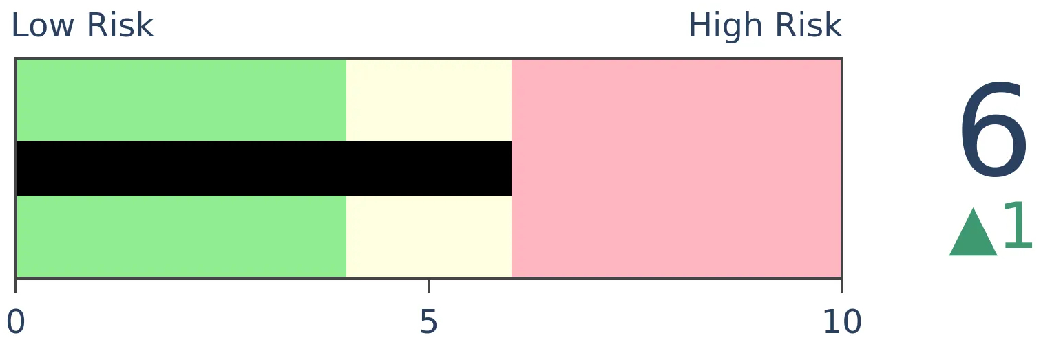
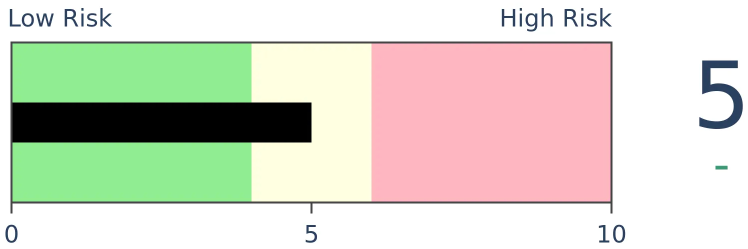
Risk Levels
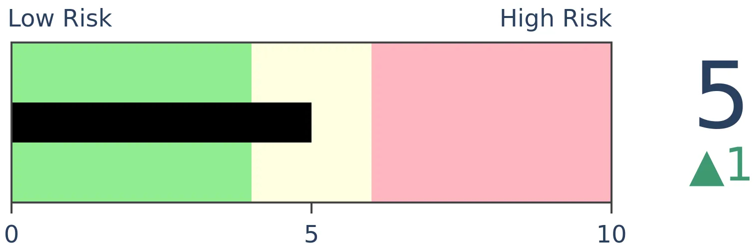
Stocks Short-Term
|
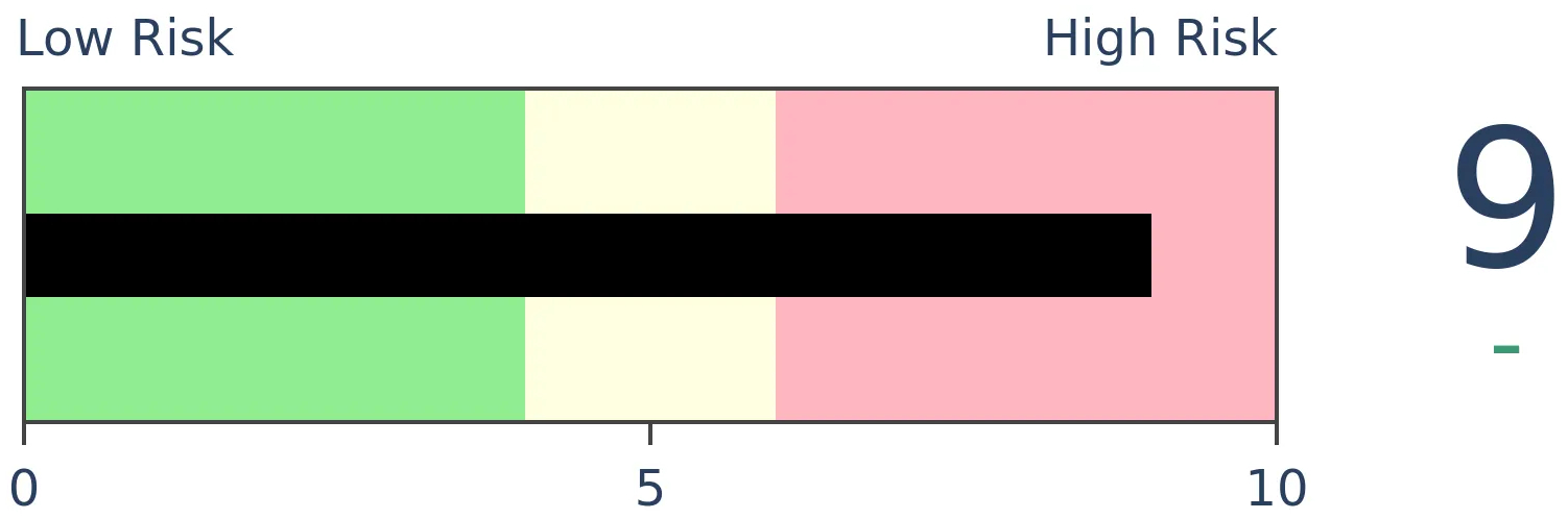
Stocks Medium-Term
|
|
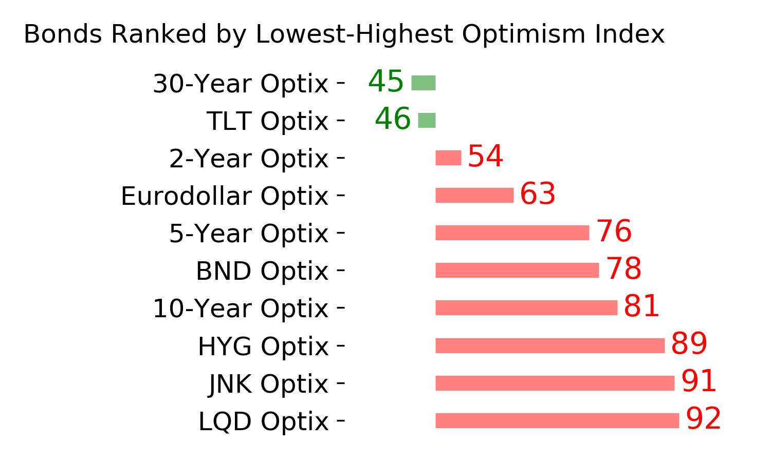
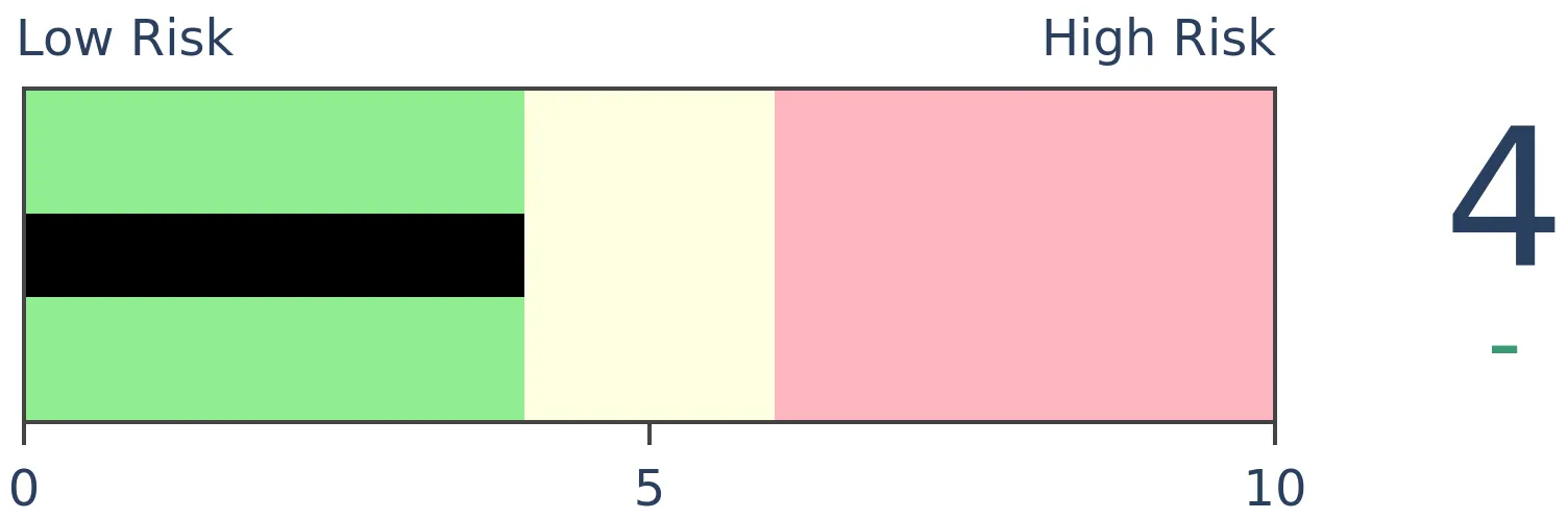
Bonds
|
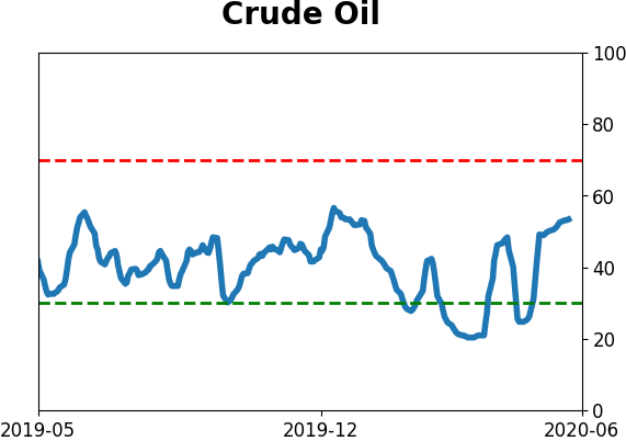
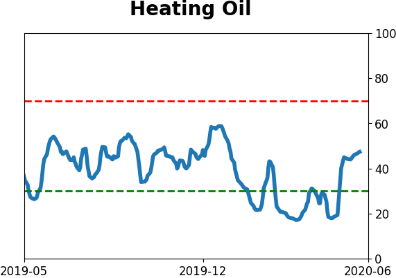
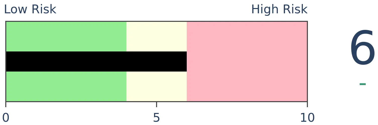
Crude Oil
|
|
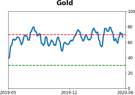
Gold
|
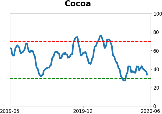
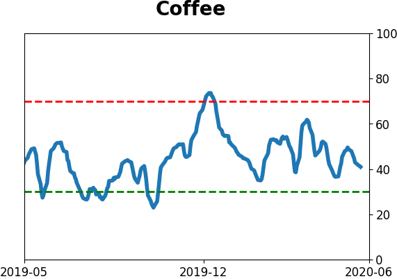
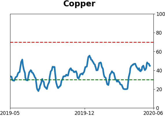
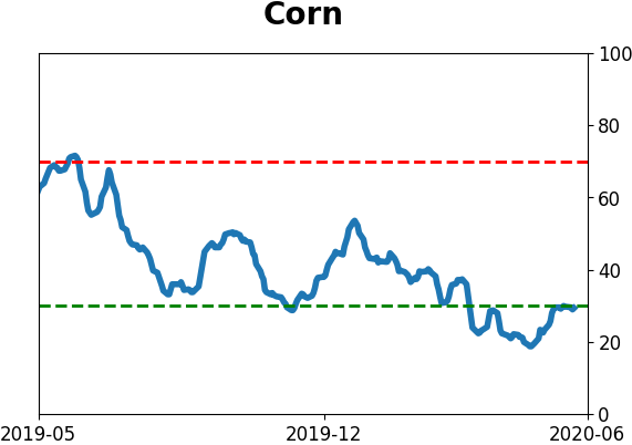
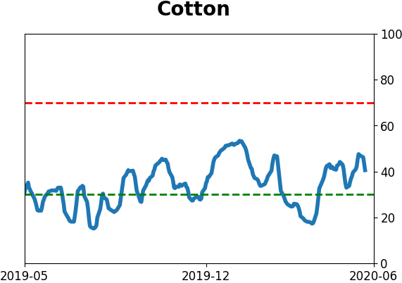
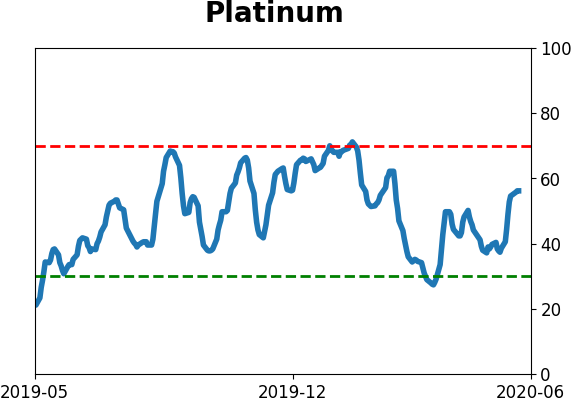
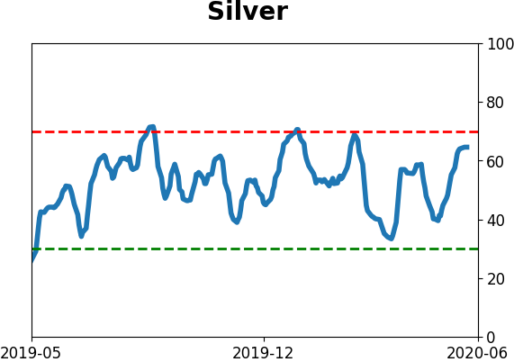
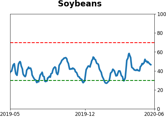
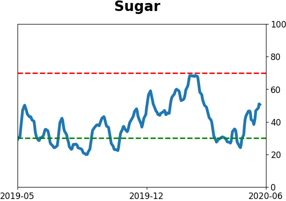
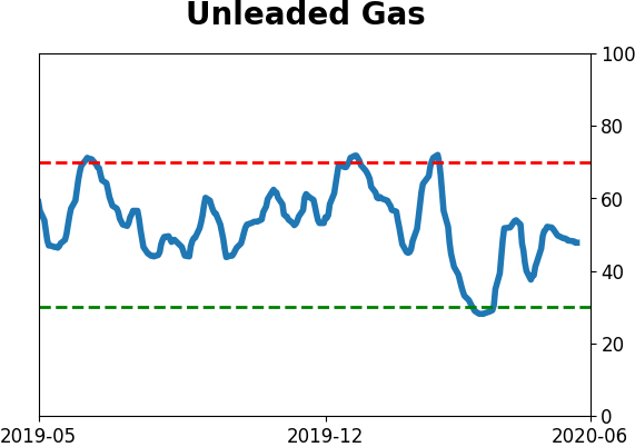
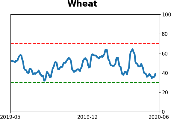
Agriculture
|
|
Research
BOTTOM LINE
Robinhood has become an increasingly popular outlet for stay-at-home investors - or more likely "gamblers" at this point. The growth in accounts holding leveraged long ETFs has risen quite a bit faster than those holding leveraged short ETFs though that's tapered in recent days.
FORECAST / TIMEFRAME
None
|
With a massive spike in people staying at home, the cancellation of virtually every sport, and a shutdown in traditional gambling, there has been a mass movement to trading. Nobody personifies this more than Dave Portnoy, perhaps the most destructive force for individuals' finances extant.
We've documented the rise in trading several times, especially the exponential growth in trades at retail brokerages and the historic volume of speculative options trading.
Another popular measure of this newfound love affair with trading is the growth in Robinhood accounts. Robinhood is "a pioneer of commission-free investing, gives you more ways to make your money work harder" and their user growth went exponential in March and April.
Using data from Robintrack, we can see that the number of users holding the most popular leveraged long ETFs has exploded.
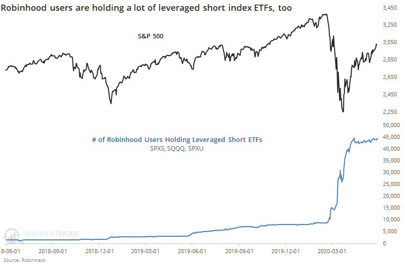
If we just stop there, we'd have to make the assumption that speculation is out of control. It would also be highly misleading since there has also been an explosion in users holding the most popular inverse ETFs. These are funds that rise when stocks fall.
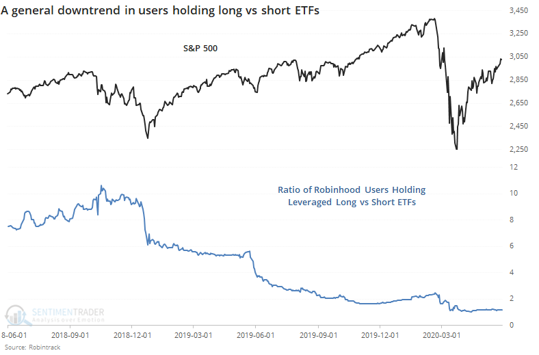
If we look at the ratio of users holding long versus short ETFs, then there has been a clear downtrend, as more and more users have discovered the uses (and pitfalls) of inverse funds.
None of these are very helpful. So, let's look at the 20-day percentage change in users holding leveraged long ETFs minus leveraged short ETFs.
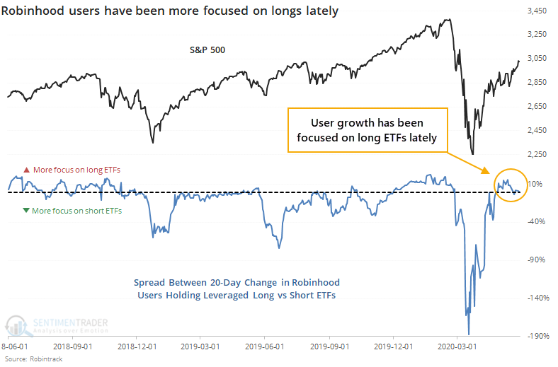
Here, we can see a more useful look at their behavior. When stocks dropped in late 2018, June 2019, and March of this year, there was an explosion of users holding the inverse ETFs relative to those holding long ETFs. It was an effective contrary indicator each time.
The opposite extremes were less clear, as were the extremes themselves. It was rare to see 10% or more growth in users holding long versus short ETFs, and the times it did, it preceded mixed-to-negative returns in the S&P 500.
In recent days, growth in accounts has been about equal between those holding long and short funds. It was skewed heavily toward long ETFs at the beginning of May but even though stocks have rallied since then, user growth has evened out.
We could maybe call this a very slight negative since there was that spike in interest in long funds a few weeks ago, but it's just not a strong enough indicator to consider it an edge.
BOTTOM LINE
An indicator that looks at sentiment in the AAII survey over a long time frame shows continued pessimism. The Farrell Sentiment indicator looks at a 10-week average of individual investor attitudes, and it's currently at a very low level, despite the rally in stocks. It doesn't have a perfect record and is acting strangely.
FORECAST / TIMEFRAME
SPY -- Up, Long-Term
|
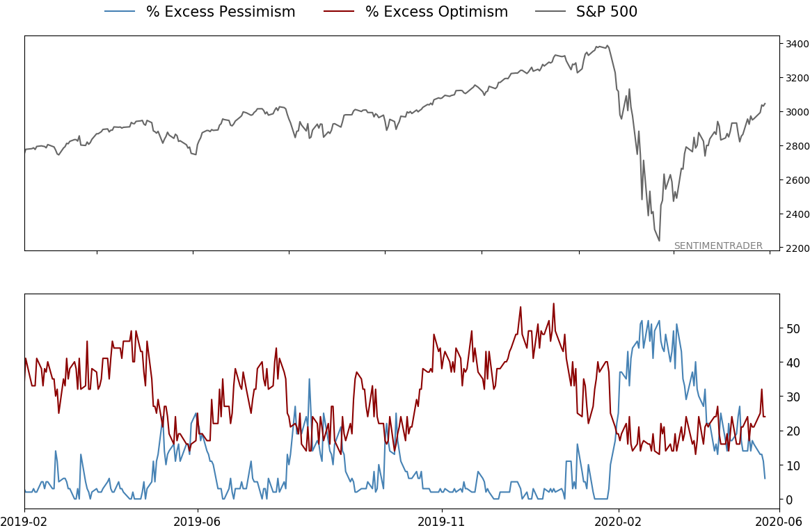
One of the more curious aspects of sentiment over the past couple of months has been the persistent pessimism, or at least lack of optimism, among individual investors in the AAII survey.
The survey has a lot of weaknesses, but remains very widely followed and isn't without its uses. Most of our models are showing that sentiment, in general, is somewhere between neutral to optimistic, but this is one that is keeping a lid on them showing too much optimism.
Over the past 10 weeks, the S&P 500 has rallied more than 25% (weekly Wednesday closes) yet the AAII survey shows less and less optimism. That's the conclusion using the Farrell Sentiment indicator, created by Bob Farrell, a respected market analyst from the earlier decades.
It's been nearly a decade since the last time we looked at this measure, which is making the rounds again as it's throwing off a buy signal. To create the indicator, we take a 10-week average of the percentage of AAII Bulls and divide it by AAII Bears plus half the neutral responses. It's currently below 0.6, a very low level historically.
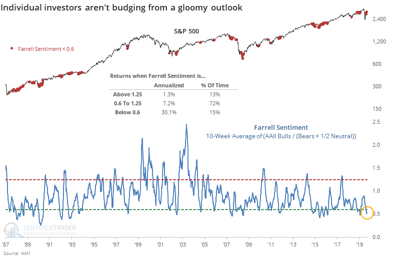
We can see from the chart that the S&P 500's annualized return when the indicator is below 0.6 is an impressive 30.1%, versus only 1.3% when the indicator is above 1.25.
If we use a signal-based approach, when the indicator first turns up from a streak below 0.6, it has led to mostly positive returns.
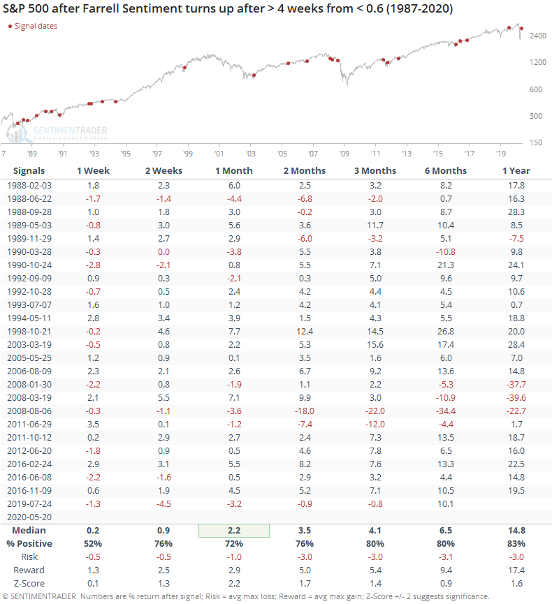
There were some definite failures in there, most notably in 2008 when it suggested several false starts. Other than that, large losses were rare.
It's also rare to see this kind of behavior during a substantial rally. There haven't been too many times when the indicator declined during a 10% or greater rally.
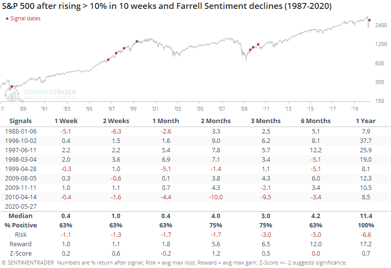
This happened in early 2010, and stocks peaked shortly after. Other than that, losses were rare, and nonexistent over the next year.
Placing a lot of weight on this particular data is shaky. It's not acting as it has historically, which raises the worry that something underlying the survey has changed. It's way too early to discount it entirely, however, and future returns after relatively similar behavior were consistently positive. We'd rate it as a minor long-term positive and not much more than that.
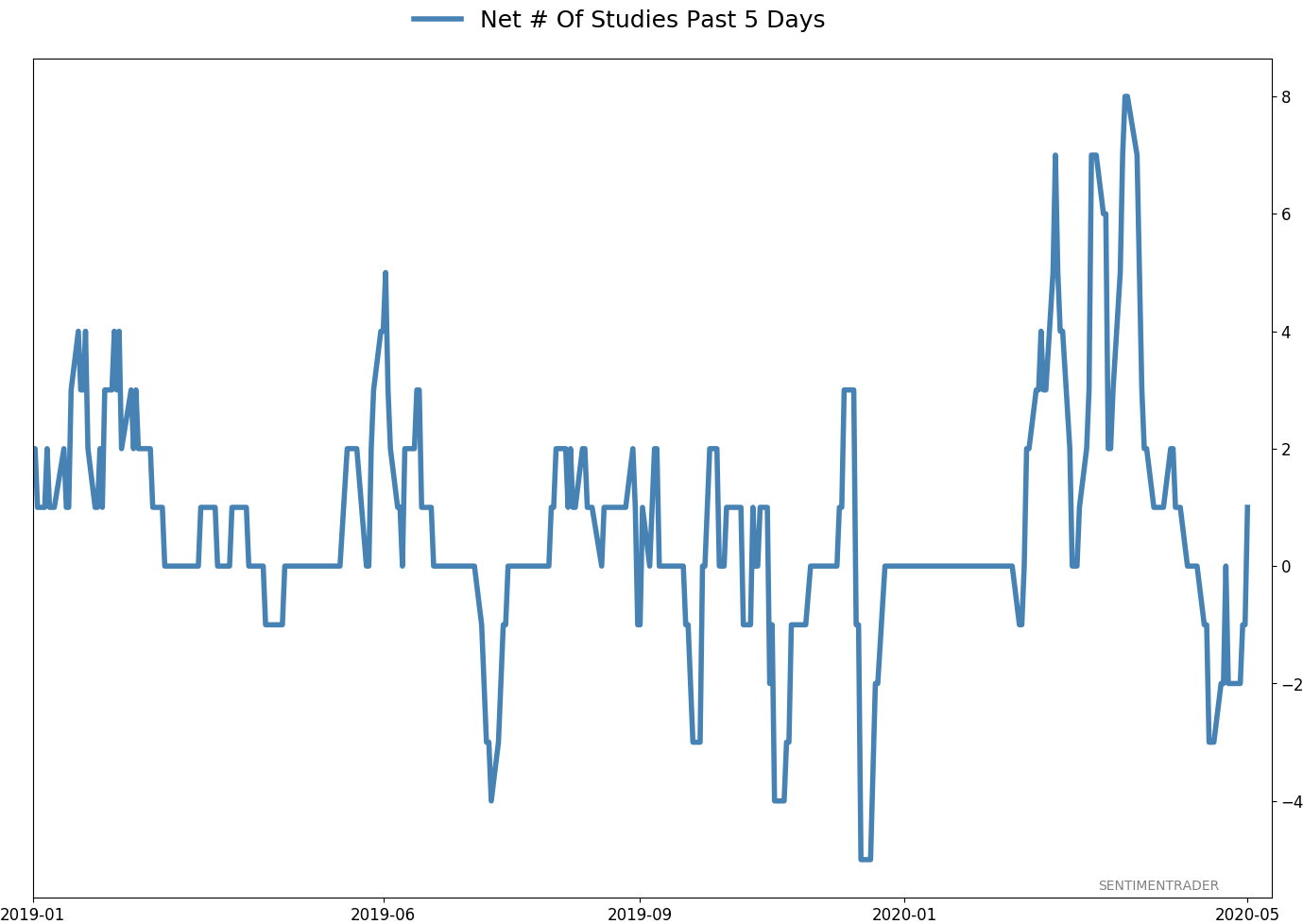
Active Studies
| Time Frame | Bullish | Bearish | | Short-Term | 0 | 1 | | Medium-Term | 8 | 4 | | Long-Term | 35 | 1 |
|
Indicators at Extremes
Portfolio
| Position | Weight % | Added / Reduced | Date | | Stocks | 38.9 | Reduced 10% | 2020-05-13 | | Bonds | 0.0 | Reduced 6.7% | 2020-02-28 | | Commodities | 5.1 | Added 2.4%
| 2020-02-28 | | Precious Metals | 0.0 | Reduced 3.6% | 2020-02-28 | | Special Situations | 0.0 | Reduced 31.9% | 2020-03-17 | | Cash | 56.0 | | |
|
Updates (Changes made today are underlined)
In the first months of the year, we saw manic trading activity. From big jumps in specific stocks to historic highs in retail trading activity to record highs in household confidence to almost unbelievable confidence among options traders. All of that came amid a market where the average stock couldn't keep up with their indexes. There were signs of waning momentum in stocks underlying the major averages, which started triggering technical warning signs in late January. The kinds of extremes we saw in December and January typically take months to wear away, but the type of selling in March went a long way toward getting there. When we place the kind of moves we saw into March 23 into the context of coming off an all-time high, there has been a high probability of a multi-month rebound. After stocks bottomed on the 23rd, they enjoyed a historic buying thrust and retraced a larger amount of the decline than "just a bear market rally" tends to. While other signs are mixed that panic is subsiding, those thrusts are the most encouraging sign we've seen in years. Shorter-term, there have been some warning signs popping up and our studies have stopped showing as positively skewed returns. I reduced my exposure some in late April and was looking for a pattern of lower highs and lower lows to reduce it further. With weakness on May 12, our studies turned even more negative over the short- to medium-term so I reduced a bit more. Some short-term indicators are already nearing oversold so we may get a quick rebound but it is what it is. If we see a clear pattern of lower lows, I may reduce even further in the week(s) ahead. Long-term prospects look decent because of the thrusts we saw off the low, but I'm more comfortable in cash in the interim. I'd consider adding back if we see our indicators and studies start to skew to the upside again, or if price action turns clearly better, indicating my caution is wrong.
RETURN YTD: -6.6% 2019: 12.6%, 2018: 0.6%, 2017: 3.8%, 2016: 17.1%, 2015: 9.2%, 2014: 14.5%, 2013: 2.2%, 2012: 10.8%, 2011: 16.5%, 2010: 15.3%, 2009: 23.9%, 2008: 16.2%, 2007: 7.8%
|
|
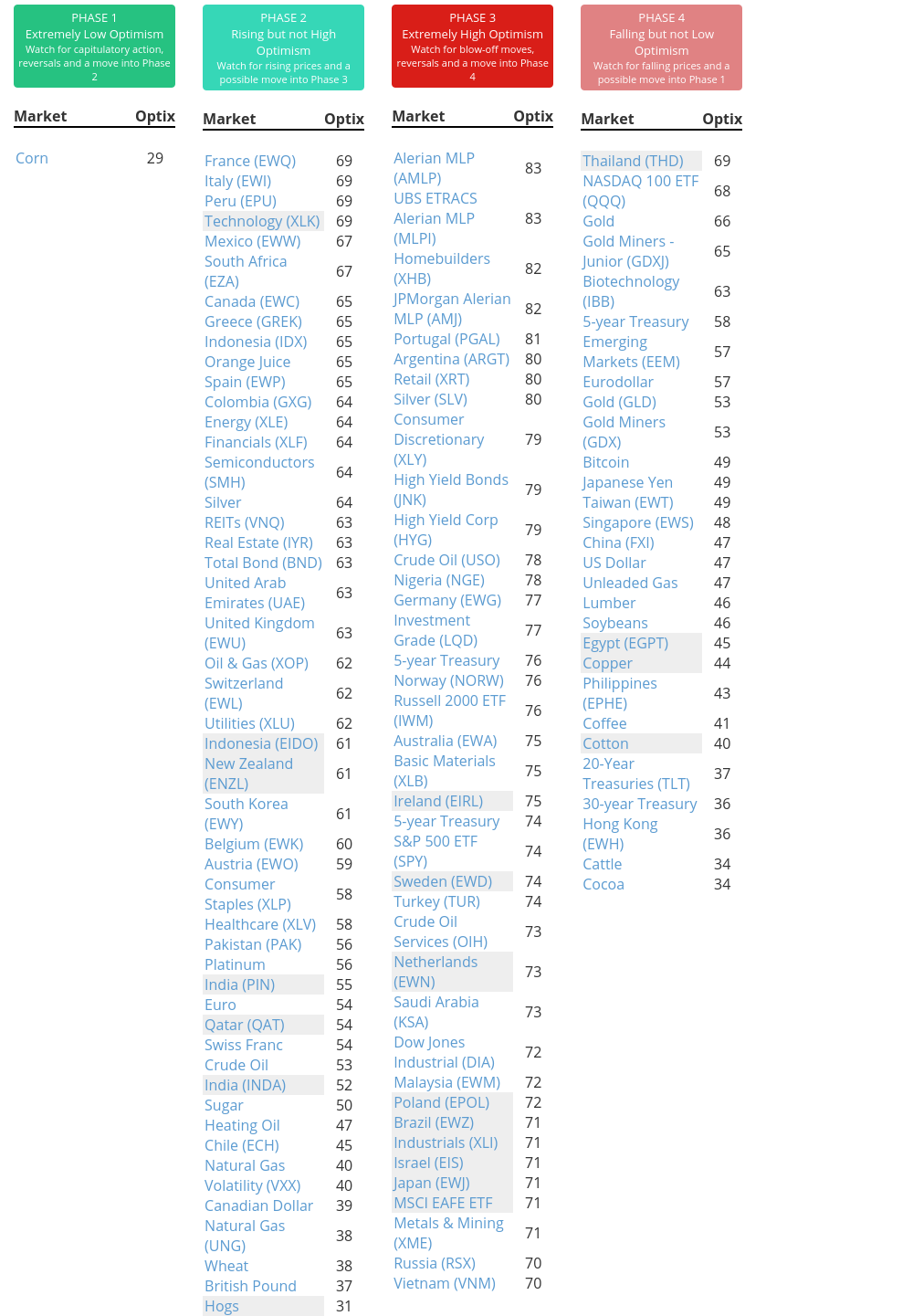
Phase Table
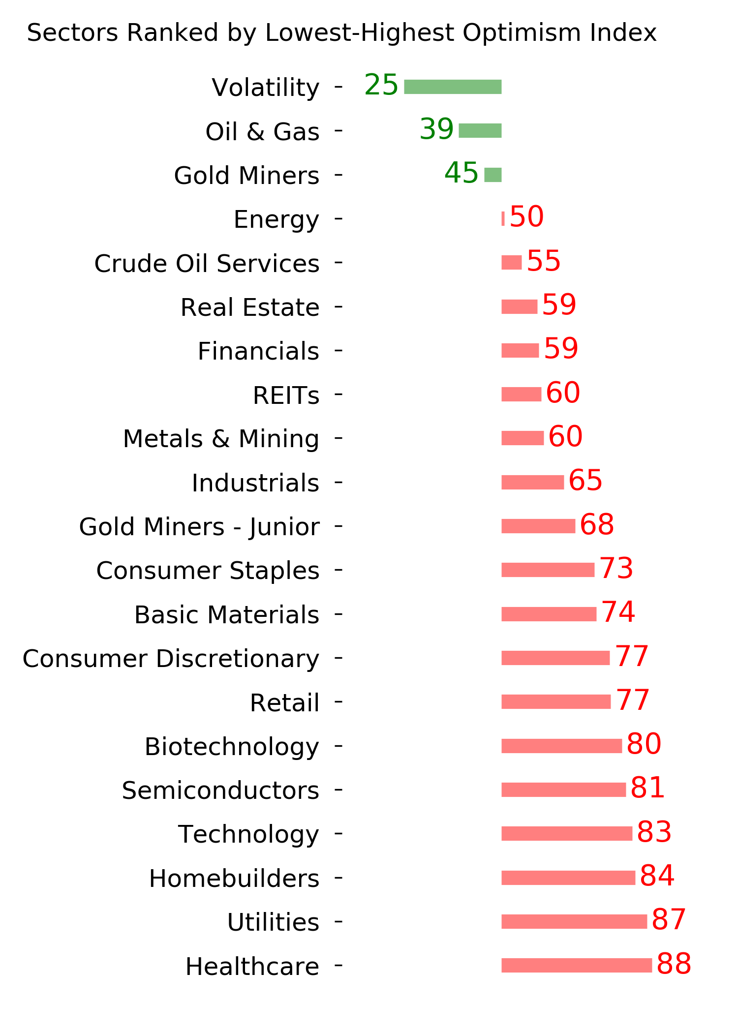
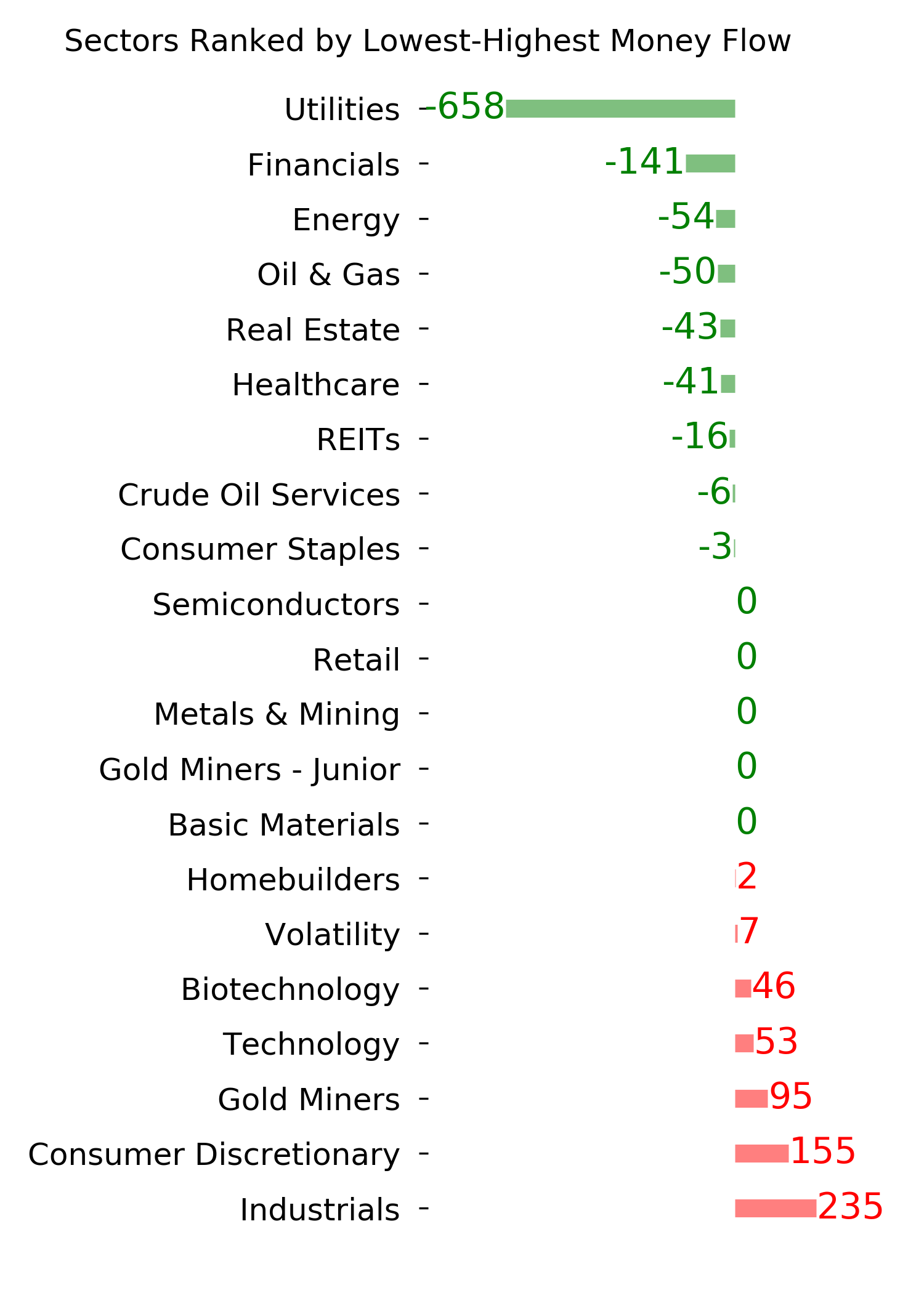
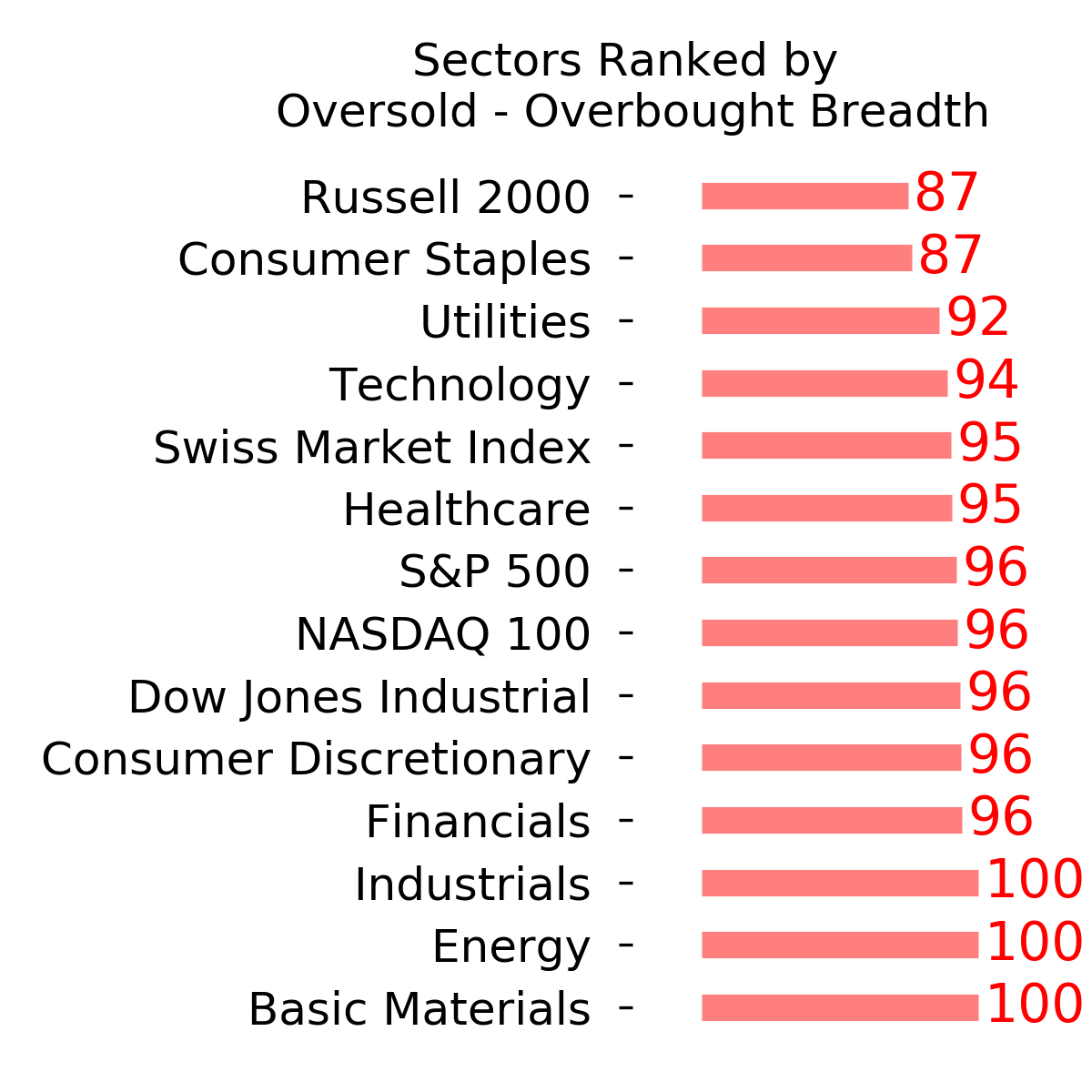
Ranks
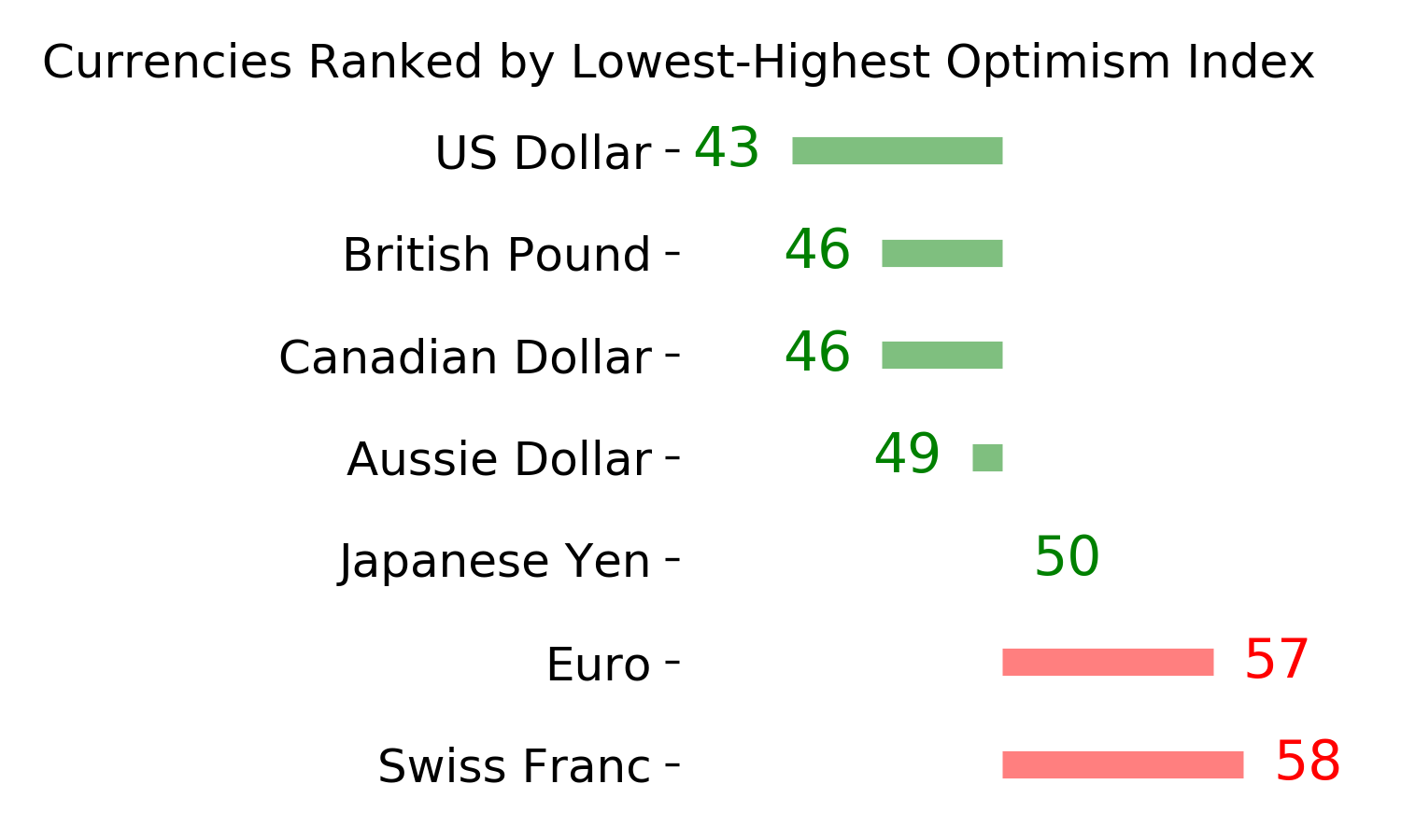
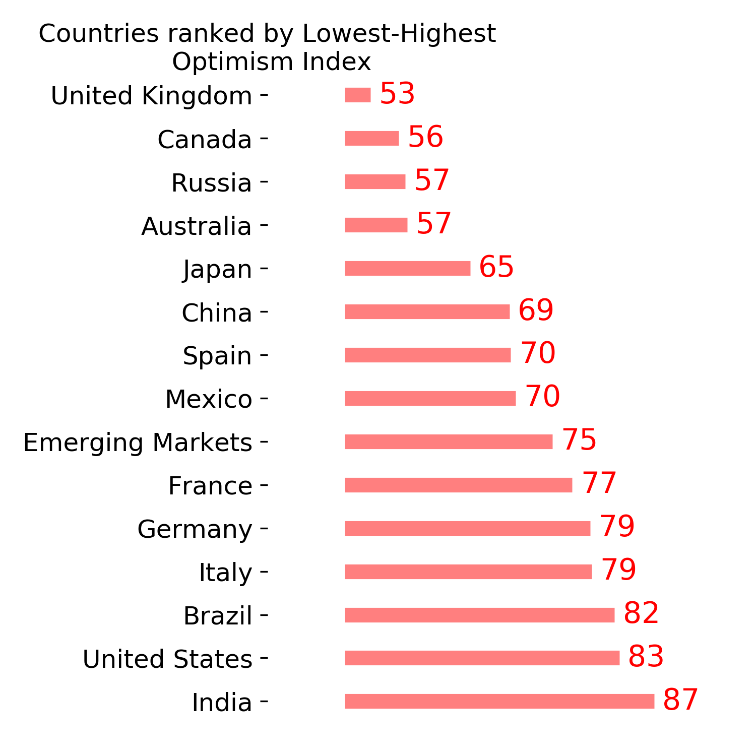
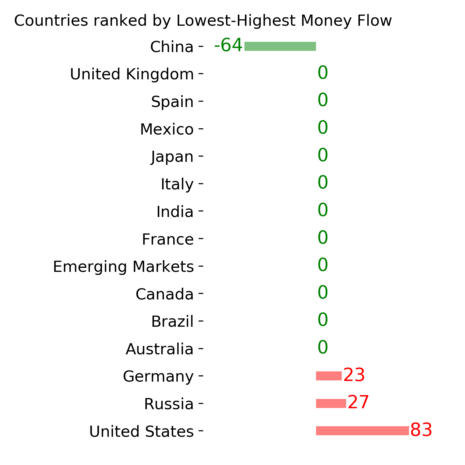
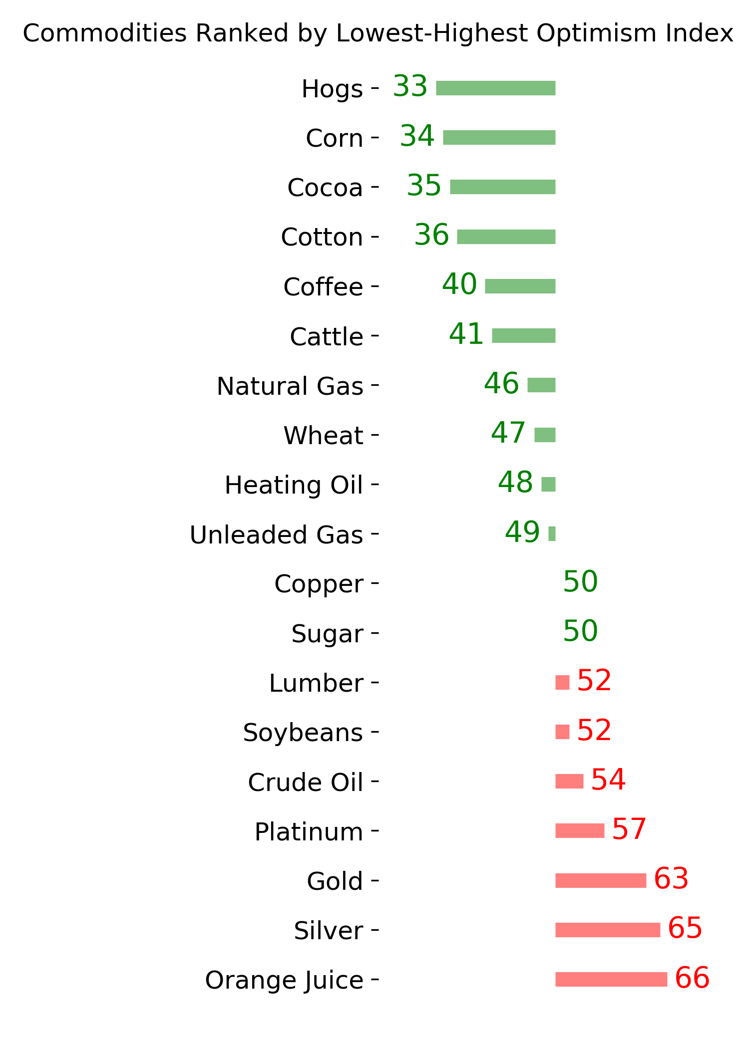
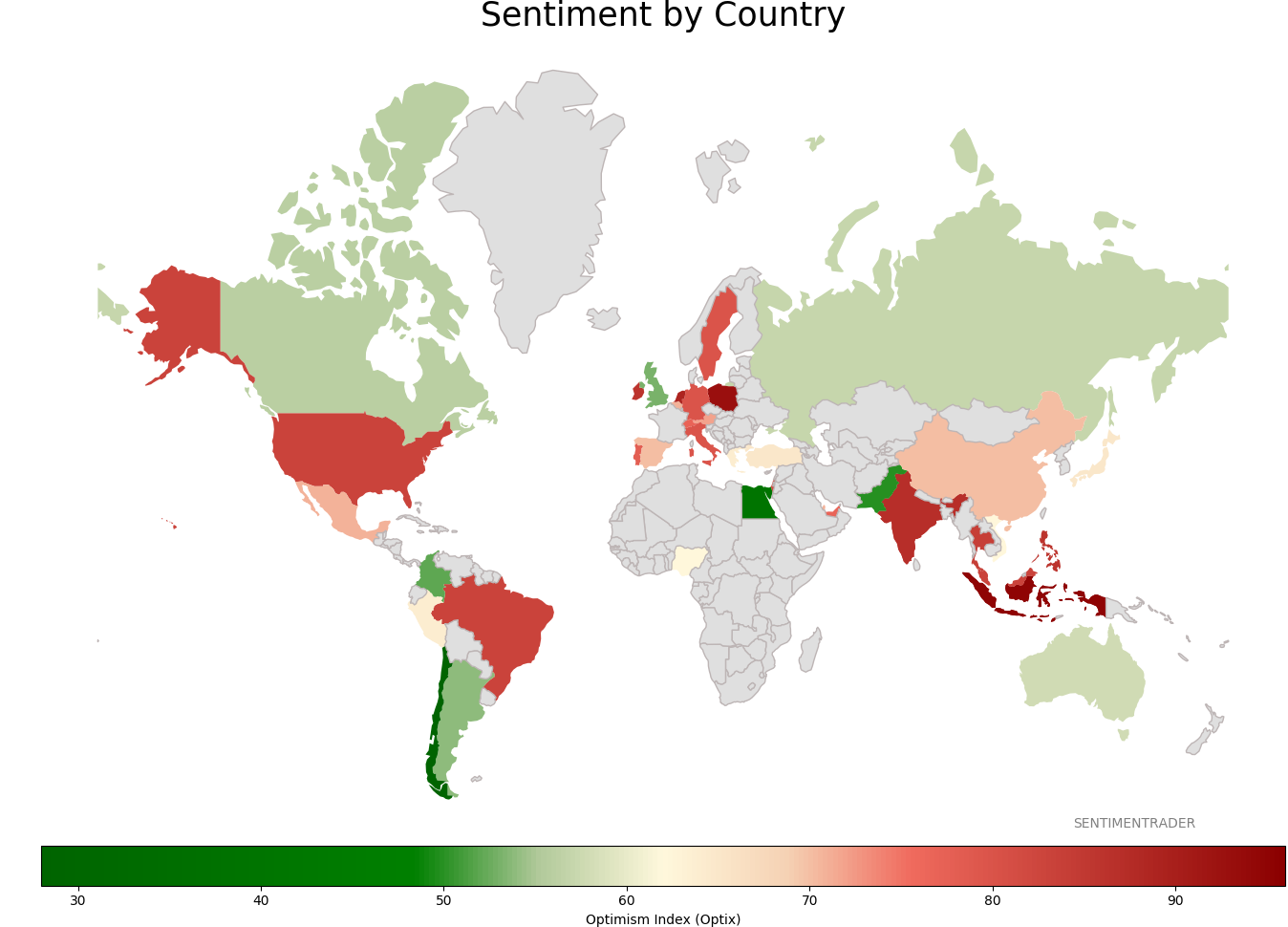
Sentiment Around The World
Optimism Index Thumbnails
|
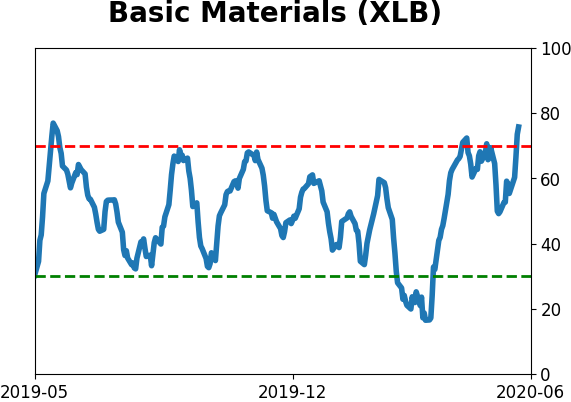
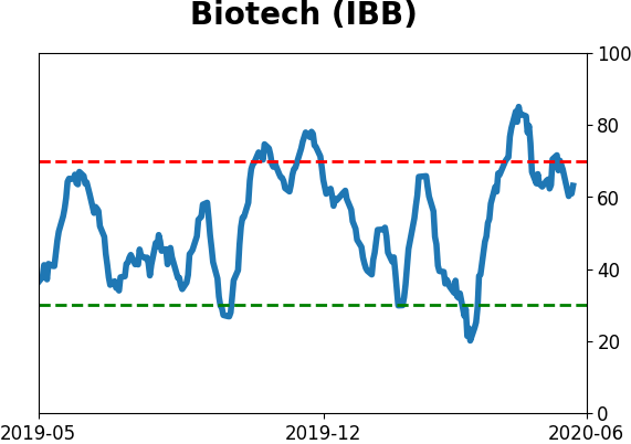
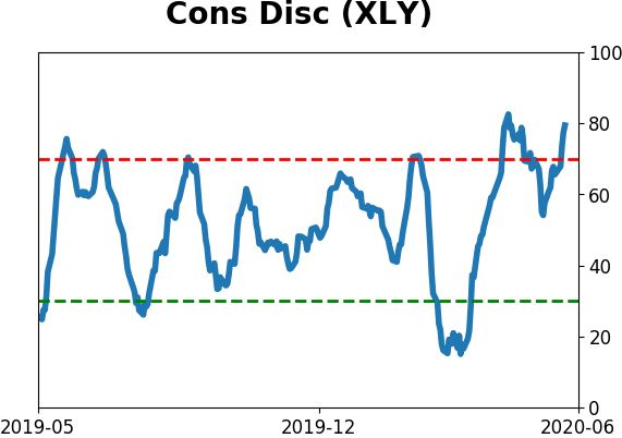
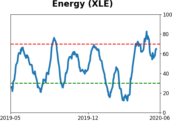
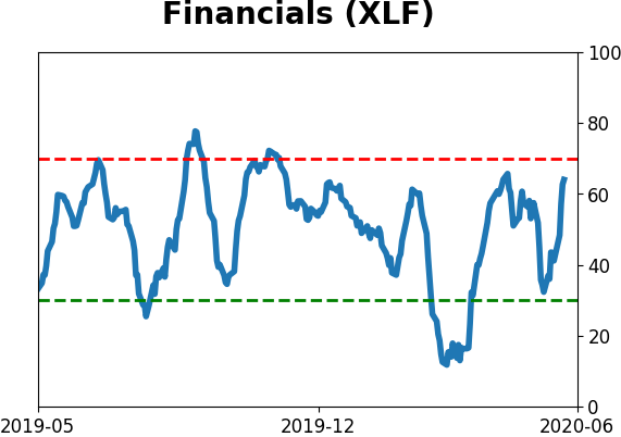
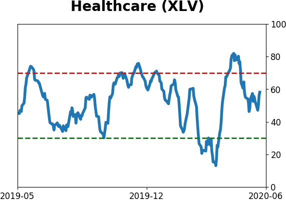
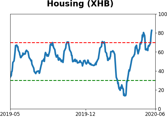
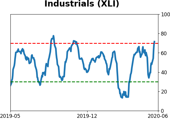
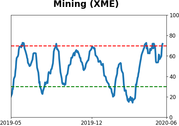
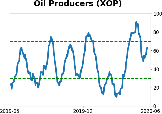
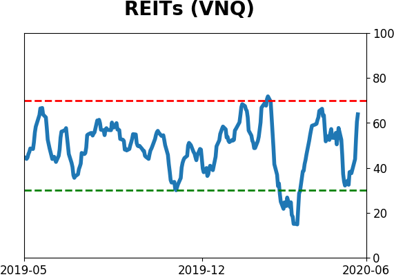
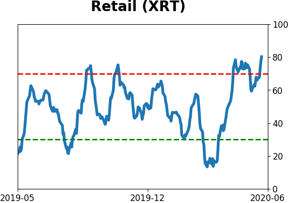
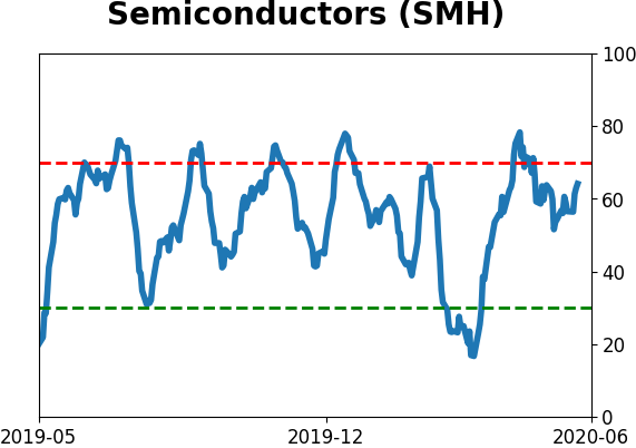
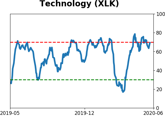
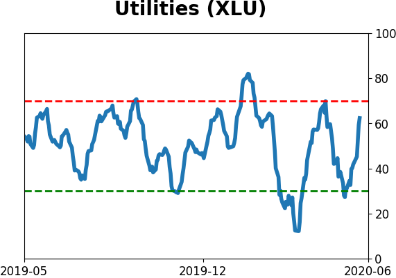
Sector ETF's - 10-Day Moving Average
|
|
|
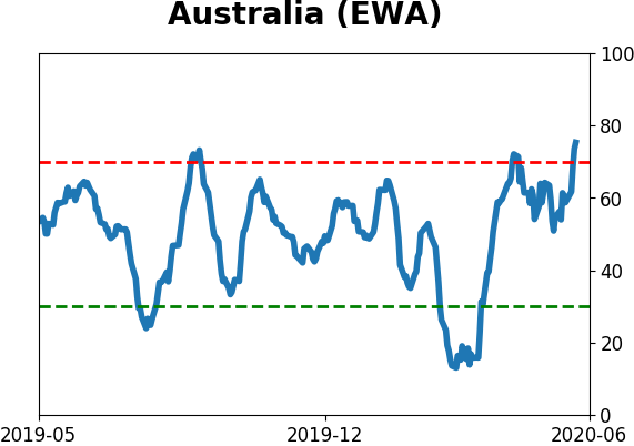
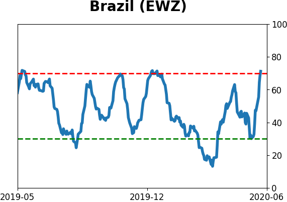
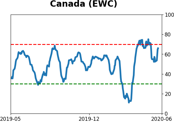
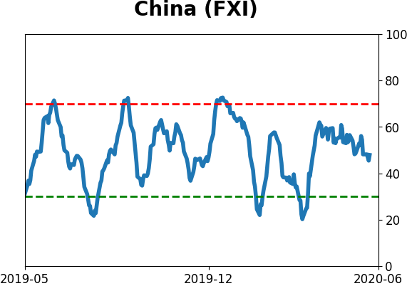
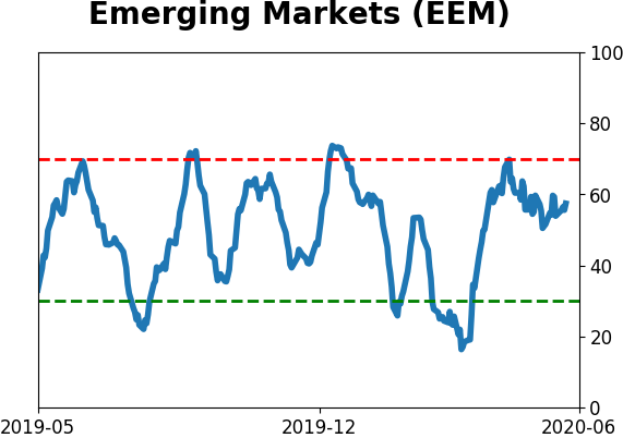
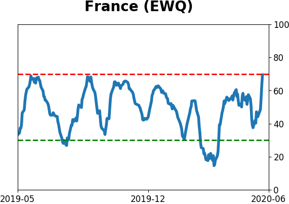
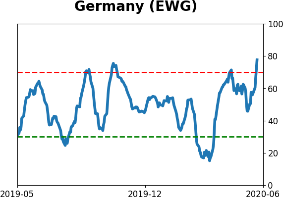
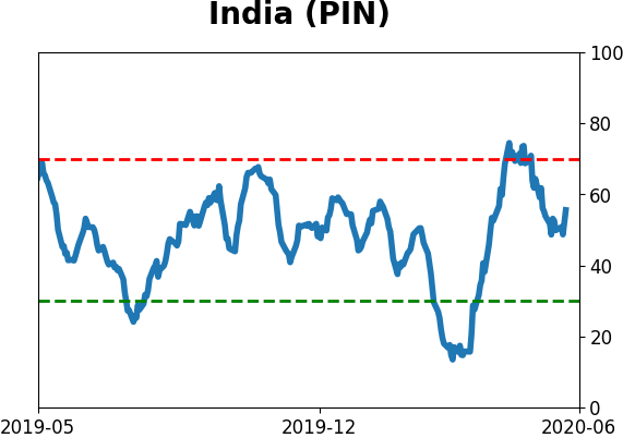
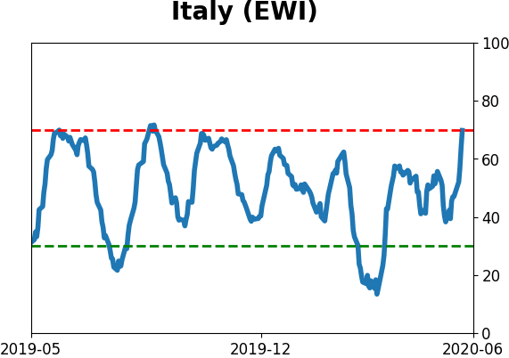
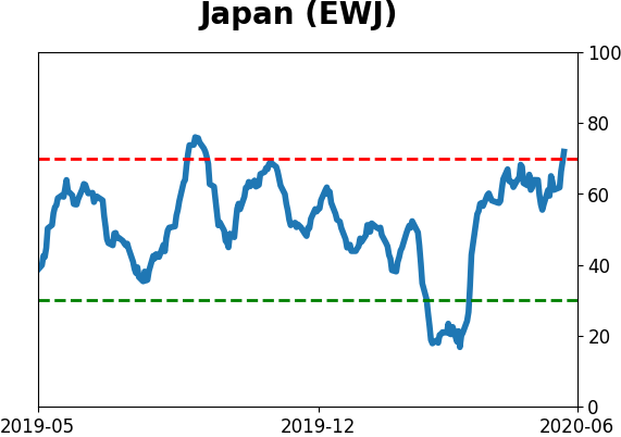
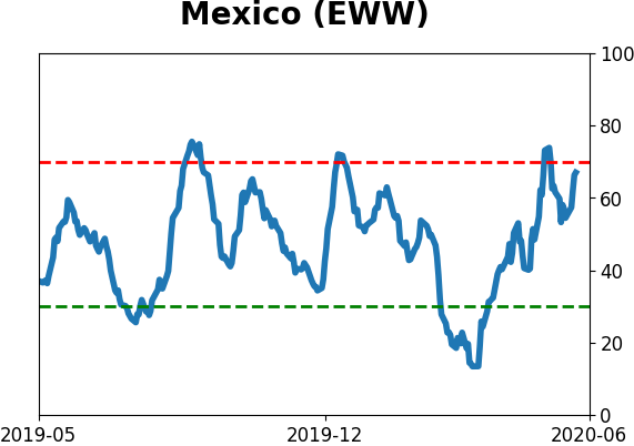
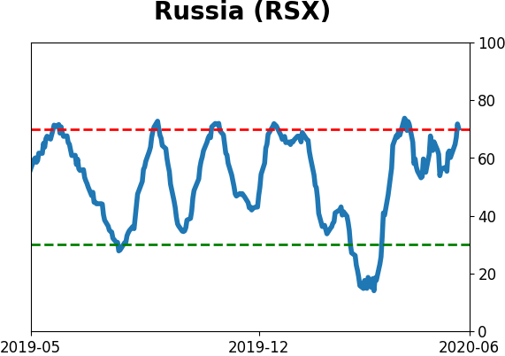
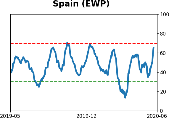
Country ETF's - 10-Day Moving Average
|
|
|
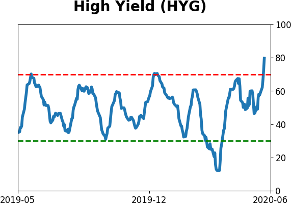
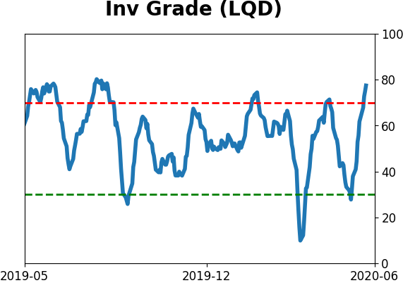
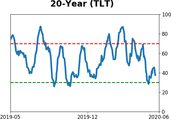
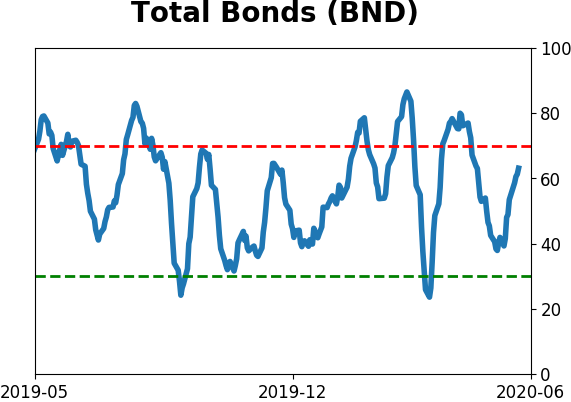
Bond ETF's - 10-Day Moving Average
|
|
|
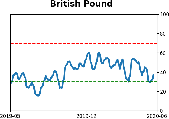
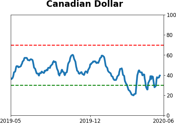
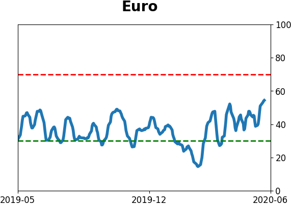
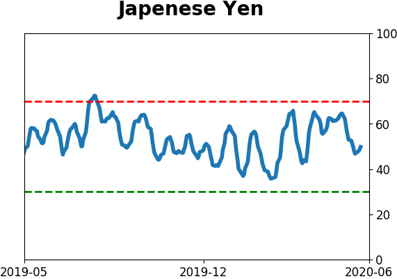
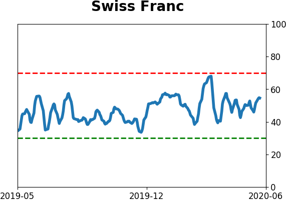
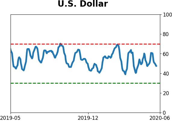
Currency ETF's - 5-Day Moving Average
|
|
|
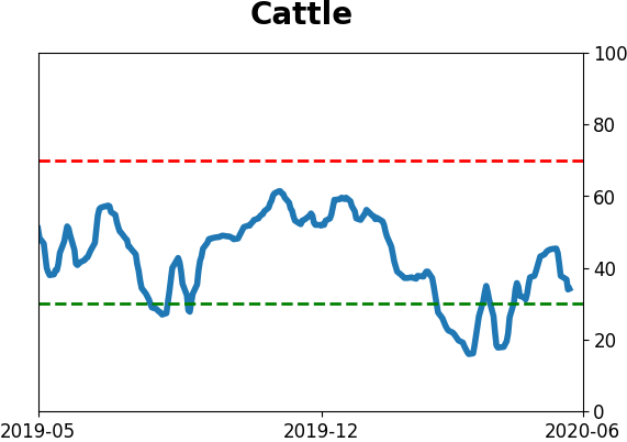
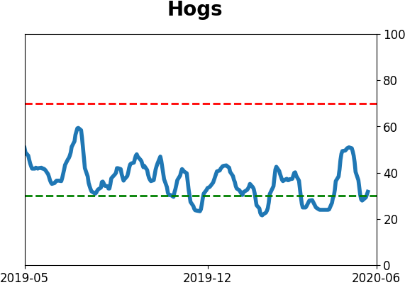
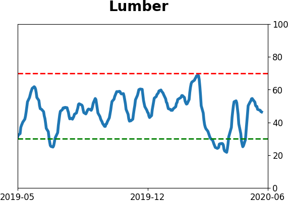
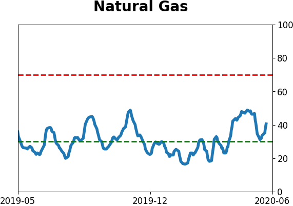
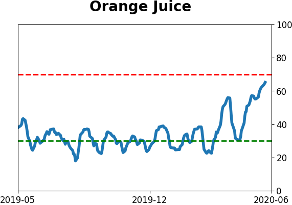
Commodity ETF's - 5-Day Moving Average
|
|