Econo-Dread, Options Fear, Money Tree, Dollar Impact On Earnings Season, Transports, Hated Commodities

I won't be publishing a Daily Report this afternoon, so this post is being sent as a Bulletin to all users. This is similar to what is included in the premium notes published most days. As always, you can find most other parts of the reports online, mostly in the tabs under the Market Overview section of the Dashboard.
The notes by both Troy and I focus on more types of data than we post in the Daily Report, diving further into fundamental data, particularly those data points being discussed (i.e. hyped) in mainstream media. It's remarkable how often it's skewed to show a particular viewpoint, and we believe looking at the data objectively is important, even if there is no solid conclusion. We also focus more on markets outside just the S&P 500, which is the most important index in the world, but there are other things that trade and often present a better opportunity.
More Econo-dread
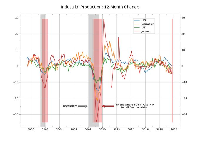
Yet another piece of economic data has turned negative, triggering the inevitable chart showing that the last time this happened was 2008.
There's nothing wrong or even misleading about the chart. It's all true.
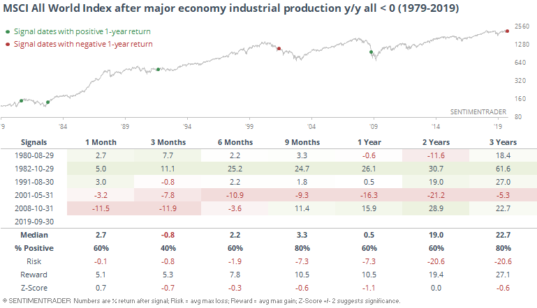
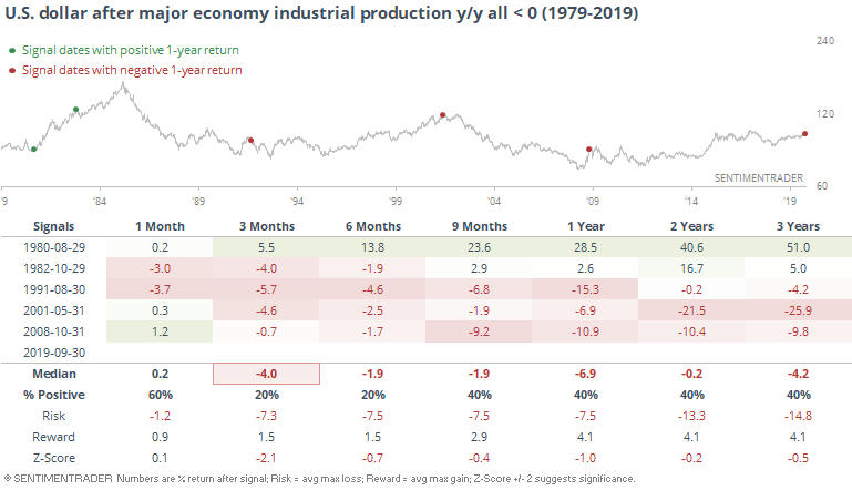
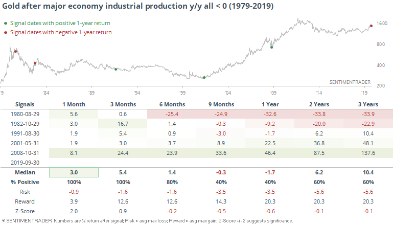
But let's go back further to see if that changes the narrative at all. The furthest we can go back in order to have data for at least 3 of the 4 countries is 1979. The chart below shows the maximum year-over-year industrial production figure for them. If the indicator is below 0, then it means that every country is seeing a decline in industrial production.
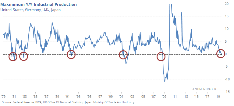
Looking at forward returns for the S&P 500 after all of them first fell below 0, there were some heavy declines over the next few months.
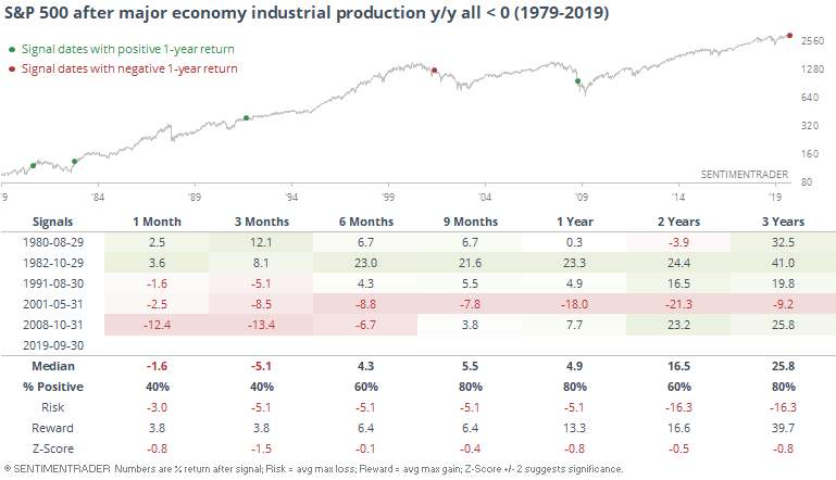
It's just as notable, though, that over the next 9-12 months, there was only one loss, and a few of them showed hefty gains.
It was mostly the same story for global stocks.
It wasn't so great for the buck except for 1980.
Gold fared much better. For a while, anyway.
If we focus only on the U.S., then we can go back much further. This series just ended a streak of 33 consecutive months of growth.
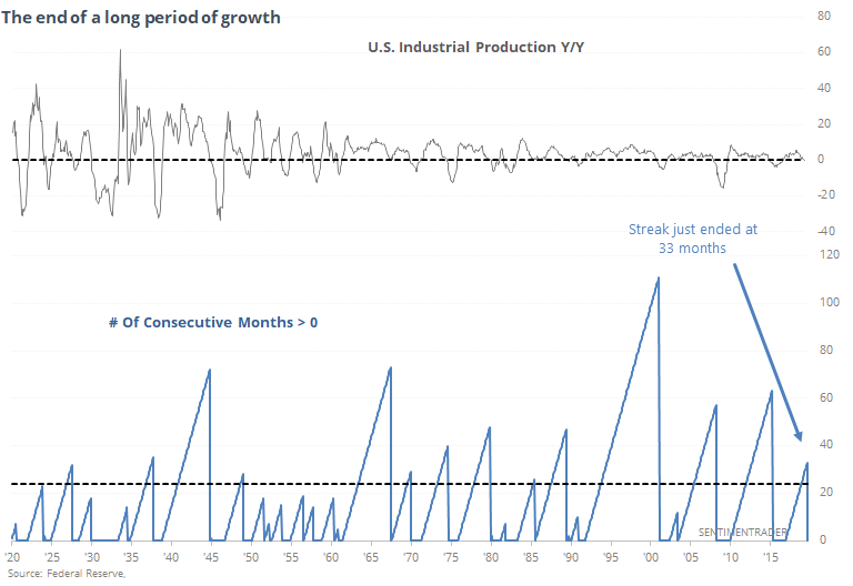
When we look at forward returns in the S&P after industrial production ends a streak of at least 24 consecutive months of growth, then we get the following.
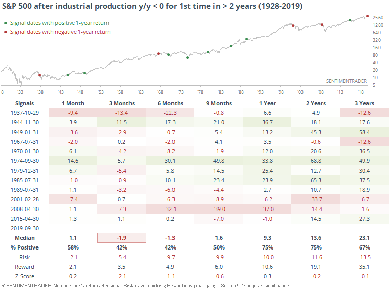
This preceded horrid returns in 1938, 2002, and 2008. But other than that, mostly gains, sometimes very large, larger even than the declines from those horrid years once we get past the first 3-6 months. Troy looked at this in a similar way, adding the wrinkle of this being a "late stage" environment, which further eroded those medium-term returns.
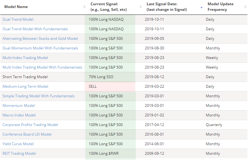
While various pieces of the fundamental picture are deteriorating, the trends have really turned yet, and almost all of the buy/sell models are still long.
Fear Trade
When Credit Suisse unveiled their Fear Barometer years ago, it was billed as a better alternative to the VIX. It hasn't really worked out that way, mainly because the indicator doesn't really act like one would expect it to. Case in point, it's now showing extreme fear. Over the past 5 years when this measure traded in somewhat of a range, it has preceded better than average returns.
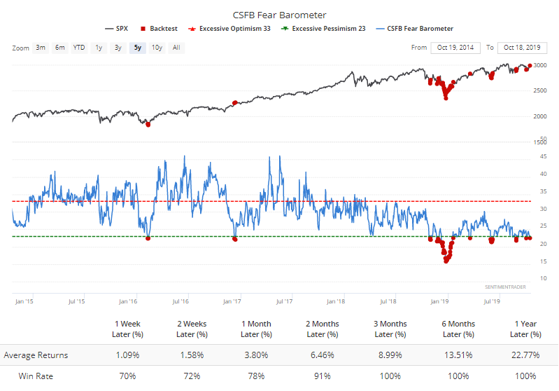
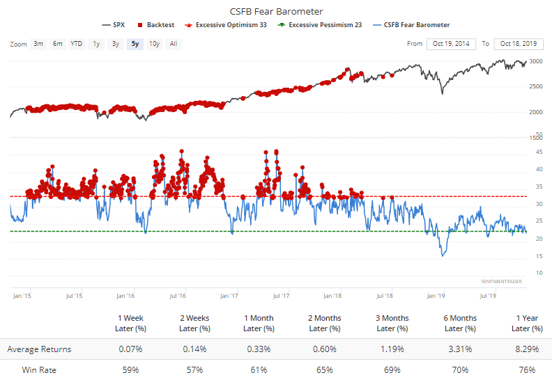
When it was high, returns for the S&P were considerably worse....and that includes the 2017 momo market.
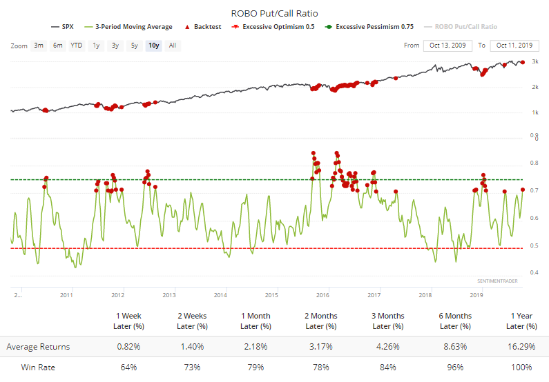
There is some support that options investors are nervous. Over the past 3 weeks, the ROBO Ratio of small trader sentiment has averaged nearly 71% (they were buying to open 71 put options for every 100 call options), among the highest levels since the financial crisis.
And they've been willing to pony up for that protection. The premiums they've been paying for puts over the past few weeks relative to what they've laid out for speculative call options is nearing the highest levels in a decade.
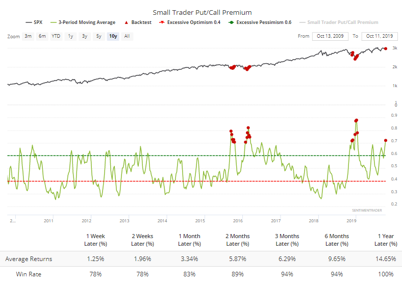
This has been among the most positive indicators we follow for weeks, and that has not changed at all. Stocks still haven't been able to break out to new highs - and are failing yet again today - so this would be a very rare exception if the indexes rolled over to new lows in the weeks ahead given this kind of sentiment among this particular population.
Still Recovering
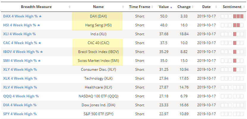
We continue to see sustained recovery in a lot of overseas indexes. More and more stocks are breaking out. Looking at the list of indexes with the largest percentage of 1-month highs, it's dominated by overseas indexes.
Same goes for those breaking out to 3-month highs.
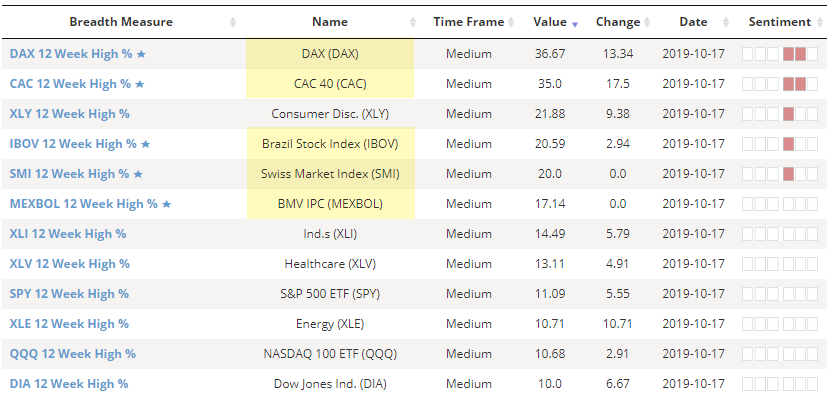
It's been a while since we've seen these kinds of metrics led by these types of indexes. Many of them are showing thrusts off oversold conditions like we've been showing for weeks, so it continues to be a good sign there.
Money Tree
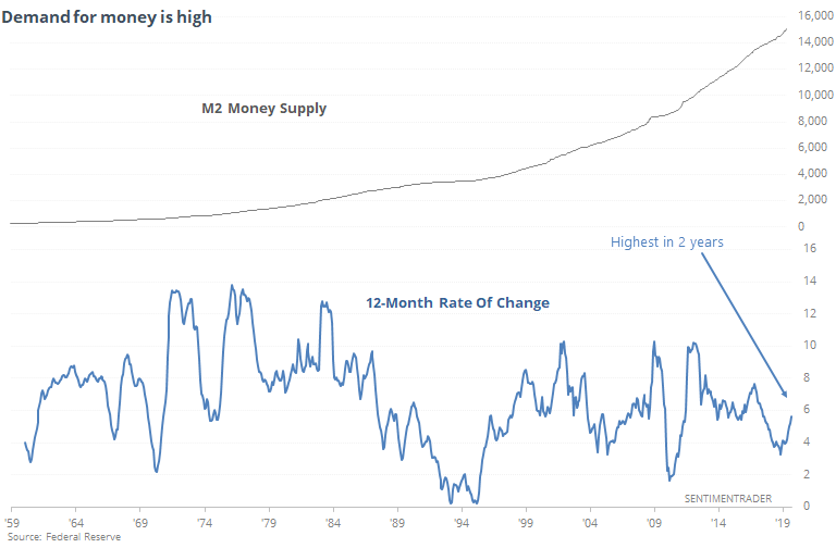
The WSJ notes that the money stock is growing. This is usually taken as a good sign, since it means there is a healthy lending environment. I won't even pretend to understand some of the structural intricacies that may be underlying this so we'll just superficially assume it's a good sign.
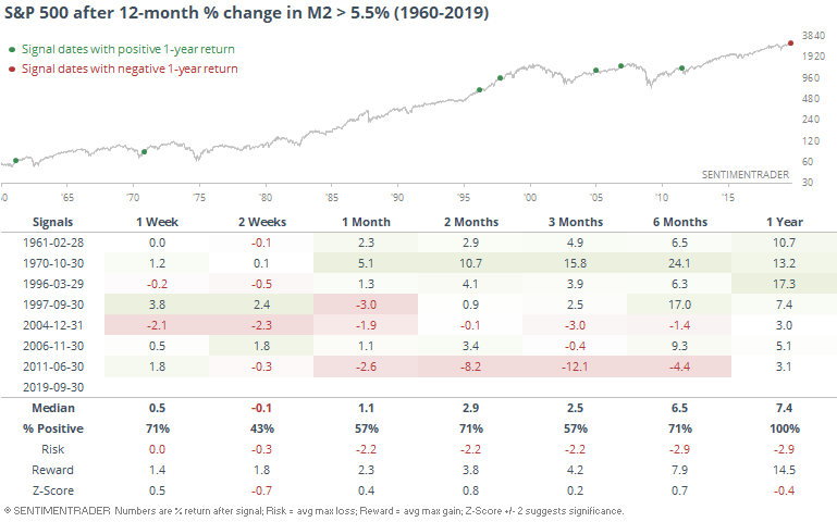
On a weekly basis, the growth is even more impressive than it is on a monthly one, but using monthly data we can go back a lot further in history. The year-over-year jump of more than 5.5% is the highest in two years.
A year after this kind of growth, the S&P was higher every time.
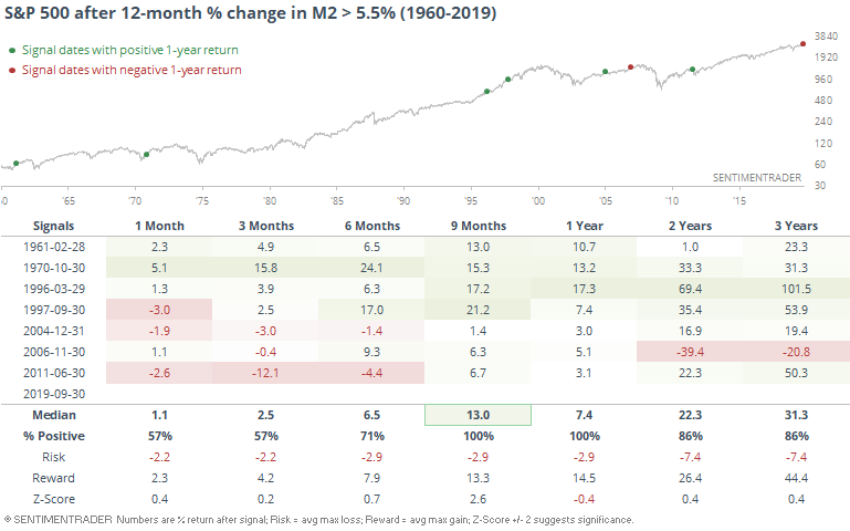
Switching to a longer-term view, returns were still positive 2 years later.
Earnings Headwind
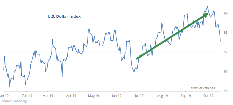
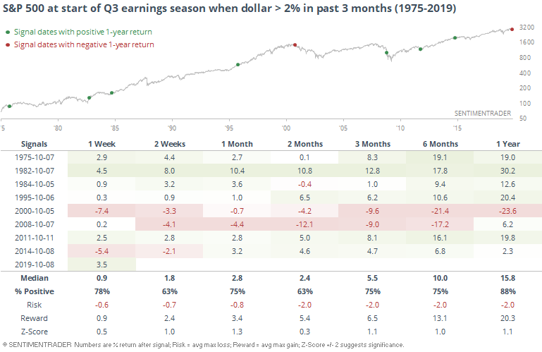
There is some concern about this coming earnings season because it's slated to be the weakest in 3 years. A primary excuse for that has been the rising dollar, which jumped more than 2% in the three months leading up to the start of earnings season.
It hasn't really been a consistent drag on past Q3 earnings reports, though. Or at least, not a drag on the S&P's returns.
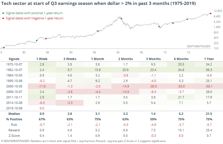
While this has changed dramatically over the years, the tech sector is assumed to be one of the sectors most susceptible to trouble due to a rising dollar. Historically, returns might have been dampened a bit, but it was not consistent.
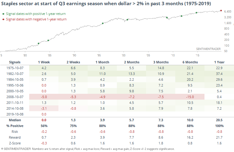
Staples did well, though.
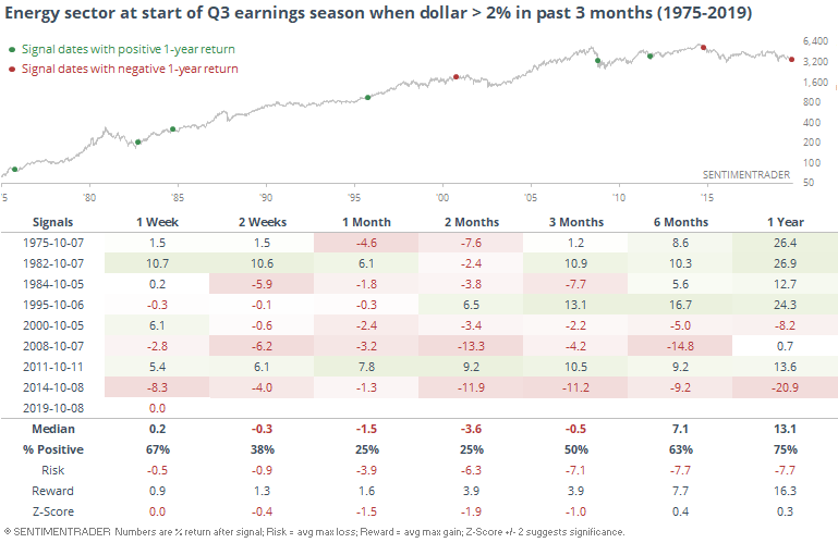
The worst performer proved to be energy stocks.
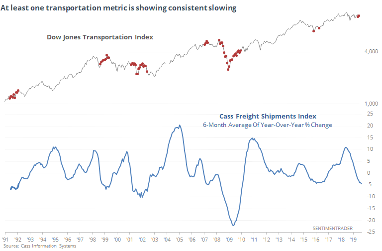
Freight Fright
The other day we looked at an alternative measure of the health of the transportation sector, which had just hit a new high. The WSJ notes yet another alternative metric, which is not only showing negative growth, it has been for months.
Over the past 6 months, the Cass index of freight shipments has averaged a loss of more than 4% from year-ago levels. That's the worst since the mini-slowdown in 2015.
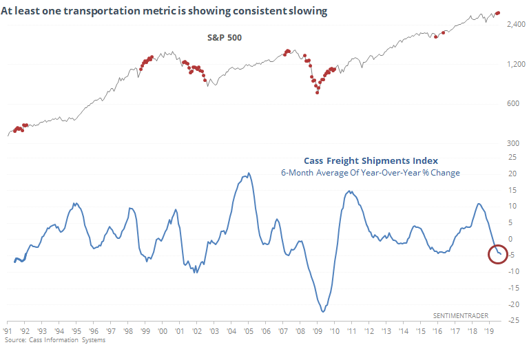
It didn't signal anything major then, nor in 1991 or 1998. The other two times occurring during the midst of the last two bear markets, so there's that.
Here's how the Transports performed.
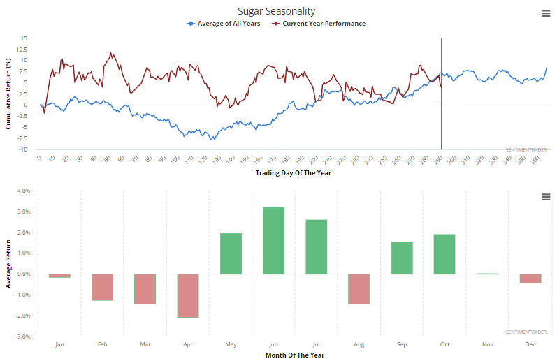
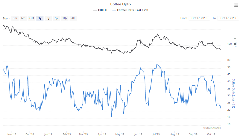
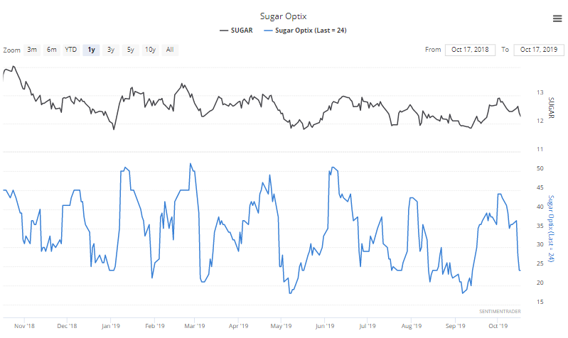
Coffee, With Sugar
Coffee and sugar top the list of most-hated commodities again, as sentiment on both has soured quickly in recent weeks.
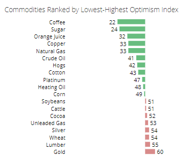
They're also topping the Sentiment & Seasonality Screen, showing heavy pessimism during what has traditionally been a positive time of year.
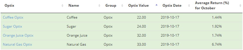
Both are nearing the lowest optimism levels in the past year.
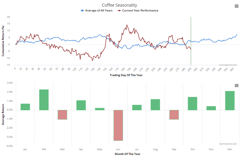
Coffee hasn't followed its usual seasonal pattern very well this year, but FWIW the next handful of months tend to be its strongest.
Sugar has followed it more closely, though its most consistently positive yearly bias is wearing out.