Friday Color - Yield Curve, Small Caps, XLU vs XLE, Bonds, Brazil

Here's what's piquing my interest on what looks to be another small-range attempt at new highs.
Steeper
One of my family's great jokes is that although I'm 6'7", I don't like heights. It's a never-ending source of entertainment for them - tall guy who's afraid of heights, haha. My knees get weak, stomach flutters, the whole deal.
I don't want to fall. But as the old joke goes, "It's not the fall that gets you, it's the landing." For some of the troubling economic data out there, it's kind of the same thing - we don't need to worry when it starts to get extreme, we need to worry when it stops.
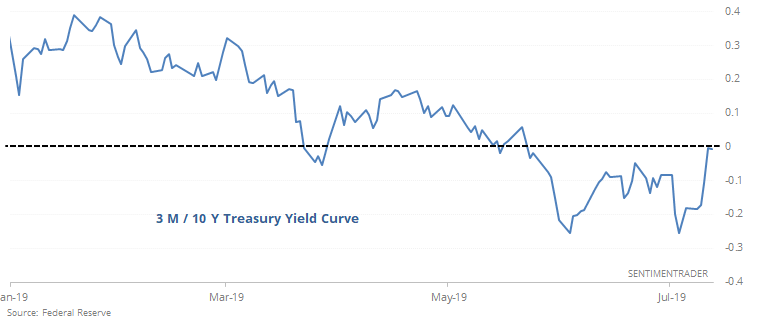
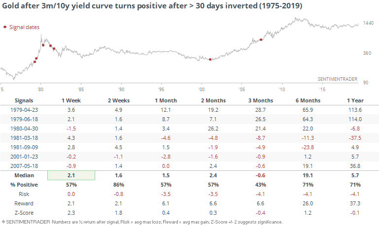
We saw the other day that the NY Fed's recession model is getting high, but that hasn't meant any imminent danger to stocks (except once). But when that data series peaks, that's trouble. That model is based on the yield curve, and that is starting to show signs of reversing after having been negative for more than 30 days.
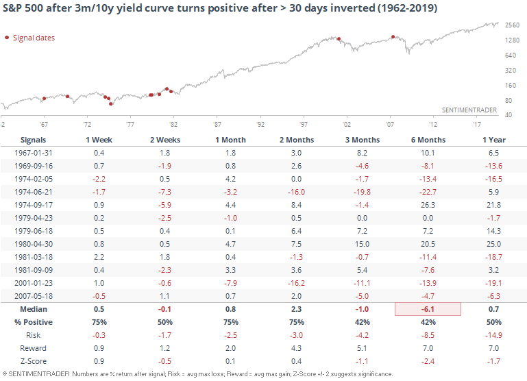
There have been some false starts with this data, especially in the mid-70's and early 80's. Even so, when the curve turned positive after being inverted for at least 30 days, returns in the S&P 500 over the next 3-6 months were not good, and risk was very high.
It hasn't been that great of a sign for the buck, either.
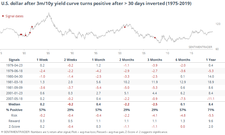
Gold mostly benefited from that, but not so much in '81.
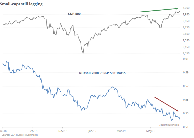
Small-Caps Sag
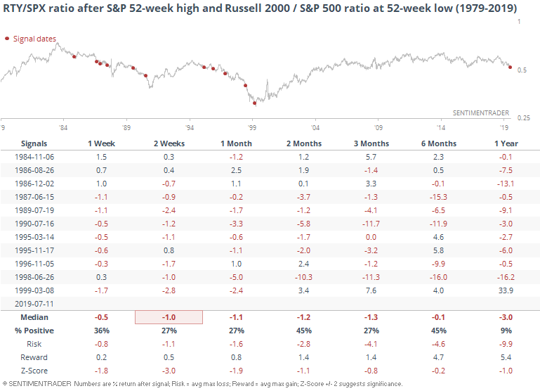
We've seen in recent weeks that some areas of the market, relative to the S&P 500, have been lagging badly, and that has been troublesome. Chief among them are small-cap stocks, with the Russell 2000 having been more than 9% below its 52-week high even as the S&P 500 hit records.
On Thursday, the S&P hit a new high, yet the ratio of the Russell 2000 to S&P 500 sunk to a 52-week low. That hasn't happened since March 1999.
Stocks didn't peak immediately after that 1999 signal, but it was an early warning that something was up. Same for 1986, 1990, and 1998. But there were a handful of false warning flags as well.
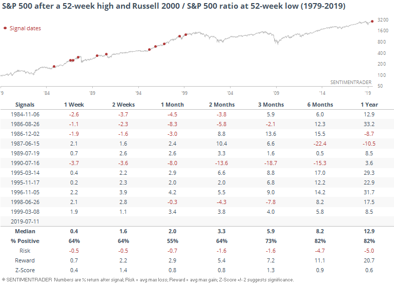
Overall, the S&P's returns going forward were fine, slightly above average. There were big winners, and big losers, making this kind of a binary signal. Either stocks will shrug this off and rocket higher, or suffer a near collapse.
For the Russell, it was a more consistently negative sign.
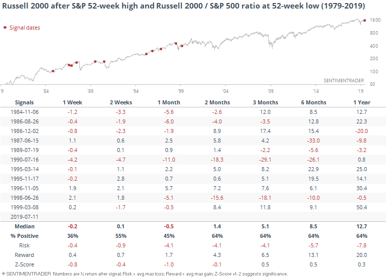
We can see that relative weakness in the following chart. While it wasn't necessarily a bad sign for stocks in general, it was an almost universally bad sign for small-cap stocks relative to large-cap ones.
Sector Divergence
The WSJ notes that for one of the few times ever, energy stocks are yielding more than utilities. It's not just the XLU and XLE funds that are showing this unusual switch, its the underlying sectors as well.
Going back to 1990, there have only been two other times when the S&P 500 Utilities sector had less of a dividend yield than the S&P 500 Energy sector.
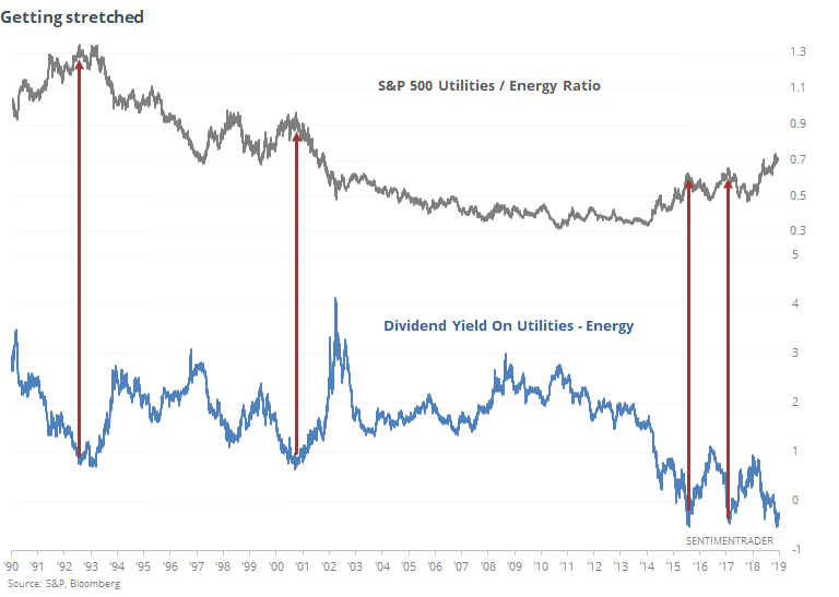
It's impossible to know ahead of time if this is a trough or more of a lasting phenomenon. It seems unlikely this will persist, though, suggesting an overweight of utilities to energy stocks should suffer in the weeks/months ahead.
Bond Selloff
In late June, we started to see more and more signs that optimism in the bond market was at an extreme, and it suggested a very poor risk/reward skew going forward.
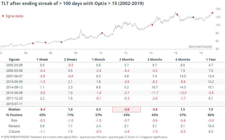
Now that bonds have started to sell off, investors are seeing something that they haven't in a very long time - bonds are showing among the lowest short-term optimism out of any other asset.
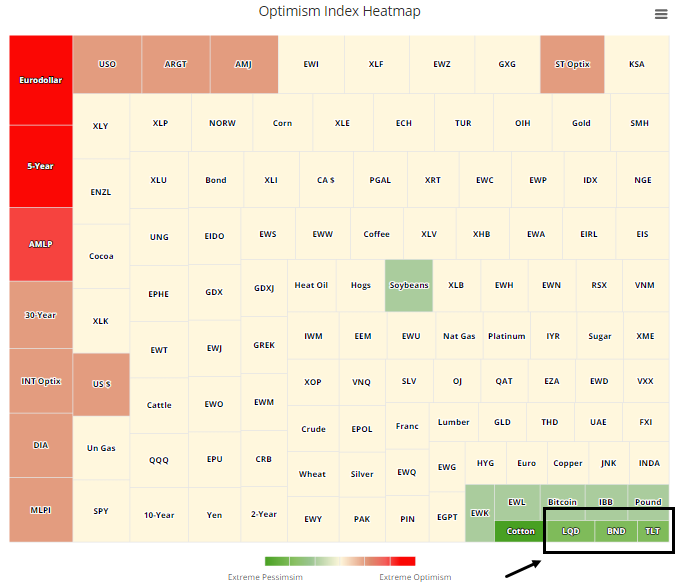
The Optimism Index for TLT is the lowest out of all markets we track. I can't remember the last time (if ever) that's happened. This is a very short-term measure, though, so it can be noisy.
This is a very low reading for a time when TLT is still trading above its 50-day moving average. It shows an intense bout of selling pressure during an uptrending market, and for this fund, has typically occurred closer to the start of declines than the end.
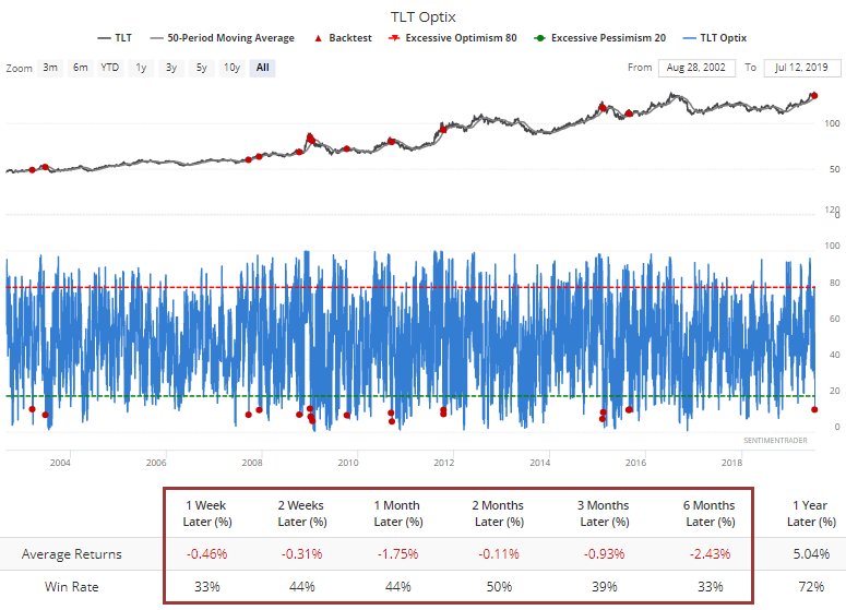
Looked at another way, it's the first Optix reading below 15 in more than 100 sessions. That ends one of the longest streaks in the history of TLT, and again this tended to lead to further declines. There were a few exceptions, but generally it indicated a high-risk scenario.
Strong Like Bull
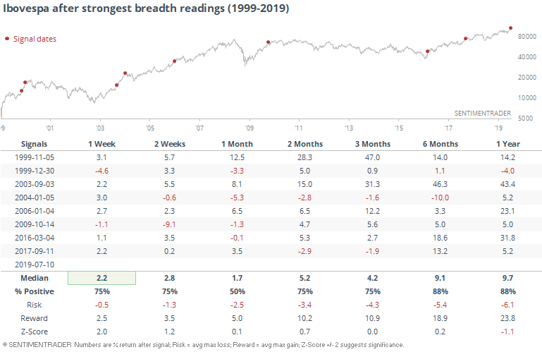
No market or sector that we track has been stronger than Brazil in recent days. The breath underlying the move in the Ibovespa has been among the strongest in 20 years.
A composite breadth gauge that looks at how many stocks in the index are hitting new highs, trading above various moving averages, exceeding their volatility bands, etc, is nearing a record high.
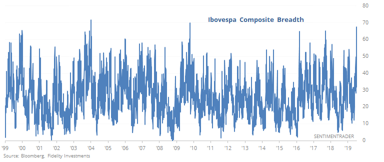
This has been a sign of unrelenting buying interest, and like most displays of extreme momentum, it has had a habit of continuing. While this would be a better sign if the market was coming out of a protracted downtrend instead of a multi-year high, it has still tended to lead to strong returns going forward.