
PPI Minus CPI - The News Gets Worse

This article highlighted that it has been bearish for stocks over the past 105 years when the difference between the 12-month % change for the Producer Price Index and the 12-month % change for the Consumer Price Index is greater than 7 points.
I designate these periods as "Unfavorable." During these periods since 1916, the Dow Jones Industrial Average has lost over -60% through May of 2021.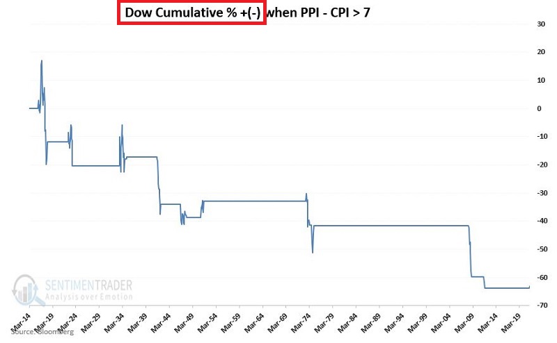
A closer look at a broader set of data reveals that "it gets worse."
A BROADER LOOK
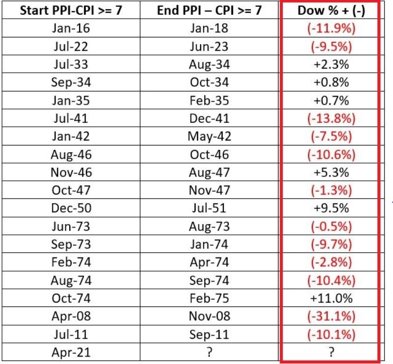
The "Unfavorable" periods were the following:
I reviewed the performance of:
- 11 S&P 500 Sectors
- 6 various factors (Large/Small/Growth/Value/Defensive/Cyclical)
- Bloomberg Commodity Index
- 10-yr. Treasury yields
- Gold
The original theory was that:
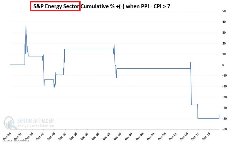
- Certain sectors such as Energy and/or Real Estate would hold up better
- Commodities - including gold - would perform well
- 10-yr. Treasury yields would rise
Now for some timely foreshadowing, let's invoke:
Jay's Trading Maxim #27: When it comes to trading and the markets, there is a chasm a mile wide between theory and reality.
STOCK SECTORS AND FACTORS
The good news is that stocks have held up just fine since the latest Unfavorable period started at the end of April 2021. The bad news is that historically the results have been dreadful.
The table below displays the unhappy totals for the S&P sectors and various factors from Dec. 1926 through May 2021
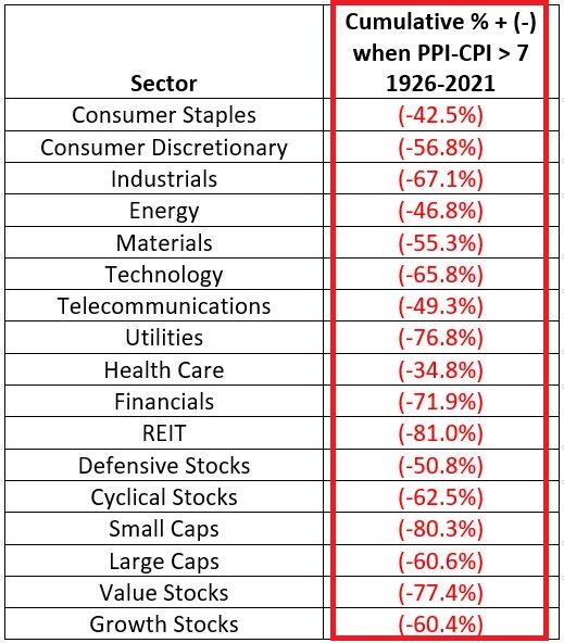
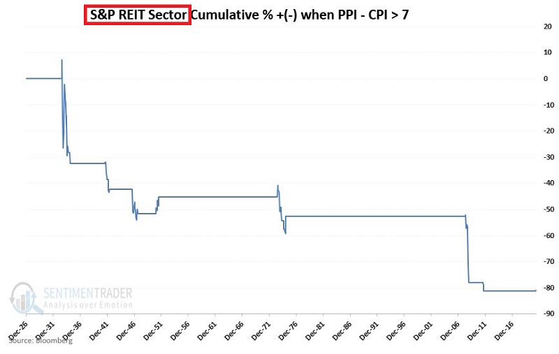
In addition, despite their supposed reputations as "inflation fighters," Energy did NOT hold up well, and REITs lost a disastrous -80%+.
COMMODITIES
So how did commodities hold up? The answer: Just fine - that is until the short bout of inflation in 2008. The chart below displays the cumulative % +(-) for the Bloomberg Commodity Index held only during the Unfavorable periods (the data series started in 1933).
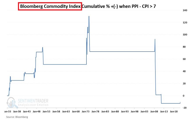
The good news is that commodities gained ground during each inflationary bout before 2008, and overall, commodities performed better than stocks.
The bad news is that after the massive commodity selloffs in 2008 and 2011, the net result was a loss of -10.2%.
10-YR. TREASURY YIELD
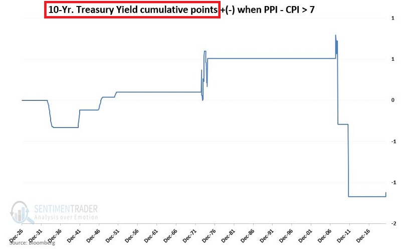
Even treasury yields had an "interesting" set of results. As you can see in the chart below, yields:
- declined sharply during the deflation of the early 1930s (no surprise)
- rose during each subsequent Unfavorable period
- until 2008 and 2011; during these two bouts of inflation, yields plummeted (based primarily on Fed pumping)
GOLD
Last but not least, how about gold - that "ultimate store of value" and "optimum hedge against inflation" (according to some)? Our data series started in 1974, so we can only evaluate performance during the Unfavorable periods in 1974-75, 2008, 2011, and since May 1st, 2021. The cumulative % + (-) for gold during Unfavorable periods appears in the chart below.
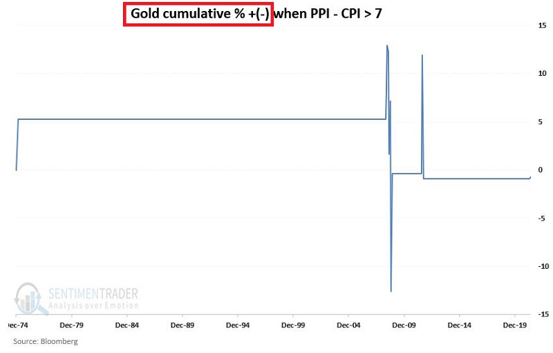
I leave you to draw whatever conclusions you can.
SUMMARY
Two pieces of bad news and one piece of good news. The bad news is:
- There has been no consistent place to hide during PPI-CPI Unfavorable periods in the past
- A new Unfavorable period began May 1st of 2021 and still persists
The good news (at least so far):
- So far in 2021, nothing seems to bother the markets
- As always, past performance is no guarantee of future results
As an avowed trend follower, I am still giving the stock market the benefit of the bullish doubt. However, based on the results detailed above, I am also keeping a close eye on the exit.