
Rates, Bonds and The Really Big Picture (Part II)

This is part 2 of a 3-part series on the long-term outlook for bonds. Part I illustrates the long-term history of interest rates. Part II details a simple way to stay on the right side of the trend in interest rates. Part III will discuss some possibilities for investing in a rising rate environment.
In Part I, I highlighted the profound impact that interest rate changes can have on bond prices, particularly long-term bonds with many years left until maturity. I suggested the potential for using a 120-month exponential moving average with ticker TYX as a way to designate the primary trend for interest rates as rising or falling.
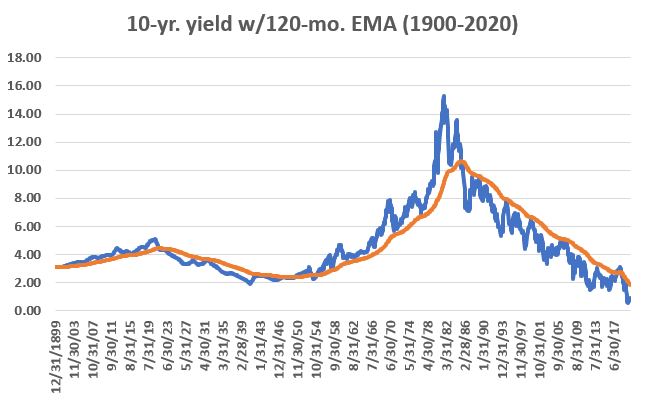
The data for TYX goes back to roughly 1970. In Part I we were talking about interest rates moving in 60-year cycles. So, to get a longer perspective we are going to focus on 10-year treasury bond yield data, for which data dates back to 1900. Ticker TNX represents the 10-year yield times 10. So, a TNX value of 20 represents an interest rate of 2%. For our purposes we will use TNX divided by 10 and look at the actual rate of interest across roughly the last 120 years.
The chart below displays the 10-year treasury yield (blue line) at the end of each month from 12/31/1899 through 12/31/2020 along with a 120-month exponential EMA (orange line). You can see the "long-term wave" nature of interest rate trends.
The following charts are designed to display how effectively something as simple as the 120-mo. EMA tracks the major trend of interest rates. Conceptually it may be a little confusing so let's try to spell it out as clearly as possible. In the charts below we ARE NOT measuring the dollar gain or loss of any particular investment. We are merely accumulating the raw number of yield points that are captured when:
- The 10-year yield moves above its 120-mo. EMA until the time it drops back below, and;
- The 10-year yield moves below its 120-mo. EMA until the time it rises back above
So, if for example:
- If rates cross above the 120-month EMA and rates are at 5%
- Then rates rise for a period of time before crossing back under the 120-month EMA and rates at that time were 10%, then we would say that the "model" correctly captured 5.00 yield points
For a declining rate period:
- If rates cross below the 120-month EMA and rates are at 10%
- Then rates fell for a period of time before crossing back above the 120-month EMA and rates at that time were 7%, then we would say that the "model" correctly captured 3.00 yield points
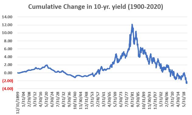
The first chart below shows the cumulative net change in interest rates from 1900 through 2020. As you can see in the chart above, yields rose until about 1920, then declined for decades before beginning a new uptrend around 1950. Rates finally peaked in August of 1981 and have been trending lower ever since. During this time rates declined in total from 3.15% to 0.917%, a net change of -2.23%.
Now let's apply the 120-month exponential moving average of 10-year yields:
- When the current 10-yr. yield is above the 120-mo. EMA we designate the trend as "Up"
- When the current 10-yr. yield is below the 120-mo. EMA we designate the trend as "Down"
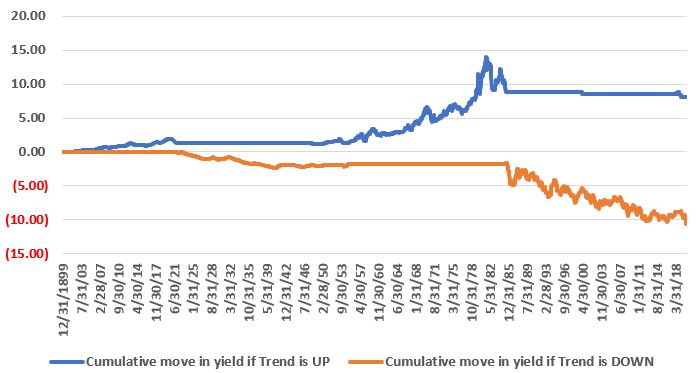
The next chart focuses solely on the cumulative increase/decrease in yield points during those periods when the trend is "Up". As you can see this simple method caught a good portion of the rise in rates early in the 20th century as well as during the 30-year uptrend form the 1950's to the 1980's. Note that like most any moving average based trend-following method it "gives back" some at the end of a major trend. Note also that there was a short "whipsaw" in the 10-year yields in the late 1990's and again briefly during 2018.

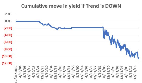
The next chart focuses solely on the cumulative increase/decrease in yield points during those periods when the trend is "Down.". As you can see this simple method caught a good portion of the decline in rates from the 1920's to the 1950's and the near 40-year decline in interest rates since the 1980's is fairly obvious on the right-hand side of the graph.
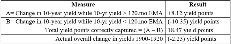
The table below puts some numbers to the charts above.
Just to paint the full picture, the chart below displays the information from the two previous charts together.
This is not exactly rocket science and like I said, maybe a little tough to grasp conceptually at first. But the bottom line is that this rudimentary method did a good job of correctly identifying the long-term trend in interest rates over time, having correctly captured 18.47 basis points over 120 years, during a time when – from start to finish – 10-year yields fell from 3.15% to 0.917%.
No one can predict when ticker TNX (and ticker TYX) will ultimately move above its 120-month EMA and presumably signal a new long-term uptrend in interest rates. But what we can say with absolute certainty is that such an event can and will have profound implications for investors and the financial markets.
For more on this topic, look for Part III.