
S&P 500 Power Period #2

It is not a secret that the 4th quarter tends to be good for stock market investors, particularly beginning in late October. Let's examine one specific period and measure the results.
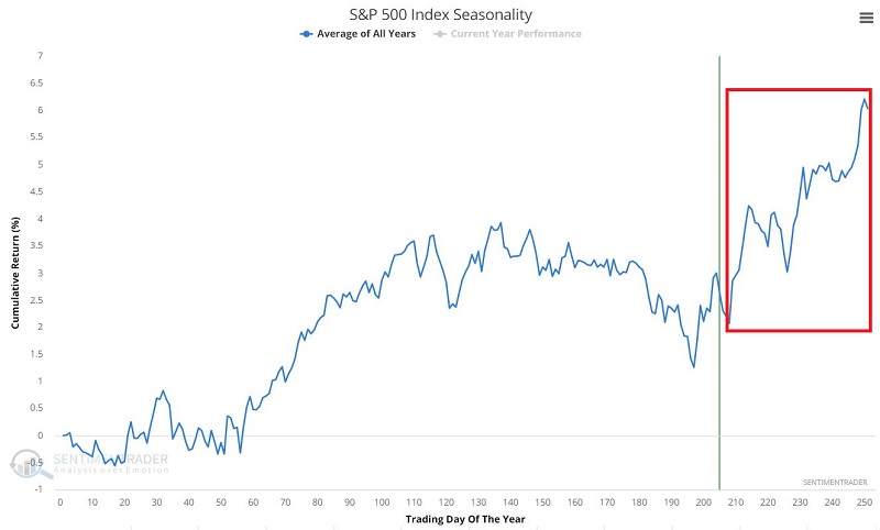
The chart below displays the Annual Seasonal Trend for the S&P 500 Index.
 THE TEST
As you can see in the chart above, the market appears to show seasonal strength from Trading Day of Year #208 through the end of the year. So that will be our test:
- Buy at the close of TDY #208
- Sell at the close of the last trading day of the year
We will start our test in 1953 (because before 1953, the NYSE was open for a few hours on Saturday, so there were technically more trading days in a year before 1953).
THE RESULTS
The chart below displays the year-by-year results in column form.
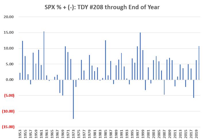
Just eyeballing the chart above seems to suggest a bullish tilt, with more "up" periods than "down." The chart below displays the day-to-day equity curve and the hypothetical growth of $1 held in the S&P 500 Index (price-performance only) ONLY during the "favorable" period highlighted above.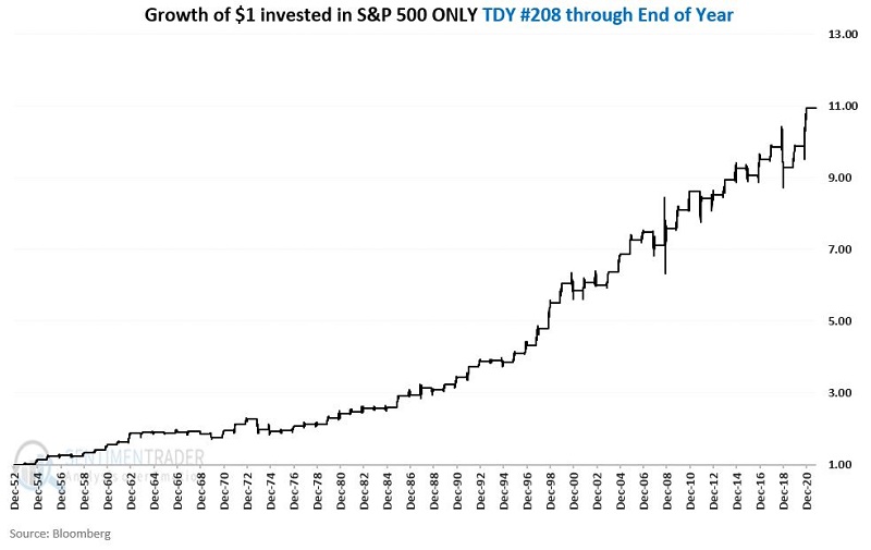 Two things to note:
- The upward slope of the results is unmistakable
- There is no guarantee from year-to-year that results will be favorable
The bottom line would appear to be that investors:
- Should give the bullish case the benefit of the doubt during the late 4th quarter
- BUT one can NEVER throw caution to the wind
SUMMARY
The summary of results in the table below would seem to bolster the bottom-line conclusions drawn above - i.e., the odds favor the bulls, but there are no "sure things."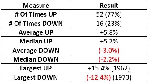
CONSIDERING DRAWDOWNS
The questions of "How much?" and "How often?" are relevant to any approach to trading under consideration. However, in real-world trading, the other question that needs to be addressed simultaneously is "How bad?", as in, "How bad does it get along the way?", i.e., how much of a decline must an investor be prepared to sit through to enjoy the perceived rewards.
The chart below displays:
- The largest % drawdown
- Measured from the closing price on TDY #208
- Through the end of the yea
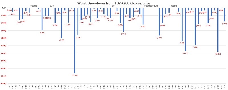 In other words, it shows the worst decline a trader would have to sit through if they bought at the close on TDY #208 and sold at the close of the last trading day of the year.
The table below displays the % of times the drawdown DI NOT EXCEED a given level.
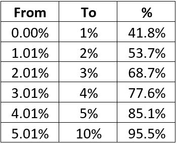 To be clear:
- 41.8% of all years saw a drawdown of LESS THAN -1% between the close on TDY #208 and the end of the year
- 85.1% of all years saw a drawdown of LESS THAN -5% between the close on TDY #208 and the end of the year
- 95.5% of all years saw a drawdown of LESS THAN -10% between the close on TDY #208 and the end of the year
Only 3 of the last 67 years saw a drawdown in excess of -10 (1973 = -17.26%, 2008 = -11.37%, 2018 = -11.57%