
The Market Breadth Debate

The ongoing market breadth debate continues as the new all-time high on Thursday for the S&P 500 once again showed a very mixed market breadth backdrop. The short-term participation levels are alarming, but the long-term indicators remain solid. The debate is simple. Should we heed the message from the weak short-duration indicators or ignore them as the long-duration measures are healthy.
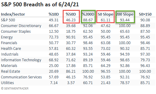
The following table provides some insight into some of the indicators we follow to measure market participation. The percentage of members above the 50-day moving average is weak, while the percentage above the 200-day is strong. If we look at the percentage of stocks with a rising 50 or 200-day average, we see the same message. Remember, a falling moving average means that the duration and magnitude of price levels relative to the average are meaningful enough to turn the slope of the average down.
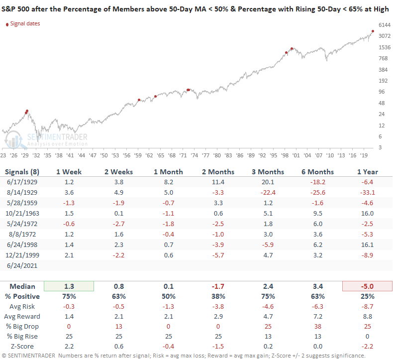
Let's conduct a study using the short-duration indicators to identify other instances in history when participation levels were low, and the S&P 500 closed at a 252-day high. For the study, I will use the following criteria.
- Percentage of members above the 50-day moving average < 50%
- Percentage of members with a rising 50-day average < 65%
HOW THE SIGNALS PERFORMED
While the sample size is small, we see some very alarming historical reference points with 1929, 1972, and 1999 sticking out like a sore thumb.
Let's now compare the current day long-duration indicator levels to the historical levels on each of the signal dates from our study. As the table shows, the present-day long-duration indicator levels are significantly better than the other periods in time when short-term breadth was weak like today.
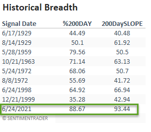
The historical breadth comparison table provides an important message. Markets are more vulnerable and likely to peak when short and long-duration indicators are weak. For now, the inadequate short-term participation levels appear to be nothing more than sector rotation.