
This is (not) just like 2009

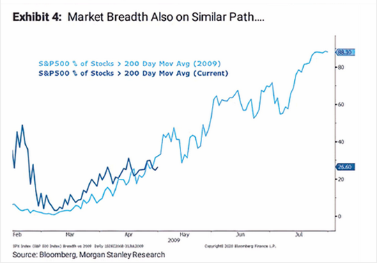
According to a major investment bank, stocks are trading just like they did during the recovery in 2009.
As noted on MarketWatch, Morgan Stanley shows that the percentage of stocks within the S&P 500 that are trading above their 200-day averages looks just like it did when they emerged out of the financial crisis.
In the decades that we've been looking at price analogs (how highly correlated a current period is to the path during other periods), they've proven to be modestly useful.
The main problem is that it's way too easy to cherry-pick examples based on whatever outlook the analyst wants to convey. That's why we use a transparent methodology, going back as far as history allows, and show every occurrence.
When we do this with the percentage of stocks above their 200-day moving average, the initial recovery in 2009 doesn't even make the list.
Below, we can see the 4 most recent instances. This is not the S&P 500 we're looking at, it's the percentage of stocks above their 200-day averages, showing the most highly-correlated paths to what we've just seen over the past 40 days.
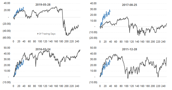
For the S&P 500 index itself, the most highly-correlated periods showed decent gains, especially longer-term. While it might not be the slam-dunk positive it was if we rely on the 2009 template, it does suggest a modest upside bias long-term.
This is an abridged version of our recent reports and notes. For immediate access with no obligation, sign up for a 30-day free trial now.
We also looked at:
- A more detailed look at the highest-correlated recoveries in stocks above their 200-day averages
- Consumers' attitudes about the present are improving relative to expectations about the future
- Among financial experts, though, present vs future sentiment is still plunging
- Dumb Money Confidence is getting high for a bear market
- Fear & Greed is high, too
- The Nasdaq 100 has almost erased its bear market losses
- So has the Nasdaq Composite - what usually happens next