
Trends to Track

If I were to choose one word to describe Sentimentrader (OK, besides "Sentiment"), it would be "Quantitative."
In a nutshell, our objective is to separate "theory/myth" from "reality" in the financial markets. We "crunch the numbers" to highlight how well - or unwell - a given market or security has performed following a particular signal or event.
That said, be forewarned. The information that follows is NOT quantitative in nature (For the record, it DOES set the stage for some future pieces on similar topics that WILL be quantitative in nature).
"GETTING A SENSE" OF THINGS
Let's start by taking a step back from all of our "number-crunching" and take a bigger picture look at the investment process.
In the broadest sense possible, there is:
- Spot Opportunity (Gathering and assessing information to form an investment or trading idea)
- Exploit Opportunity (Entering an actual trade to express that idea)
Needless to say, we think it important for investors and traders to use quantifiable information when the time comes to zero in on an actual trade. But one tangential element involves "feeling comfortable" with the underlying idea. In other words, many individuals like to "have a sense" of which way things are headed before they can be comfortable enough to dive into the nitty-gritty of finding an actual trade and determining an actual entry and/or exit point.
That is where the information below comes in:
- It is NOT intended to guide you to a specific trade
- Consider it as an overarching step in assessing which way the winds are blowing and in determining reasonable places to start looking for actual trading ideas
RECOGNIZING BIG PICTURE TRENDS
The trend is your friend. At least until it is not a trend anymore, then it becomes more like an ex who keeps trying to "lure you back in" with memories of "the good times," even though the relationship has unquestionably run its course. In both cases, the end is pretty similar (and typically not pretty).
Investors have been blessed with various strong and persistent trends in the financial markets in recent years. By getting on board and staying onboard, many investors have accumulated a great deal of wealth.
But nothing - particularly a trend in the financial markets - lasts forever. Neither I nor anyone else cannot predict when a particular trend or relationship in the markets will end. But the one thing we can do is recognize when a trend or relationship is "getting a little long in the tooth" and prepare ourselves mentally for the day when we need to walk (or run, as the case may be) away.
5 RELATIONSHIPS TO WATCH
There are certain "battles" that take place in the markets on a never-ending basis. These battles can go in one direction for years at a time. And then, when everyone finally concludes that there is no battle anymore - things change.
A few of these ongoing "battles" include:
- Foreign stocks versus U.S. stocks
- Value versus Growth
- Commodities versus Stocks
- Technology versus the broader market
- Energy versus Technology
Each of the charts below (courtesy of StockCharts.com) are "relative strength" charts, NOT price charts:
- In other words, the chart displays how one asset is performing "relative to another"
- If the bars in the chart are rising, it means the 1st asset listed is outperforming
- If the bars in the chart are declining, it means the 1st asset listed in underperforming
Each chart below:
- Is a 5-year weekly chart
- Includes a 104-week (i.e., 2-year) moving average
What we will look for is:
- The current overarching trend of the relationship
- What needs to happen to confirm a reversal - or continuation - of the current trend
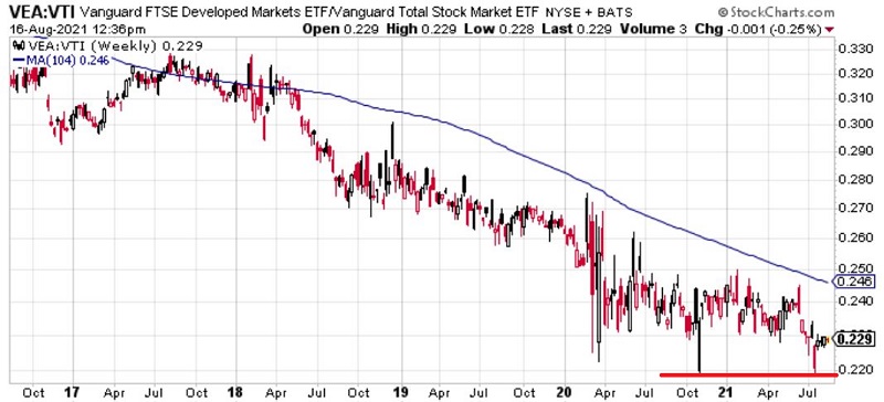
#1. FOREIGN STOCKS VS U.S. STOCKS
The chart below displays a weekly chart of the performance of:
- Ticker VEA (Vanguard FTSE Developed Markets ETF) relative to
- Ticker VTI (Vanguard Total U.S. Stock Market ETF)
Things to Note:
- The downward slope of the bars AND the 104-week average illustrates the fact that U.S. stocks have consistently outperformed in recent years
- A breakdown below the recent low would suggest a continuation of the current trend
- A move above the 104-week average would suggest a reversal in trend favoring foreign stocks
#2. Value vs. Growth
The chart below displays a weekly chart of the performance of:
- Ticker VTV (Vanguard Value ETF) relative to
- Ticker VUG (Vanguard Growth ETF).
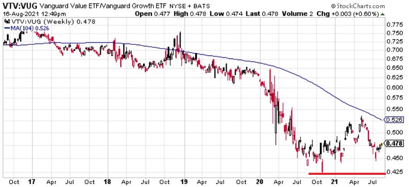
Things to Note:
- The downward slope of the 104-week average illustrates the outperformance of growth stocks in recent years
- The bars have bounced higher since October of 2020, suggesting potential for a reversal
- A move above the 104-week average would suggest a reversal in trend favoring value stocks
#3. Commodities vs. Stocks
The chart below displays a weekly chart of the performance of:
- ticker DBC (Goldman Sachs Commodity Index ETF) relative to
- ticker VTI (Vanguard Total U.S. Market ETF)
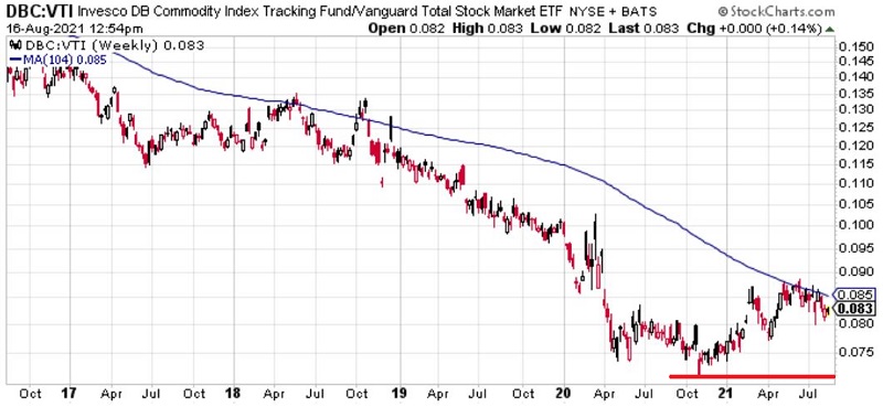
Things to Note:
- The downward slope of the 104-week average illustrates the steady and significant outperformance of stocks over commodities in recent years
- The bars have bounced higher since October of 2020, suggesting potential for a reversal
- A move above the 104-week average would suggest a reversal in trend favoring commodities
#4. Technology Sector vs. The Total Stock Market
The chart below displays a weekly chart of the performance of:
- ticker XLK (SPDR Technology) relative to
- ticker VTI (Vanguard Total U.S. Market ETF)
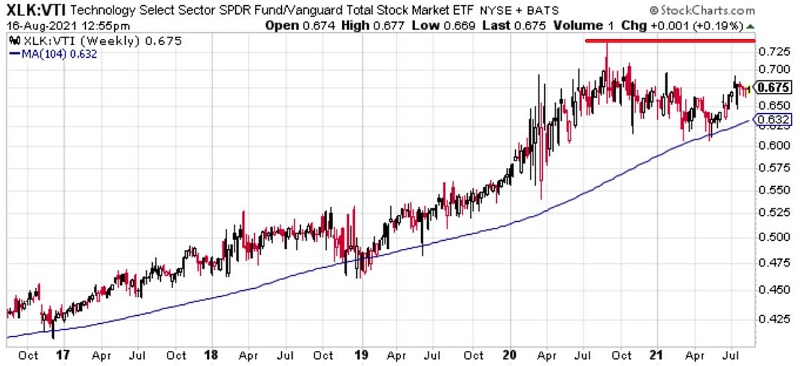
Things to Note:
- The upward slope of the bars and the 104-week average illustrates the significant and steady outperformance of technology stocks in recent years
- The bars topped out in September of 2020, suggesting potential for a reversal
- A move below the 104-week average would suggest potential trouble for technology stocks
#5. Energy Stocks vs. Technology Stocks
The chart below displays a weekly chart of the performance of:
- ticker XLE (SPDR Energy) relative to
- ticker XLK (SPDR Technology)
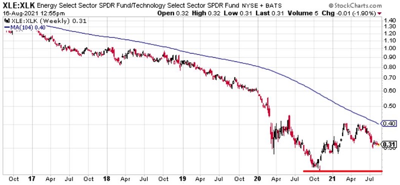
For over four years - leading into October 2020 - the relative performance between two sectors has rarely, if ever, been more one-sided than the one you see in the chart above. While technology led the universe in performance by a wide margin, traditional energy stocks became arguably the most hated sector ever (as Jason noted shortly before the low in the chart above).
Things to Note:
- The sharp downward slope of the 104-week average illustrates the massive outperformance of technology over energy in recent years
- The bars have bounced higher since October of 2020, suggesting potential for a reversal
- A move above the 104-week average would suggest a reversal in trend favoring energies
Bonus Chart: "Alternative Energy" versus "Traditional Energy"
The chart below displays a weekly chart of the performance of:
- Ticker ILCLN (iShares Global Clean Energy) relative to
- ticker XLE (SPDR Energy)
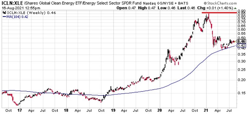
This is a newer "battle" that will likely continue to play out in the years ahead.
Things to Note:
- Starting in 2019, clean energy stocks have significantly outperformed traditional energy companies - as evidence by the upward slope of the bars and the 104-week average
- The bars have fallen sharply since early 2021. One can only speculate whether this is due to clean energy stocks coming off of overvalued levels or investors finally perceiving value in traditional energy companies
- A move below the 104-week average would suggest a reversal in trend favoring energies
It will be interesting to see how this relationship plays out over time:
- On the one hand, by and large, the world (particularly transportation and flight) still runs on fossil fuels
- In addition, a vast array of products that we use every day are produced using petroleum. So, one can argue that this sector has been overdone to the downside and now represents great value.
- On the other hand, the move toward "renewable energy" seems unlikely to abate.
SUMMARY
Remember:
- Getting a sense of "the current trend" can be a useful step in sorting through all of the various opportunities out there before getting down to the real work of quantifying an actual trading opportunity
- Attempting to identify a reversal in trend in real-time is a low-probability approach
This seems like a good time to invoke the following:
Jay's Trading Maxim #37: Recognizing the trend right now is worth far more than a thousand predictions regarding what will happen next.
Jay's Trading Maxim #18: Follow the trend, but DO NOT fall in love with the trend.