
TradingEdge for Apr 23 - New highs with a bit of a wobble


The goal of the Weekly Wrap is to summarize our recent research. Some of it includes premium content (underlined links), but we're highlighting the key focus of the research for all. Sometimes there is a lot to digest, with this summary meant to highlight the highest conviction ideas we discussed. Tags will show any symbols and time frames related to the research.
| STOCKS | ||
|  | |
Stocks have been running hot, and investors are responding. More and more extremes have been triggering, helping to push valuations high amid low volatility.
The past few weeks have only added to a historic run from the months before that. At various points during the past year, we've looked at streaks of large gains in the S&P or different sectors, and it's only gotten more remarkable. Even with a breather over the past couple of sessions, the S&P has never before seen a year with more +1% daily gains versus -1% losses.
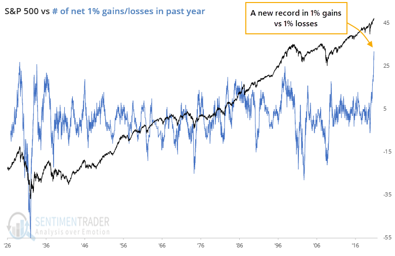
The past year has seen 32 more big gains versus losses, more than the net +27 days heading into September 1929, +26 days into February 1934, and +25 days into April 1998.
When we look at the major sectors, the ones that currently have a record or near-record net number of big positive days include Discretionary, Industrials, Materials, Communications, and Financials. For what it's worth, all of them preceded at least multi-month exhaustion points.
THE BIG GAINS HAVE LED TO MORE EXTREMES
It hardly seems effective to outline yet more extremes in sentiment. We've noted them repeatedly since January, and yet we were recently at new highs in most major equity indexes.
So at the risk of tilting at even more windmills, we looked at several more extremes, either updating previous notes or just noting remarkable displays of optimistic sentiment, like the fact that for the first time in the 20 years we've been computing them, more than 60% of our core indicators showed excess optimism while 0% (yes, none of them!) showed excess pessimism.
A month ago, we estimated that margin debt would rise enough in March to push its year-over-year change to 73%. It didn't quite pan out that way, as the growth ended up being "only" 72%, the 2nd-highest rate of growth in 35 years, though as noted before, relative to the growth in the S&P 500, it's been hovering around 20%, which isn't as extreme as 2000 or 2007.
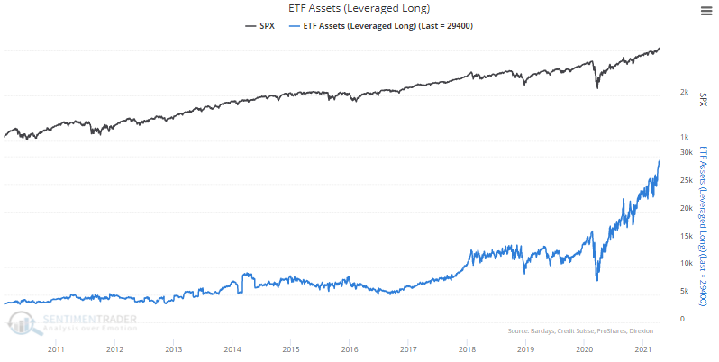
All of this optimism has pushed the Risk Appetite Index to one of its highest levels in several years over a 5-day period. And ETF traders are fully embracing this appetite for risk by pushing assets in leveraged long funds to record highs.
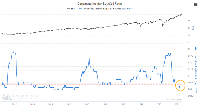
At the same time that investors are feeling so euphoric, corporate insiders appear to be selling. A weekly ratio of insider sales to buys as computed by Thomson Reuters skyrocketed to an astounding 143-to-1, the highest in the weekly readings reported by Barron's in at least 16 years.
The Corporate Insider Buy/Sell Ratio remains near a decade low. While spikes in insider buying vs. selling is a much more consistent buy signal for stocks than a drop is as a sell signal, it would be better to see this at least in neutral territory.
Investors are pushing the valuation of stocks to extreme heights and not even having to suffer much volatility along the way. That started to change in a minor way over the last few sessions, so we'll have to see if it lasts.
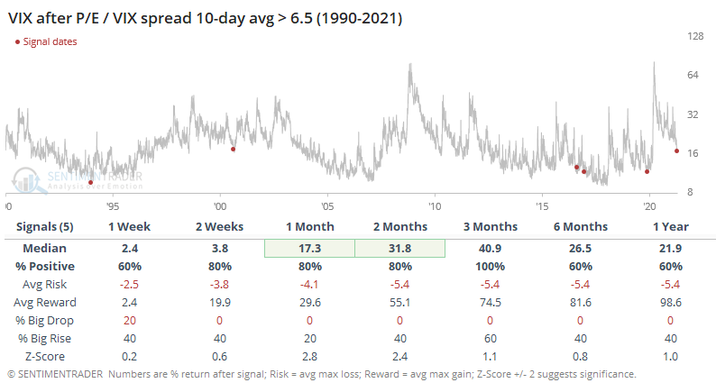
Zooming out over the past 30 years, the current spread between the S&P 500's forward price/earnings ratio and the VIX "fear gauge" is still among the highest readings.
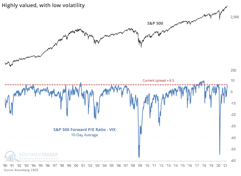
After other times the 10-day average of the spread reached its current level, the S&P struggled, except for the "nothing matters" market of 2017. Notably, the S&P's price/earnings multiple declined every time, even after the 2017 signal. This was not a good setup if you want to believe that investors will be willing to keep pushing valuation multiples higher.
Also notable is that the VIX rose every time. Even during the 2017 mo-mo market, the VIX managed to rise over the next few months.
DIVERGENCES, BUT NO MAJOR RISK WARNINGS
For months, we've seen that sentiment has oscillated around extreme levels of optimism, yet stocks were holding firm. Not just the popular indexes, but most stocks, industries, sectors, even global markets.
That has started to shift in recent days.
It's too early to tell whether this can morph into something larger, but already there are splits that we haven't seen for a long time. As Bloomberg noted, around 80% of S&P 500 members are still holding above their 50-day moving averages, but within the Nasdaq Composite and Russell 2000, it is a vastly different story.
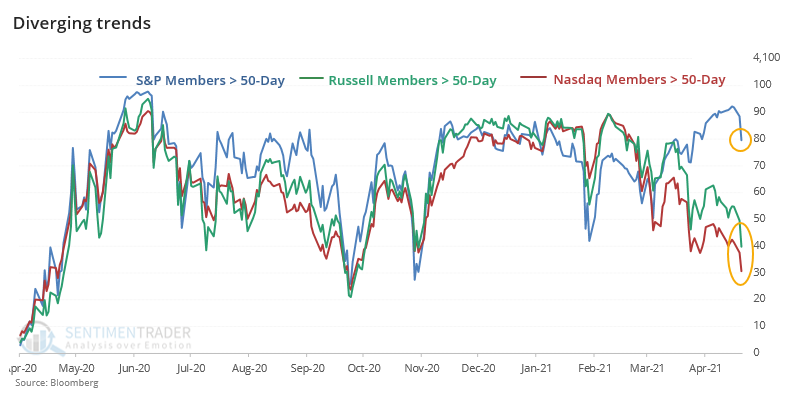
Even with Wednesday's rally, the picture didn't change much. The S&P had more than 85% of stocks above their 50-day averages, while both the Nasdaq Composite and Russell 2000 had fewer than 50% of members above their 50-day. That's never happened before.
To get a larger sample size, we have to relax the parameters. The table below shows each instance when 80% or more S&P members were above their averages, while fewer than 50% of Nasdaq and Russell members were above theirs.
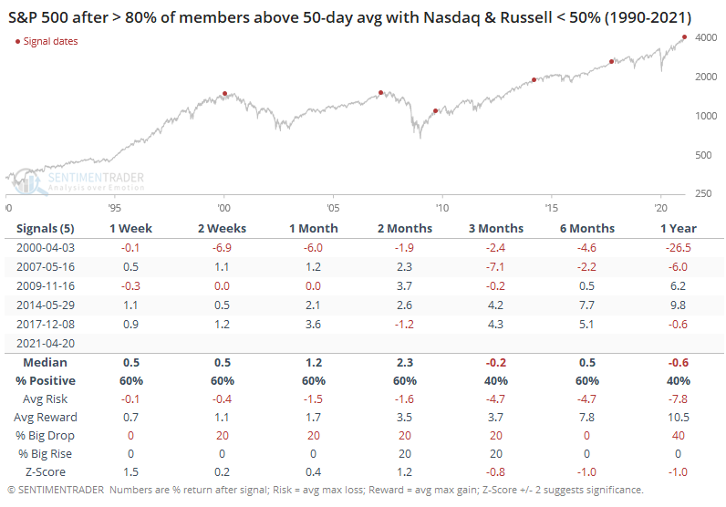
This is one of those times when the chart tells a better story than the numbers. It's pretty clear from the dots on the chart that these conditions wiped out any further gains in the S&P in the months. How long it took varied, from immediately to half a year, but it happened every time.
The Nasdaq Composite was a vaguely similar story, though it held up significantly better after the 2009, 2014, and 2017 signals. The small-cap Russell 2000 fared worse than the other indexes.
As a continuing series looking at major risk warnings, Dean concluded a review of the TCTM Risk Warning Model by sharing the sentiment component. When sentiment reverses from an extreme, take note.
By ranking 5 common sentiment indicators according to their current vs. historical levels, the Sentiment Composite Model seeks to identify instances when sentiment falls from an optimistic level. The current chart shows that the Composite is high - the setup is ready - but the trigger hasn't yet...well, triggered.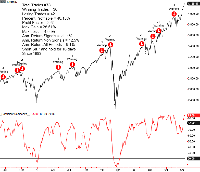
This signal triggered before the last 10 major declines in stocks, so if it does trigger in the coming week(s), we should pay attention.
Another risk warning model, the Relative Strength Ratio Range Model, has deteriorated significantly.
The chart below shows each of the component ratios used in the model, with the green box highlighting recent action. Only the copper / gold ratio remains in the upper end of its range.
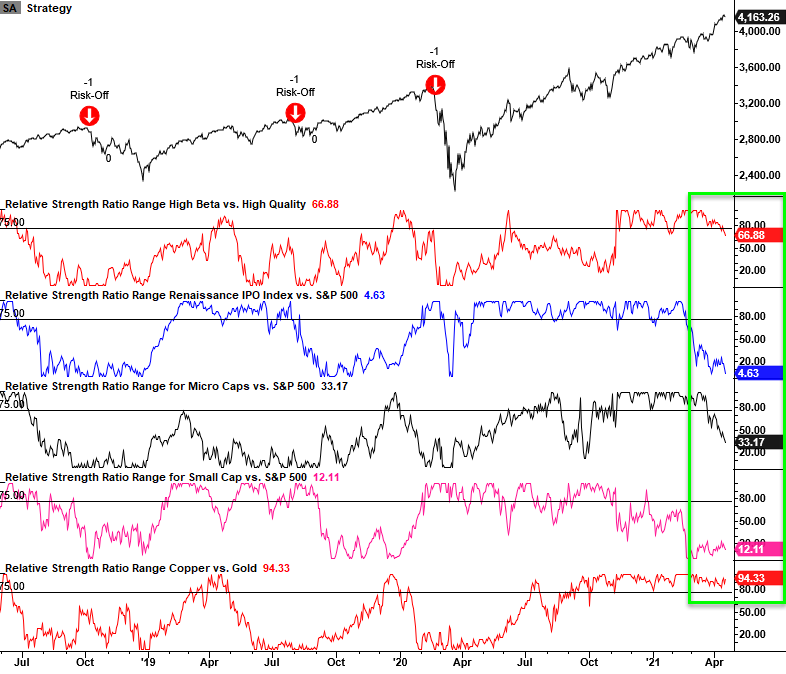
Most of the risk-on relative ratio measures have been under pressure, and the model is on the cusp of a risk-off signal should the S&P 500 deteriorate further from current levels. The transition away from more risky pockets of the market does not always spell doom and gloom as other groups can lead the market.
USING THE CALENDAR FOR OPTIONS
Jay outlined an options strategy that can allow a trader to speculate on an increase in the price of a stock, index, ETF, or futures contract without tying up a lot of capital.
The Out-of-The-Money (OTM) Calendar Spread has, in many cases, a relatively low dollar risk. It can also benefit from an increase in volatility after the trade is entered.
This strategy can be convenient in a "low conviction" situation. For example:
- You see a stock breaking out to a new high
- You think the up move may continue
- You are seriously not in the mood to get whipsawed (you buy the stock, and it immediately reverses)
- You are not overly excited about committing a lot of capital to buy the stock
- But you feel compelled to make a play
A lot of us have been in this situation - or something similar to it. This is just one situation where a calendar spread can come in handy.
For example, let's say that a trader hopes that Cisco (CSCO) will follow through and wants to participate but is not inclined to commit $5,296 to buy 100 shares of CSCO recently priced at $52.96 a share.
The trade below offers an alternative approach.
- Buy 1 Jul16 57.5 call @ $0.68
- Sell 1 May21 57.5 call @ $0.26
Ideally, we want to put on a calendar spread when implied volatility is relatively low so that we can pay less to enter the position, we have the potential to see an increase in position value if volatility rises, and we have less potential for a "volatility crush" that can deflate the value of our position if volatility falls sharply after we enter the trade.
The chart below shows CSCO along with the implied volatility of its options.
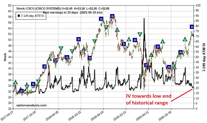
Since implied volatility is relatively low, an increase would work in the trade's favor.
For the record, the trade detailed above is NOT a recommendation. It serves only as a vehicle to illustrate the mechanics - and relative pros and cons - of the out-of-the-money call calendar spread.
STOCKS AND SECTORS
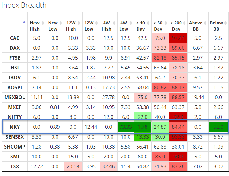
The Spotlight on Breadth page on the site is an excellent place to review and compare breadth measures for domestic and global indexes.
As Dean scanned the table this week, he noticed several short-term Nikkei 225 breadth measures deteriorated by a material amount. One of the measures, the percentage of Nikkei 225 members registering a 4-week low, surged above 73% on Wednesday.
This stands out like a sore thumb versus just about everything else.
When looking at other times that stocks in the Nikkei did something similar, the 1-month timeframe provided a slight edge. But when he sorted the instances based on the distance the Nikkei was from its high, forward returns were more consistent...and not in a good way.
When the Nikkei was not yet in a correction, meaning it was within 10% of a 52-week high, then there was a drastically different story regarding forward returns, with several notable (and negative) z-scores in the 1-3 month timeframe.
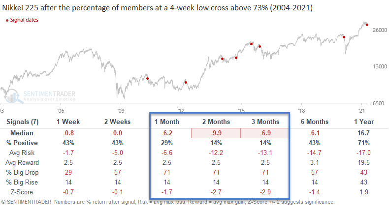
This short-term breadth weakness is a momentum sell signal, and we may want to avoid any mean reversion long trades until momentum flips the other way.
| COMMODITIES | ||
 |  |  |
WHEN TO OWN GOLD
Jay looked at a simple long-term trend-following system to show when it has paid to own gold versus stocks.
These days, there is chatter about the impending huge rally in gold (and other related stocks and precious metals). With the expansion of U.S. government spending and the national debt in the last 12 months, the talk of inevitable hyperinflation flows pretty freely. And maybe it will, in fact, all play out that way - with gold, silver, and mining stocks all experiencing explosive rallies.
But gold has some proving to do first.
Specifically, the ratio of the yellow metal to the S&P 500 needs to cross above its 200-day exponential moving average (EMA). The table below shows the cumulative performance for gold based solely on whether the gold/S&P ratio is above or below its 200-week EMA from January 1975 through April 2021.
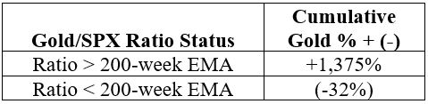
Does this mean that gold cannot and/or will not rally anytime soon? Not at all. It simply means that some improvement in the relationship between the performance of gold and the performance of the S&P 500 Index must occur BEFORE this particular indicator once again favors gold. This reversal of fortune could happen quickly if gold were to pop and/or if stocks were to swoon.
CORN AND COMMODITY RUN
Corn has been a strong performer of late.
Things have been so good that Jay noted we might have reached a point where things are getting a bit too good. When corn rallied more than 100% over 252 trading days, a rally of this magnitude has typically served as something of a warning sign.
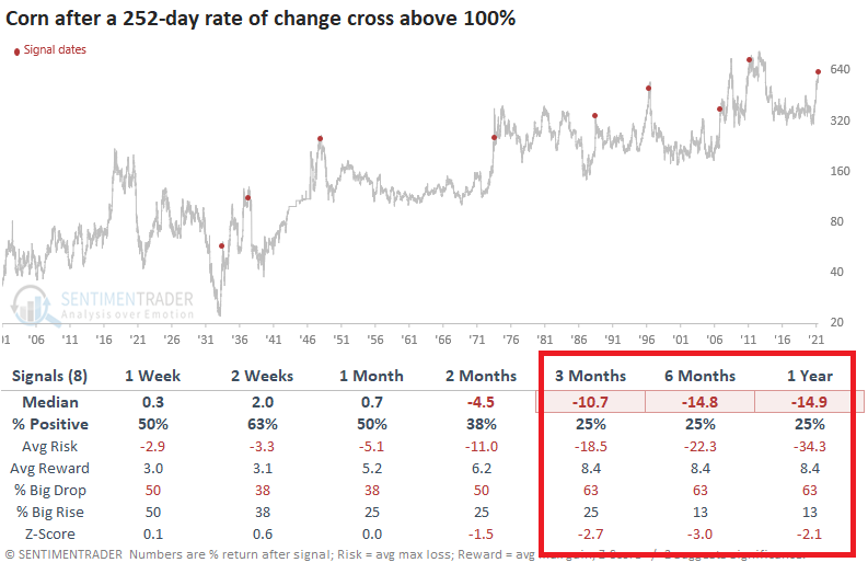
Seasonality, sentiment, and trend in corn are all conspiring to say the same thing - the contract has had major trouble holding its gains. After similar conditions, once corn fell below its 50-day average, its runs were about done.
It's not only corn that's been running.
Dean showed that while lumber is getting all the headlines, commodity participation is broad. This week, the 252-day rate of change for the Bloomberg Commodity Index crossed above 46%, a level last reached in 1980.
When looking at the component contracts in the index and measuring the percentage of commodities with a 252-day rate of change of 50% or more, the percentage has reached the highest level since the 1970s.
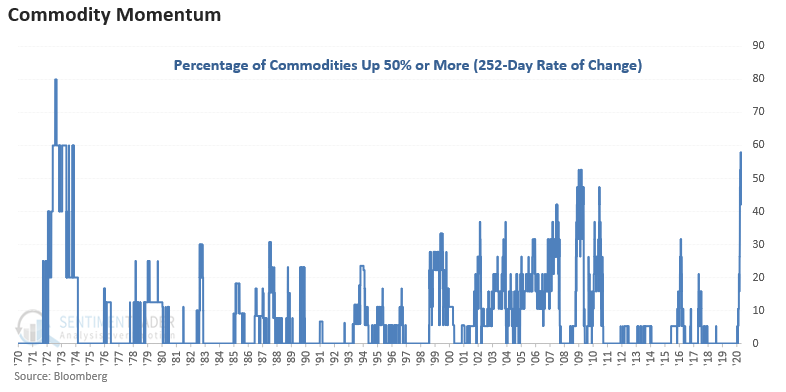
It was rarely sustainable. The tables below show each instance when the rate of change crossed above 30%.
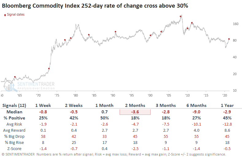
Commodities show consistent weakness across all timeframes with some notable numbers in the 2-3 month window.