TradingEdge for Feb 19 - More speculation that hasn't mattered, gold and bonds get battered


The goal of the Weekly Wrap is to summarize our recent research. Some of it includes premium content (underlined links), but we're highlighting the key focus of the research for all. Sometimes there is a lot to digest, with this summary meant to highlight the highest conviction ideas we discussed. Tags will show any related symbols and time frames related to the research.
| STOCKS | ||
| ||
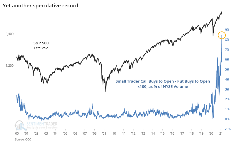
It was a mixed picture for stocks this week. We hardly need more evidence of extremes. But some of these are so extraordinary, we took a look anyway. Once again, options traders continued to get ever more aggressive.
We could point to any number of similar jaw-dropping signs, mostly redundant at this point. Speculation is at a point that is arguably beyond anything we've ever seen before.
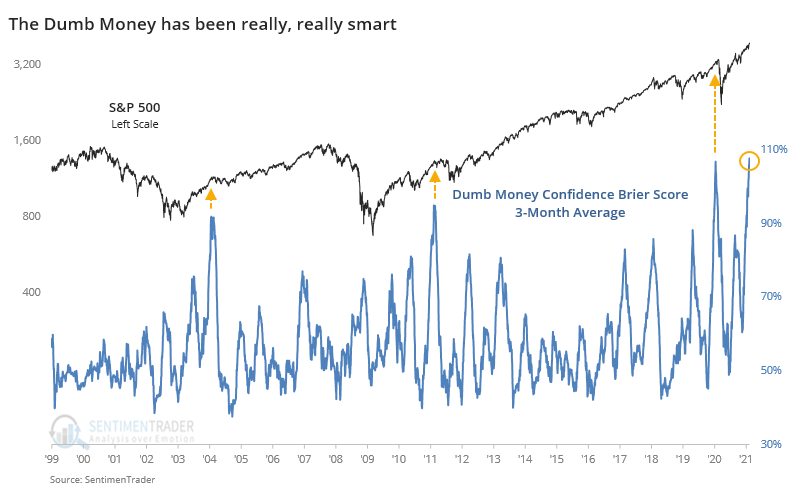
With so many indicators showing optimism, there are usually a couple of odd exceptions that suggest pessimism. This is one of those rare times, though, with more than 50% of our core indicators showing an optimistic extreme and exactly 0% showing a pessimistic one.
The "dumb money" has been smart for months now. A 3-month average of the Brier Score for Dumb Money Confidence shows that we just hit uncharted territory, meaning that the model has been failing to do what it usually does to a record degree. The only other time since we began calculating this model in 1999 that the dumb money had been so right for so long was mid-January 2020. The other high levels also led to a reckoning.
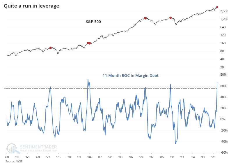
That's helped investors justify adding yet more leverage to their accounts. Margin debt has jumped more than 60% in the past 11 months, outpacing the growth in the S&P 500 by more than 20%.
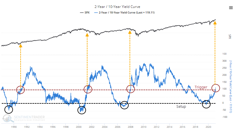
The U.S. Treasury market has seen some stiff selling pressure in recent days. As a result, the benchmark 2-year / 10-year yield curve is the steepest in almost 5 years.
Among sectors, Staples held up the best across most time frames. Technology was the only sector to show losses over the next 3, 6, and 9 months after all 3 signals, averaging -9.6%, -11.5%, and -18.7%, respectively.
Like we've seen for the past few weeks though, all of this speculative activity hasn't amounted to much, because there is still an appetite for risk, and there are only scattered signs of internal deterioration. That helps prop up all the speculation.
Dean provided an update on the Tactical Composite Trend Model, which is still positive. We're still working on getting this model and its components added to the regular site updates, but you can find some general background in the knowledge base.
Since the market is firmly in a cyclical uptrend, Deans has focused on the Risk Warning Model. As the chart below shows, the model signal count currently resides at 10%, with one out of ten components on a signal. The sentiment component is the only indicator with a warning signal, which should not be a surprise.
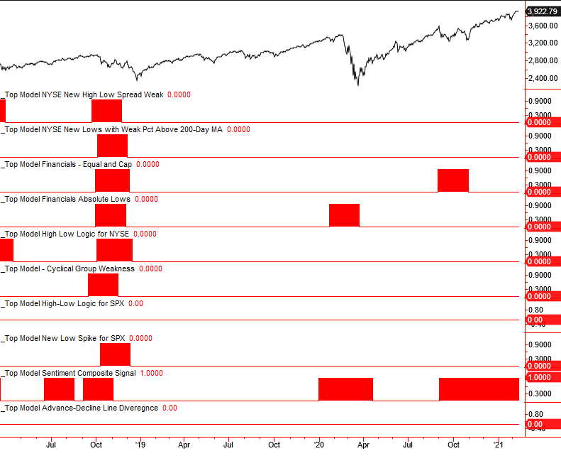
Granted, there were few warnings ahead of the collapse one year ago, but generally, we do see a rise in the count of risk warnings prior to protracted declines.
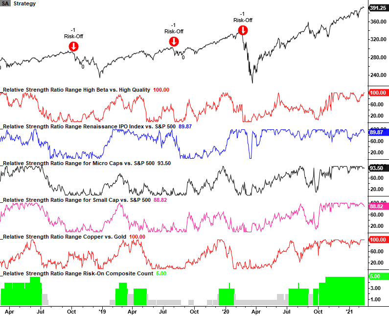
Dean also noted that the relative strength ratio rank risk-on model remains in a firm position with a composite count of five and all components in the 88th percentile or higher. The model will trigger a risk-off signal when the count falls to one or less, and the S&P 500 turns down. In the late January market dip, only one component fell below the 75th percentile. Risk appetite remains firm.
With so much volume flowing into options, Jay highlighted several important aspects of options trading.
In Part 1, he provided a quick-and-dirty explanation of delta: It roughly represents the stock equivalent position of holding the option. In other words, an option with a delta of 25 would be expected to react much like a position holding long 25 shares of stock and an option with a delta of 75 would be expected to react much like a position holding long 75 shares of stock.
In Part 2, he discussed more of an apples-to-apples comparison to highlight the reward/risk differences between buying an out-of-the-money call option and buying shares of the underlying security. Instead of comparing a 25-delta call option to 100 shares of stock he compared being long one SPY 25-delta call option versus being long 25 shares of SPY.
The chart below displays the risk curves for the two-position overlaid atop one another. The risk curve for the stock position is the black straight line; the risk curves for the option position are the orange curved line and the grey line that resembles a hockey stick.
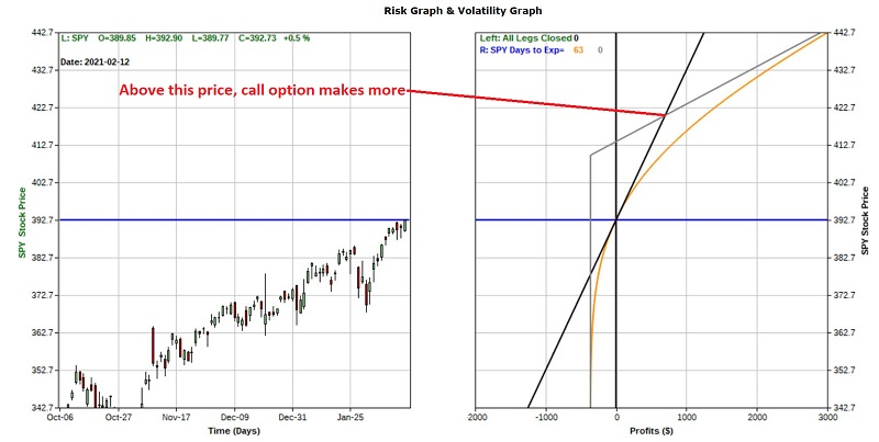
The tradeoffs are fairly easy to grasp:
- The option position costs far less to enter
- Above a certain price, the call option has greater profit potential
- Below a certain price, the call option has less downside risk
- Between those two prices, the call option has a greater potential for loss due to time decay
The question on most people's minds is "which position is better?" The answer to that question is in the eye of the beholder. Among the primary considerations when attempting to answer that question are 1) How confident you are that SPY will make the necessary price move prior to option expiration and 2) How long you want to have exposure to SPY.
Jay also showed that with all of the rampant speculation going on of late a number of traders are looking for a reversal of sorts in the near future. One expectation among those in this camp is that volatility will spike when the anticipated reversal of fortune occurs.
Ticker UVXY is a leveraged ETF that is intended to deliver twice the daily return of the VIX Index. So, for someone looking to play the long side of volatility, it would appear to be just the right vehicle, but it has major drawbacks.
Let's assume that a trader expects a spike in volatility in the next month and highlight an example trade.
The trade that we will consider combines:
- A bull call spread (long a lower strike call and short a higher strike call)
- A bull put spread (short a higher strike put and long a lower strike put)
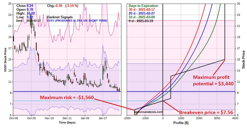
This trade has some potentially positive characteristics:
- The maximum profit potential ($3,440) is 2.2 times the maximum risk (-$1,560)
- The trade starts making money immediately if UVXY rises by any amount from its current level
- Time decay works in favor of this trade
- The breakeven price for this trade at expiration ($7.56) is actually 18% BELOW the current share price ($9.24)
- If UVXY is between $15 and $8 at expiration this trade earns a credit of $440
The risk in this trade is simply that volatility keeps falling and UVXY drops precipitously (which in all candor UVXY has been known to do on a regular basis).
| BONDS | ||
 | ||
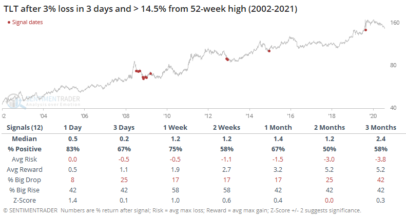
The go-to Treasury note/bond fund, TLT, has gotten hit hard the past few days, down about 3%, which is a large move relative to its typical gyrations. Losses over the past few months have driven the fund nearly 15% below its 52-week high.
Normally, we'd expect a consistent bounce-back after losses like this, especially for a vehicle that has been in an uptrend pretty much the entire 19 years it's been in existence.
After similar declines, it did have a moderate tendency to rebound over the next week or so, but it wasn't as strong of a signal as we'd like to see to suggest aggressive action.
At the same time, fund managers in the monthly Bank of America survey have given up on bonds, being more than 60% underweight.
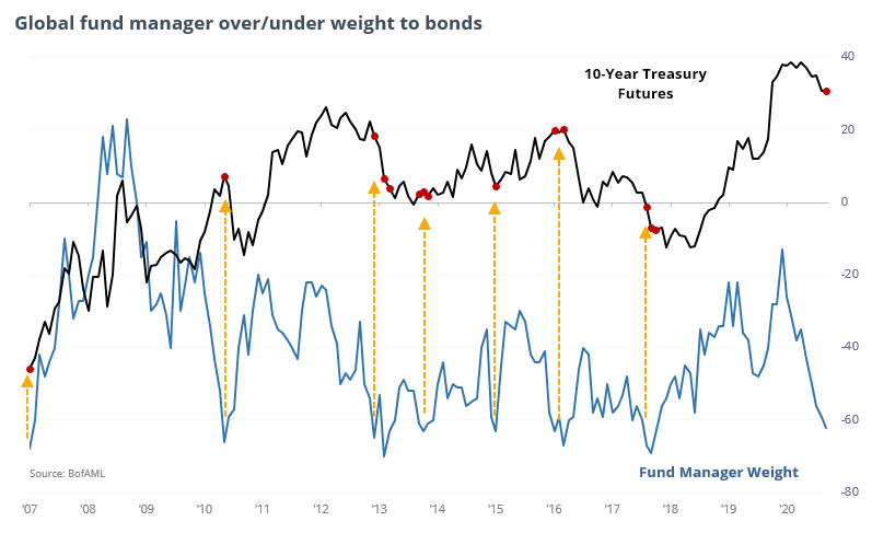
The survey has a mixed record of being a contrary indicator. It's okay, and is more contrary than not at extremes, but it's less consistent than more common ones. That's typical for big-money types of surveys.
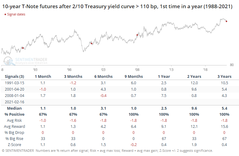
Even though notes and bonds have been selling off and it has triggered a rapid steepening in the yield curve, the past few similar cycles have not seen much damage in 10-year Treasury note futures afterward.
| COMMODITIES | ||
 |  |  |
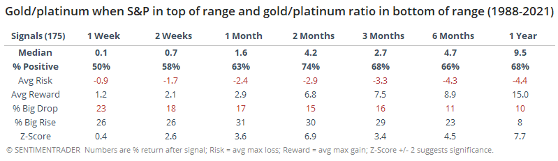
Gold has had a tough 2021, even when measured against some other metals. So much so that the ratio of gold to platinum has plunged to its lowest level in years.
Out of 175 days that met these criteria, forward returns in the S&P were subpar but not consistently so, especially after the first couple of months. Up to 3 months later, risk was higher than reward, which is fairly unusual given the uptrend in stocks since 1988. So, there's a bit of support for the argument that this is negative, or at least "not positive," for stocks.
That means that between the two metals, forward returns favored gold over platinum. The ratio of gold to platinum rose over the next 2 months 74% of the time, with an abnormally positive average return.
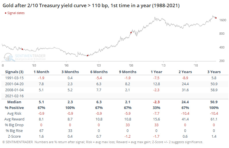
Among major assets after the yield curve starts to normalize, gold held up best - over the next 2 years, its average drawdown was -10.4% versus an average maximum gain of +41.4%.
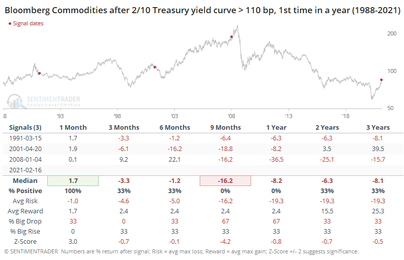
 Commodities, in general, have not fared nearly as well.
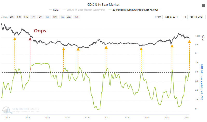
Gold and gold miners seem to be at a make-or-break point. Fewer than 40% of miners now have a rising 200-day moving average, and over the past month, an average of more than 80% of them have been mired in bear markets. This has typically been about it for corrections...except when it's not, and that tends to be very bad for this group.
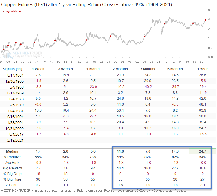
Copper has been getting more attention than arguably any other commodity in recent days, and for good reason. Dean pointed out that it has now jumped nearly 50% in the past year.
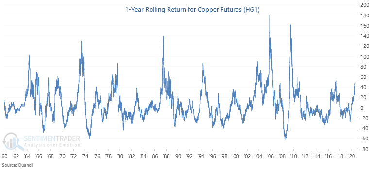
This has been a good sign for risk assets in general, but for copper itself in particular. Seems counter-intuitive given the massive gains already, but the momentum tended to keep rolling, with one major exception in 1968.