
TradingEdge for May 21 - Mixed Stocks, Tech Troubles, Gold Tries Again

The goal of the Weekly Wrap is to summarize our recent research. Some of it includes premium content (underlined links), but we're highlighting the key focus of the research for all. Sometimes there is a lot to digest, with this summary meant to highlight the highest conviction ideas we discussed. Tags will show any symbols and time frames related to the research.
| STOCKS | ||
 |  |  |
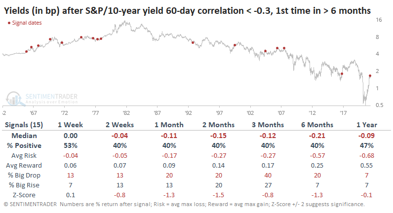
When stocks have been falling, bonds haven't provided much of a haven. And it's scaring some investors that held ingrained beliefs about the nature of the two assets to backstop each other.
Over the past 60 days, the correlation of daily changes between the S&P 500 and 10-year Treasury yields has turned decidedly negative. This means that on days when the S&P fell, note yields often rose, meaning bond prices declined along with stocks. When both stocks and bonds fall together, then a large part of most investors' portfolios take a hit.
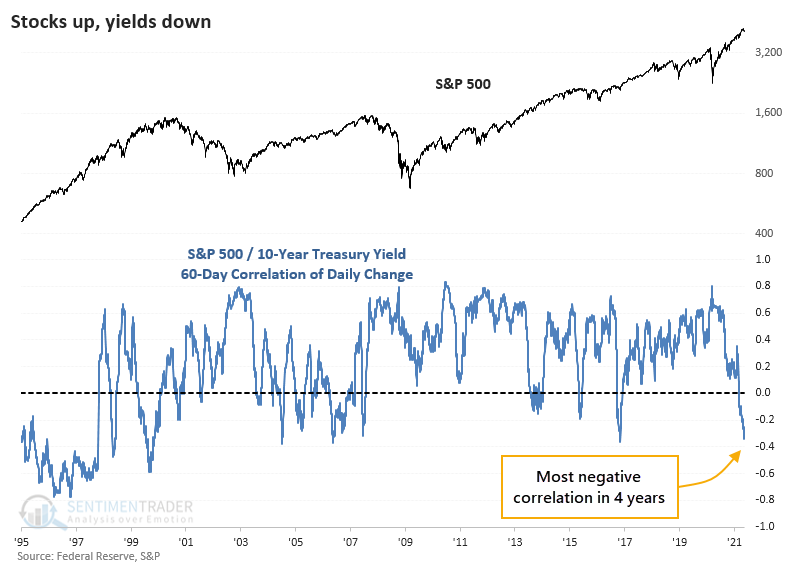
As for the implications, the table below shows future returns in the S&P 500 once the correlation between it and note yields fell to -0.3 for the 1st time in at least 6 months. This was relatively common before 1978, then didn't happen even once until 1992.
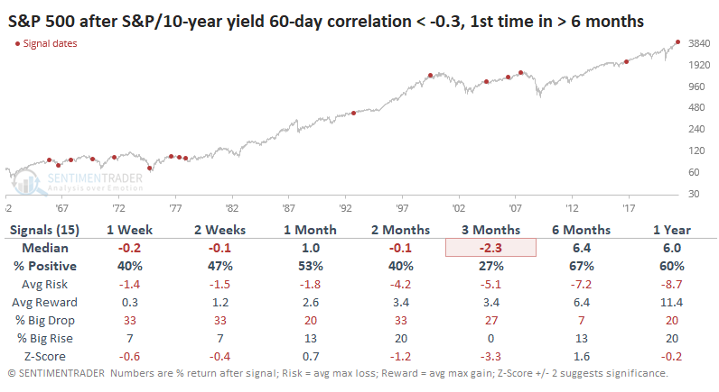
Financials showed a positive return 60% of the time over the next 3 months, while Discretionary stocks only had a 27% win rate.
When we look at risk parity strategies, medium-term returns were mixed. There were a couple of losses, a couple of gains, and a non-event. But over the next 6-12 months, risk parity rebounded every time.
ANOTHER HISTORIC TREND
The bears tried. They failed.
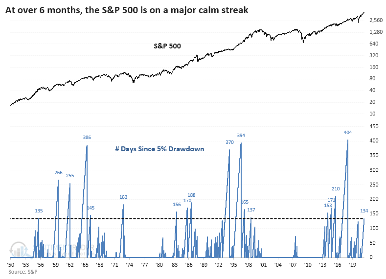
Once again, sellers failed to push the S&P 500 down even 5% from its peak. It got close last week but held above that threshold. The index has now gone more than 134 trading days without a 5% pullback. That's the 18th-longest streak since 1928, and it would take only a few more days to push it into 15th place.
Once it got this extended, the S&P's returns over the next month were poor. Even up to 3 months later, its risk outweighed its reward. But when buyers have been so persistent, they didn't give up easily, and there were few large declines to speak of.
The Risk/Reward table highlights those signals when the index fell more than 10% from the signal date. Only 2 out of the 17 signals suffered that fate within the first 3 months. Within the next year, 6 of the 17 suffered at least a 10% drawdown, though only 1 extended to 20%.
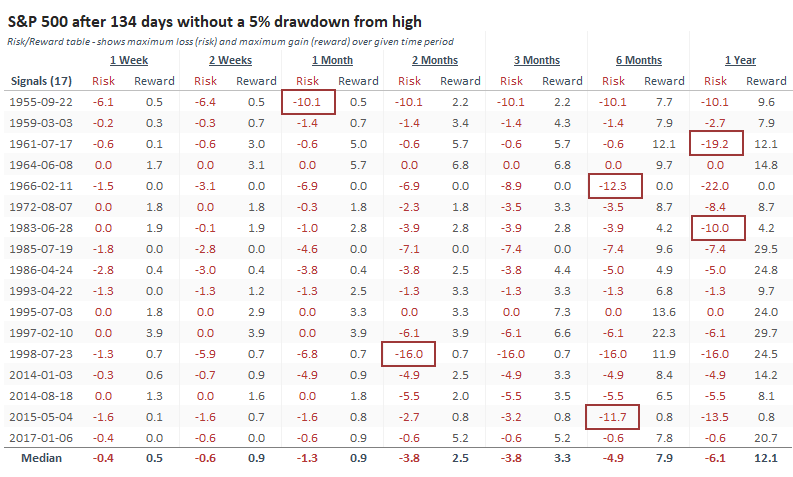
We've seen time and again in recent weeks (and months) that momentum like we've witnessed so far in 2021 has a habit of preceding choppy medium-term conditions. Such intense buying interest typically doesn't dry up for long, and 6-12 month returns tend to be above average.
EVEN SO, OPTIONS TRADERS ARE HEDGING
Stocks are holding up pretty well, especially in the broader market, yet options traders are getting nervous.
Small options traders have spent 22% of their volume buying put options to open, tied for the 2nd-largest amount since last July.
This rise in put volume - both buying and selling - has pushed the De-Trended version of the Equity Put/Call Ratio ratio above 20%. This has preceded a very favorable annualized return since 1997.
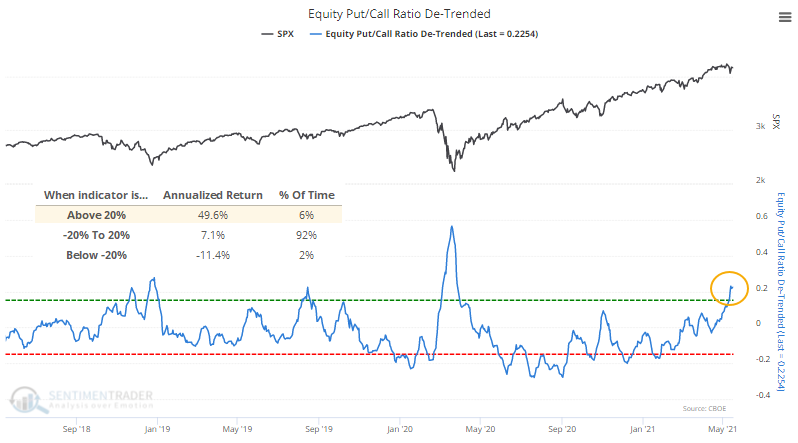
What's especially notable about the current instance is that it triggered while the S&P was within 1.5% of a 52-week high. The only other times that's happened were early December 1997 and late June 1998. The former preceded short-term weakness then medium-term strength. The latter showed the opposite.
Looking for times when the ratio got this high with the S&P within 5% of a peak, returns were mixed.
The biggest risk is that after the massive speculative bubble reached in February, we could be heading into a larger corrective phase, in which case a modestly high put/call ratio won't help at all. The biggest clue to that will be how markets react to the current display of modestly high hedging activity in options. If buyers aren't interested and stocks continue to struggle, it will increase the probability of a larger trend change afoot.
RISK-OFF MODELS ARE STILL MOSTLY "RISK-ON"
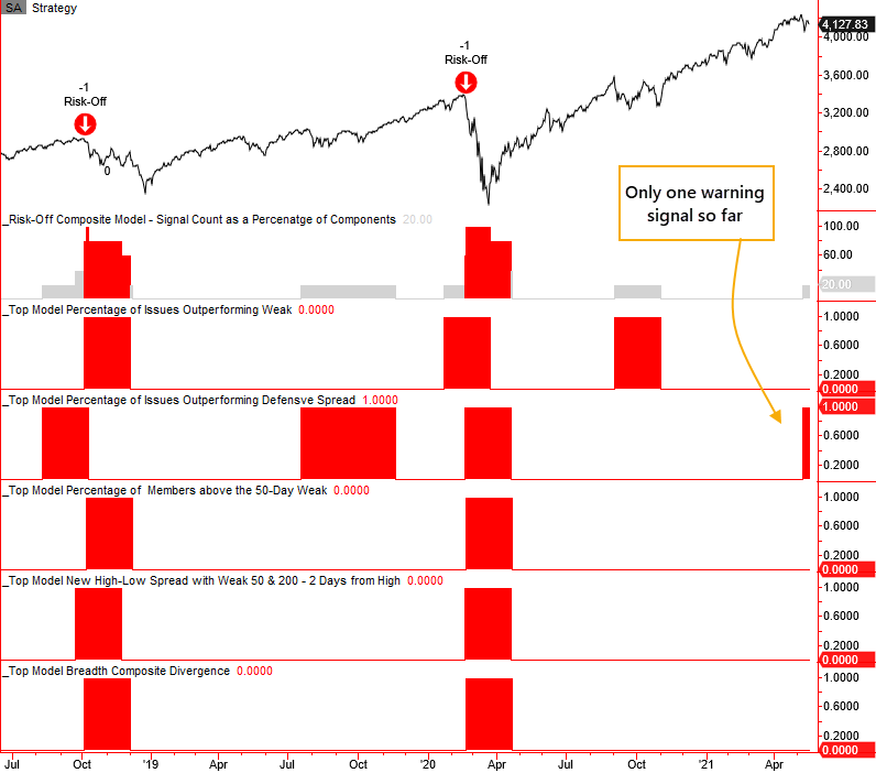
Dean shared a Risk-Off model that incorporates several of the other similar models he's updated recently. This is now updated regularly on the Spotlight on Trend (TCTM) page.
While the models are suitable as a standalone tool, he likes to use a weight-of-the-evidence approach as a single model is more susceptible to whipsaws. A new composite model that contains five risk-off models for managing market exposure is shown below.
Currently, only 1 out of the 5 different models is in risk-off mode, meaning the Composite is at 20%. There is a higher risk of a sustained market decline when the Composite reaches 60%, so as of now, we're unlikely to get a risk-off signal soon.
STOCKS AND SECTORS - TECHNOLOGY TRENDS ARE STILL POOR
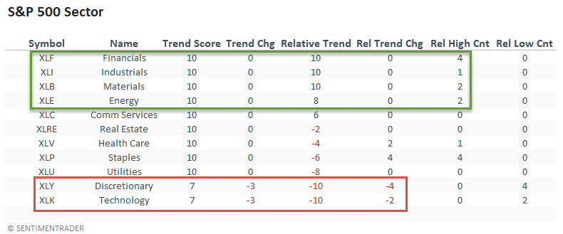
Dean updated his look at absolute and relative trends for domestic and international ETFs.
The relative trend backdrop continues to favor value/cyclical groups. Financials had a solid weak with the sector registering a new relative high on 4/5 days. For the first time since 2016, the relative trend score for technology and discretionary groups simultaneously registered a reading of -10.
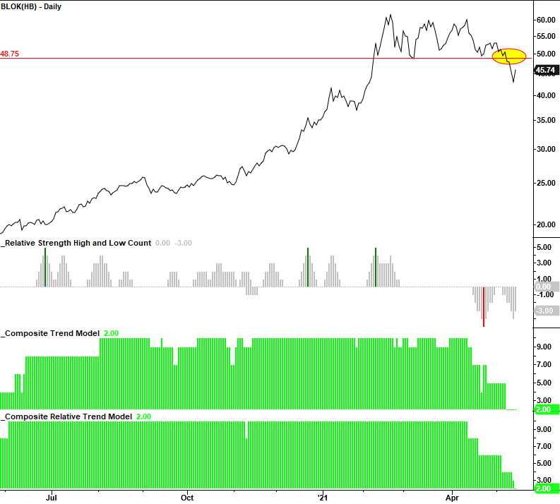
The Amplify Transformational Data Sharing ETF completed an intermediate-term top last week. Watch the breakdown pivot point at $48.75. If it fails to recover above that level, take note. The ETF is a good proxy for Bitcoin and other digital assets.
Jay looked at inflation's impact on the Technology sector.
To say that technology has taken the world by storm in the past 25 years would be an understatement. No one knows for sure what the future holds. However, history has shown that technology stocks have not performed well when inflation reaches a certain level.
For testing purposes:
- The 12-month change in PPI >= +10% = bearish for technology stocks
- The 12-month change in PPI < +10% = bullish for technology stocks
The chart below displays the cumulative % +/- for the technology sector ONLY during those months when the previous month ended with the 12-month change in the Producer Price Index at +10% or higher. In all, the S&P 500 Technology sector has lost over 44% when the PPI was over +10%.
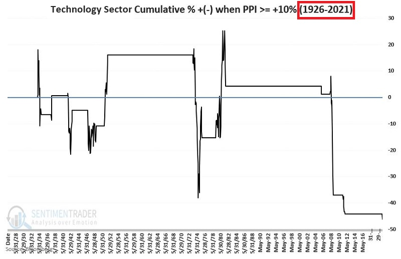
Does this mean that tech stocks are "doomed" to fall? Not at all. There are obviously many other factors in play that can and will affect the fortunate of the technology sector as a whole. Still, the results above suggest investors pay close attention to their technology stock holdings if the recent uptick in inflation persists.
STOCKS AND SECTORS - AT LEAST APPLE LOOKS INTERESTING
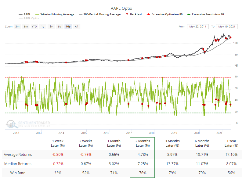
Jay looked at a setup in Apple and an educational look at how a trader could use options.
Let's assume that we get a buy signal for AAPL from a trading system. What we "should" do is buy 100 shares of AAPL at $124.85 (or $12,485 for 100 shares of stock).
As an example, let's consider the following setup:
- AAPL is above its 200-day moving average
- The 5-day average of our Optimism Index for AAPL crosses above 32
The chart below shows AAPL with the signals for the last 3 years per our Backtest Engine.
Now let's further assume that while we have a buy signal in hand, we also have some doubt that the stock will be able to break out to the upside and/or concern that the stock will either decline in the short-term or hit resistance at the recent high and then reverse lower.
These doubts and concerns might keep us from buying the stock. So, let's look at a strategy that will allow us to 1) Participate on the upside if AAPL rises in price, 2) Limit our downside risk if AAPL decline in price and 3) Most likely end up buying shares of AAPL.
With AAPL trading at $124.85 a share, this example trade involves selling an in-the-money put and buying an out-of-the-money one of the same expiration.
The risk curves for this particular trade appear in the chart below.
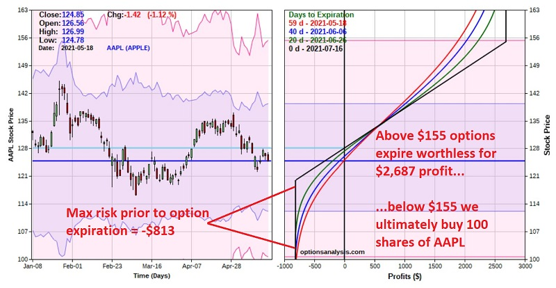
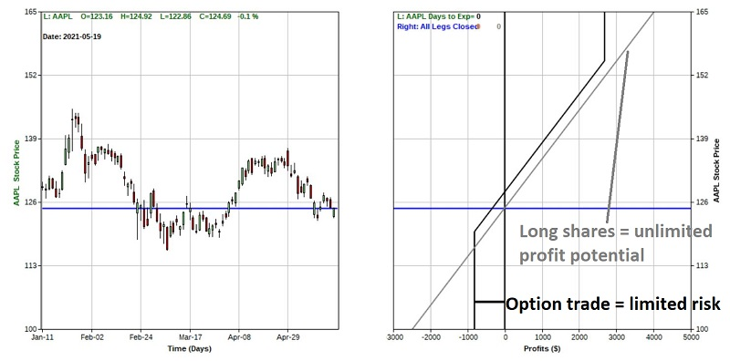
To fully appreciate the relative pros and cons of this options-based approach, let's compare the reward/risk tradeoff for this trade to that of buying 100 shares of AAPL at $124.85 as we originally intended to do. The chart below overlays the risk curves for the option trade with the risk curve for buying 100 shares of AAPL at $124.85.
The primary differences are:
- The stock trade has unlimited profit potential above $155 a share and unlimited risk to the downside
- The option trade has limited risk below $120 a share and limited profit potential above $155 a share.
Which is the better approach? That is in the eye - and mind - of the beholder/trader when a trade is called for.
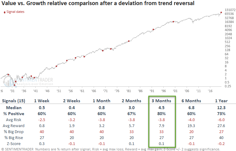
STOCKS AND SECTORS - VALUE IS STILL A RELATIVE BARGAIN
We've shared several notes in the last few months that have suggested a bias toward value-oriented sectors. Dean updated the trend in Growth versus Value to assess whether the backdrop has changed.
This past week, the 1-year deviation from the trend for the growth/value relative ratio indicator crossed below -10%. One has to go back almost two decades to find the last reading below this level.
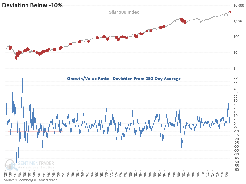
After other extremes in this ratio, Value continued to look good on a relative basis versus growth, especially in the 3-month timeframe.
STOCKS AND SECTORS - TAIWAN VOLATILITY SIGNAL
Dean looked at a signal in Taiwanese shares, which recently saw a jump in stocks trading below their lower Bollinger Bands.
The Bollinger Band signal seeks to identify instances when many Index members trading below their respective lower Bollinger Band cycles from a high to a low percentage, and Index momentum turns positive.
While the most recent signals on the chart look good, the overall trading statistics exhibit below-average metrics. Mean-reversion systems can suffer during bear market periods that exhibit several counter-trend rallies. The 2007-08 market was a notable example.
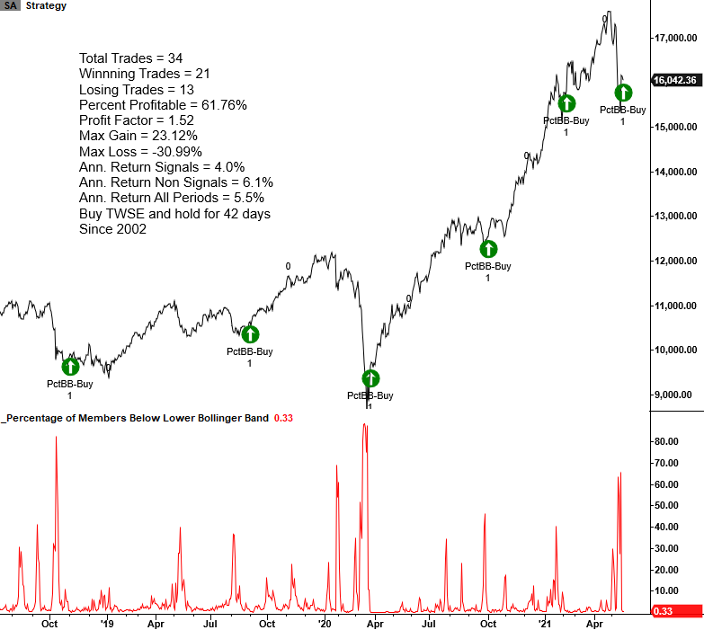
The Bollinger Band mean reversion buy signal works better on some indexes than others. Taiwan has been a less than stellar mean-reversion market. If one applies the signal to the Taiwan ETF (EWT), the results are weaker.
We now have two mean reversion buy signals for the Taiwan market (the other was a spike in 4-week lows), but as always, it's better to see a turn in momentum before dipping a toe in the sand.
| BONDS | ||
 | ||
As noted above, over the past 60 days, the correlation of daily changes between the S&P 500 and 10-year Treasury yields has turned decidedly negative. This means that on days when the S&P fell, note yields often rose, meaning bond prices declined along with stocks. When both stocks and bonds fall together, then a large part of most investors' portfolios take a hit.
This proved to be a relatively weak setup for stocks. For bonds, yields tended to decline as well, meaning that bond prices had a modest tendency to rebound.
| COMMODITIES | ||
 |  |  |
GOLD TRIES A TREND CHANGE
For the first time in months, gold is back in an uptrend.
Gold finally punched above its 200-day average for the first time since the start of February. That ends the longest stretch below the 200-day since late 2018. After it regained its average, it rallied for another couple of months before giving almost all of those gains back and then finally managed to roar ahead.
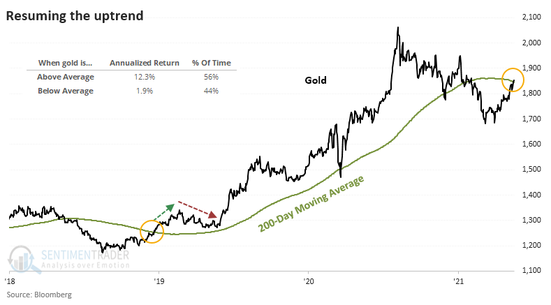
It's certainly better to be holding gold when it's above-trend than not - since 1975, the metal showed an annualized return of +12.3% when above the 200-day average versus only +1.9% when below.
We've seen before that gold tends to be trendy, and attempted reversals in long-term trends aren't very sticky. The table below shows what happened to gold after it ended other multi-month streaks below its 200-day. Medium-term returns weren't kind.
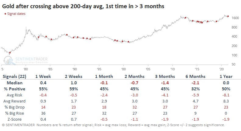
Over the next 6 months, gold showed a positive return only 32% of the time, and all the other stats were poor. We place more weight on recent occurrences, though, and there's some solace there for gold bulls. Each of the last four signals led to more gains for gold.
There was a +0.36 correlation (from a scale of -1.0 to +1.0) between the return on gold over the next 2 weeks and the return over the next year. That suggests that if gold bugs are especially eager and willing to keep buying gold at higher prices, it bodes well longer-term.
There was a +0.43 correlation between returns over the next 2 weeks and the return over 12 months for gold mining stocks. If buyers are even more interested in miners in the short-term, the probability increases that we could see one of those double-digit 6-month gains.
URGENT DEMAND FOR NATTY
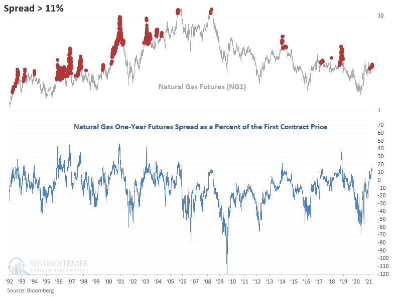
Dean pointed out an extreme in the term structure of natural gas.
As shown in the chart below, the natural gas futures spread has reached one of the highest levels in the last decade. Spread levels above 11% percent have been less frequent since 2004, roughly coinciding with the advent of fracking.
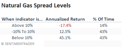
As shown in the table below, spread readings above 10% suggest poor annualized returns. If the indicator increases above 20%, watch out below because then returns got appreciably worse.
This extreme in the term structure is triggering just as natural gas is about to enter a weak spot in June - July. The latter has been especially weak, particularly in the last eight years.
A LONGER-TERM CASE FOR COMMODITIES IN GENERAL
Jay looked at a case for commodities in the coming year(s).
Let's first consider the relative performance of stocks versus commodities. For stocks, we use the S&P 500. The Bloomberg Commodity Index is designed to track a basket of physical commodities to track the performance of commodities as an asset class. The components and weightings are determined by Bloomberg and can and will change slightly from year to year.
The chart below displays the growth of $1 invested in stocks divided by the growth of $1 invested in commodities on a buy-and-hold basis since 1933.
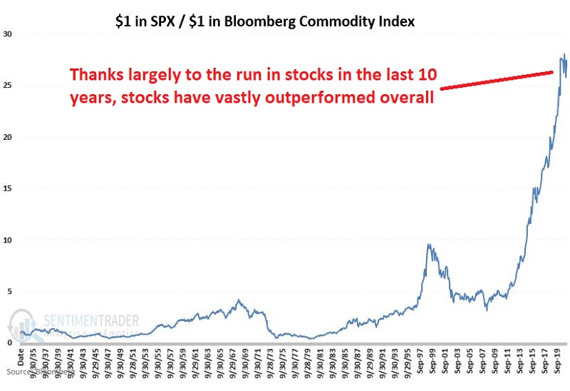
On the face of it, it's no contest - stocks win handily.
In Part II, Jay looked at a simple switching system between the two markets.
The system uses a 15-month exponential moving average of the ratio between the Bloomberg Commodities Index and the S&P 500. If the ratio is above the moving average, hold commodities during the next month; if below, hold stocks.
The chart below displays the Commodities/Stocks ratio (Variable C) along with its 15-month EMA (Variable D)
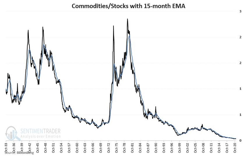
The value has been favoring stocks for almost 10 full years, but the gap has been narrowing of late and may soon exceed 0 once again. That's when we'd favor commodities for the next month.
Jay compared this switching approach to splitting money 50/50 between commodities and stocks and rebalancing at the beginning of each new calendar year. All results are hypothetical and include price-only returns (not total return including dividends). They DO NOT include any deductions for trading costs such as slippage and commissions.
As a benchmark, $1,000 invested buy-and-hold:
- In commodities = $17,478
- In stocks = $466,648
- Splitting 50/50 between commodities and stocks and rebalanced at the start of each year = $177,615
- Switching based on the system described above grew to a hypothetical value of $2,461,956
The chart below displays the hypothetical growth of the "switching" strategy (in black) versus the "50/50 split and rebalance" strategy (in blue).
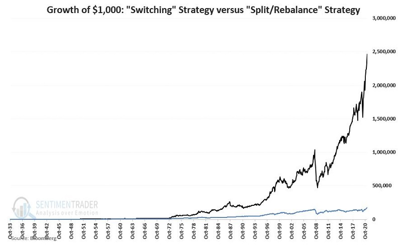
With some of the monster moves in commodities lately, it's worth paying attention to the possibilities in markets outside of just stocks, especially if momentum between them starts to see a sustained shift.