
What I'm looking at - small caps vs. large caps, corporate earnings, bonds, daily swings, RV's
The stock market continues to swing back and forth. Here's what I'm looking at:
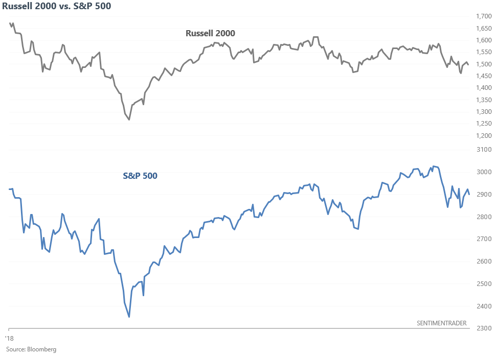
Small vs. large caps
Small cap stocks were relatively weak during the Q4 2018 stock market selloff, and have been relatively weak since February. While the S&P 500 has been trending sideways/higher, the Russell 2000 has been trending sideways/lower.
Many market watchers have noticed this over the past few months and expressed concern. The idea is related to breadth: i.e. "in order for the rally to be healthy, small caps must participate". There is some merit to this. The S&P:Russell ratio was trending higher in 2007, just before the bull market ended.
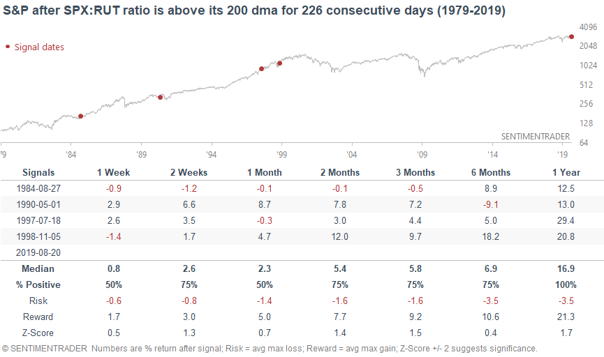
When comparing large caps vs. small caps, we can look at the S&P:Russell ratio vs. its 200 dma. When this ratio continues to be above its 200 dma, it implies that large caps continue to outperform small caps (e.g. right now).
This ratio has been above its 200 dma for 226 consecutive days. From 1979 - present, there have been 4 other streaks this long. 1 of them did precede a recession (May 1990). Here's what happened next to the S&P.
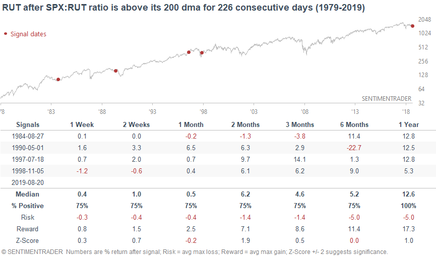
Here's what happened next to the Russell 2000.
A sample size of 4 is small, so let's relax the parameters. Here's what happened next to the S&P when the S&P:Russell ratio was above its 200 dma for 7 months.
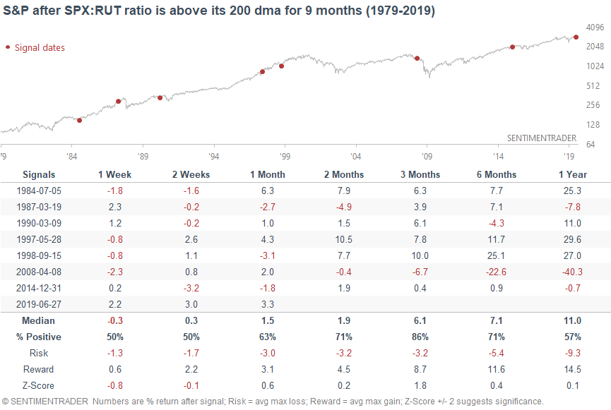
There were a few problems (2015, 2007, 1990). But there were also plenty of false signals.
Why the divergence between small caps and large caps?
It's important not to confuse correlation with causation. So while small cap weakness may have preceded the 2007 bull market top, it might not be the CAUSE of the 2007 bull market top.
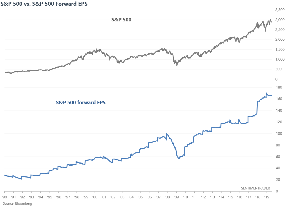
So from a fundamental perspective, why have small caps underperformed? Here's the S&P 500 (large cap stocks) vs. its forward earnings.
Here's what S&P 600 (small cap stocks) vs. its forward earnings.
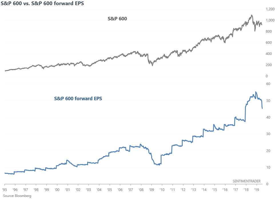
As you can see, large cap earnings expectations have been flat over the past few months while small cap earnings expectations are falling. There are many potential reasons for small caps' fundamental weakness. Some that Market Watch cited are:
- Small cap companies are struggling with rising costs (labor, supplies, services).
- Many small cap companies are in finance sector, which has lagged.
The price is reflecting this concern. While the stock market and corporate earnings do not move in sync on a day-to-day or even month-to-month basis, the two generally move together from a long term perspective.
When it comes to looking at economic indicators, it's better to apply a moving average to smooth out erratic swings. That way we can see the real underlying trend and filter out some of the false bearish signals.
The following chart demonstrates what happens if you:
- Buy and hold the S&P 500
- Buy the S&P 500 when the S&P 500 forward EPS' 52 week average is going up. Otherwise, shift into cash.
- Buy the S&P 500 when the S&P 500 forward EPS' 52 week average is going up. Otherwise, shift into the Bloomberg Barclays US Aggregate Bond Index
- Buy the S&P 500 when the S&P 500 forward EPS' 52 week average is going up. Otherwise, shift into Bloomberg Barclays US Corporate Bond Index
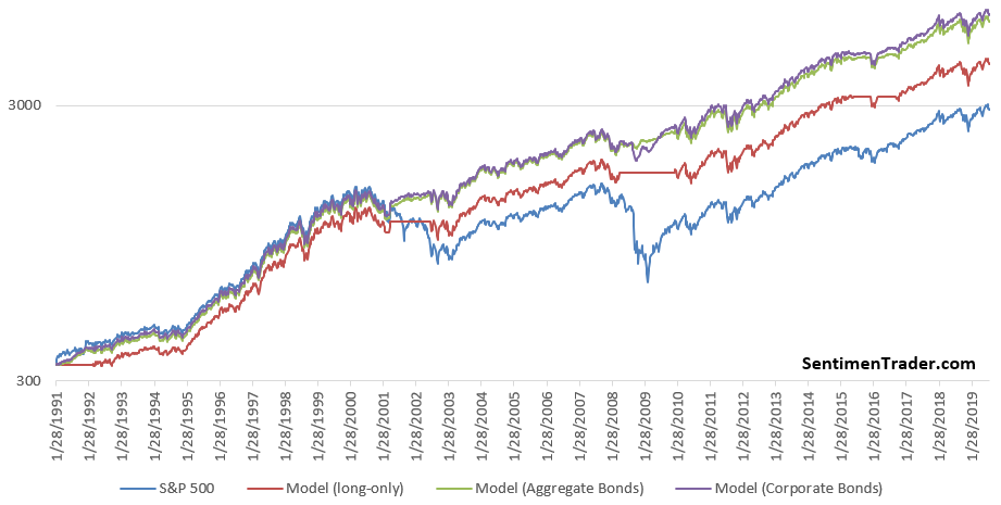
As you can see, this fundamental trend following strategy beats buy and hold by avoiding big bear markets, which mostly coincide with recessions and earnings weakness.
This strategy remains on a BUY for the S&P 500 right now.
The next chart demonstrates what happens if you:
- Buy and hold the S&P 600
- Buy the S&P 600 when the S&P 600 forward EPS' 52 week average is going up. Otherwise, shift into cash.
- Buy the S&P 600 when the S&P 600 forward EPS' 52 week average is going up. Otherwise, shift into the Bloomberg Barclays US Aggregate Bond Index
- Buy the S&P 600 when the S&P 600 forward EPS' 52 week average is going up. Otherwise, shift into Bloomberg Barclays US Corporate Bond Index
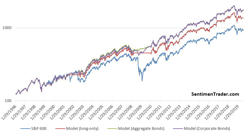
This strategy is on a SELL for the S&P 600.
The importance of earnings
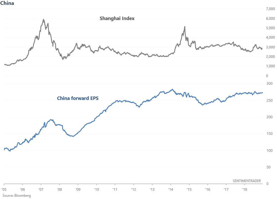
One last word on corporate earnings. This isn't quantitative analysis, but nevertheless I find it fascinating. European and Chinese stocks have underperformed U.S. stocks over the past 10 years, despite being consistently cheaper. There are many reasons for this, and the following charts highlight an interesting one.
This chart compares the Shanghai Index with Chinese stocks' forward earnings estimates.
This chart compares the Euro Stoxx 50 (Eurozone index) vs its forward EPS.
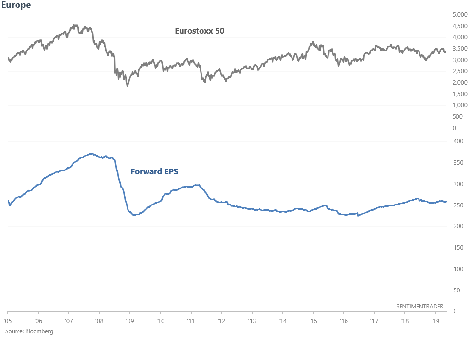
Earnings matter. Both Chinese and European earnings have generally gone nowhere since 2011. Hence relative weakness in their stock markets.
Bond surge
Much digital ink has been spilled over the global collapse in interest rates. When the stock market crashes, you usually see a lot of analogue charts that compare the S&P with *insert historical market crash*, e.g. "the stock market today looks just like 1987". But you don't quite see this for bonds "e.g. the bond market today looks just like 2008".
Most of these "today looks just like..." charts don't make a lot of sense, because the scales are squeezed, compressed, and changed. Doing so allows one to create whatever narrative he/she wants to believe. So to objectively create an analogue, it's better to look for high correlation cases.
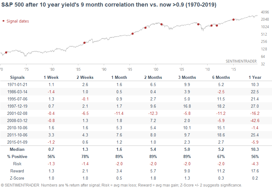
The 10 year Treasury yield has collapsed over the past 9 months. I took this 9 month period and compared it with other 9 month historical periods. Here are the other 9 month historical periods that have a correlation of greater than 0.9 vs. today.
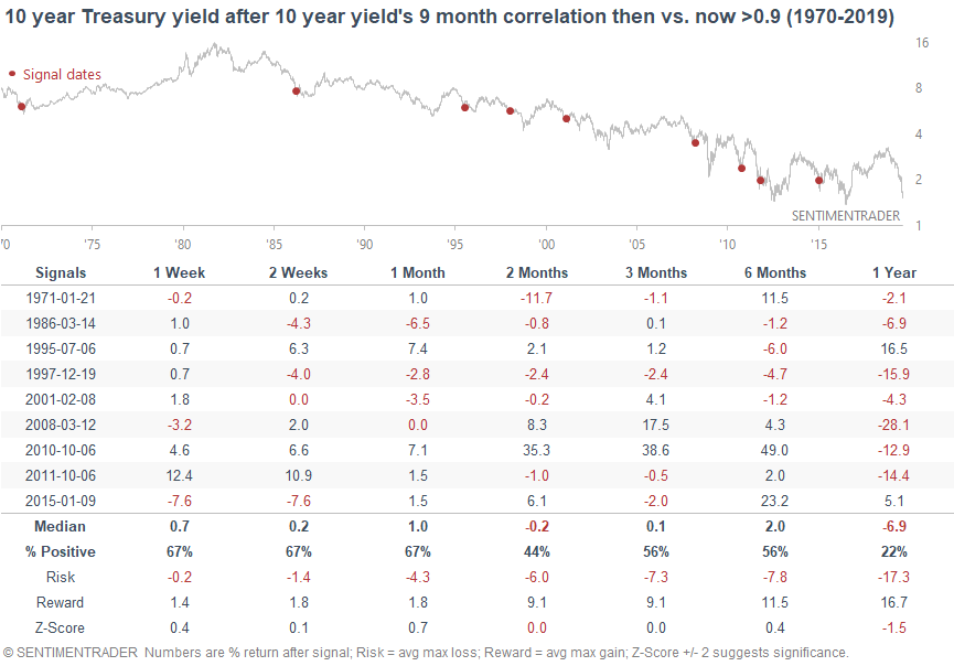
We can note something interesting here. While the 10 year yield does eventually bounce sometime in the next few weeks/months, it usually goes lower over the next year. Extreme cases often see a divergence before making a long term reversal. So perhaps yields will bounce (bonds will fall), and then make new lows?
Seems hard to believe with Treasury yields at multi-year lows. But then again, the headlines are screaming about negative interest rates. What was once unthinkable is now the norm.
And in case you're wondering, this hasn't been consistently negative for the S&P over the next few months, although there were a few long term worrisome cases (2015, 2008, 2001).
Choppy days
The stock market has been choppy recently. Up 1%, down 1%, up 1%, down 1%. But overall going nowhere. As a result, the NYSE Up Volume / Down Volume ratio has been choppy as well. Stocks surge today, most volume flows into issues that went up. Stocks plunge today, most volume flows into issues that went down.
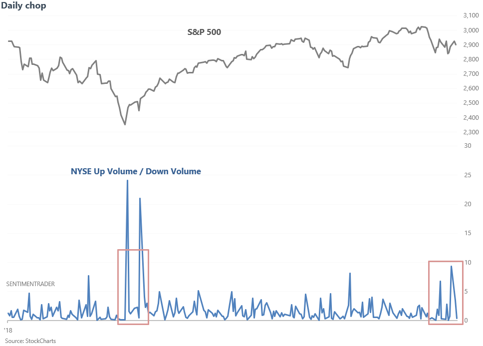
The last time this ratio was so volatile (defined as "15 day standard deviation") was during the December/January stock market bottom. Does this mean that the stock market's bottom is in? Here's what happened next to the S&P when the Up/Down Volume ratio's 15 day standard deviation exceeded 2.65 (rather high), while the S&P was above its 200 dma (in a long term uptrend).
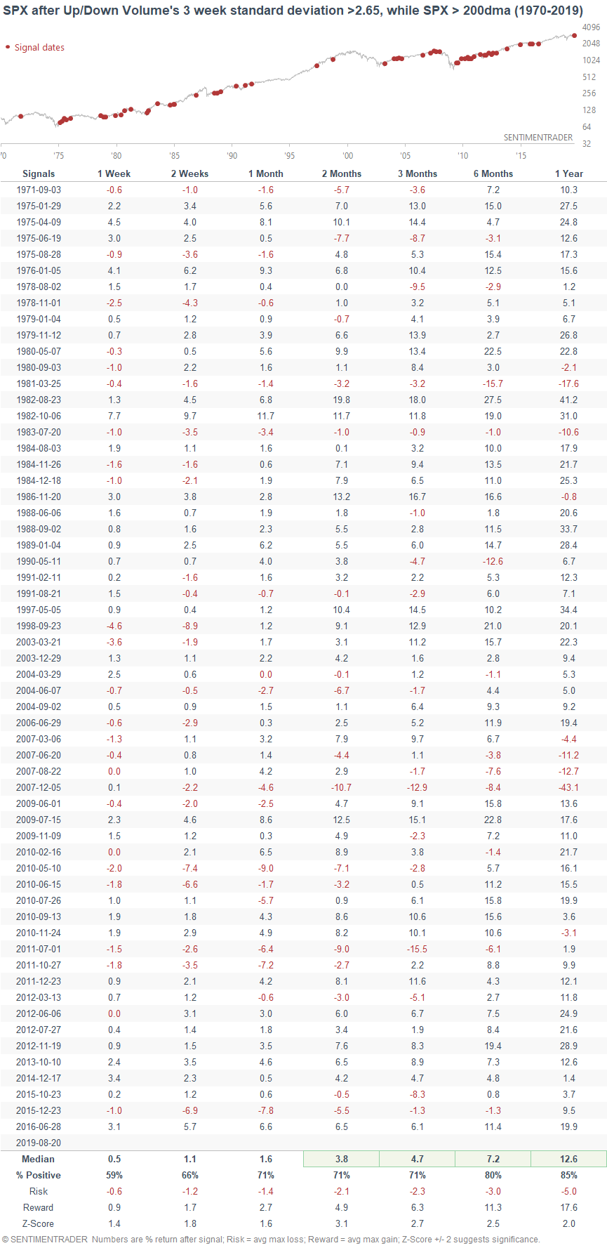
The S&P's forward returns over the next 1-2 months are slightly more bullish than random. This isn't extremely more bullish than random, but it's hard to get "up 85% 1 month later" on stats that have a sample size of 60.
RV's
And lastly, the WSJ noted that RV shipments are down 20% so far this year after falling -4.1% last year. This is concerning (or so the thinking goes), because every other 2 year decline in RV shipments coincided with a recession (1990, 2001, 2008).
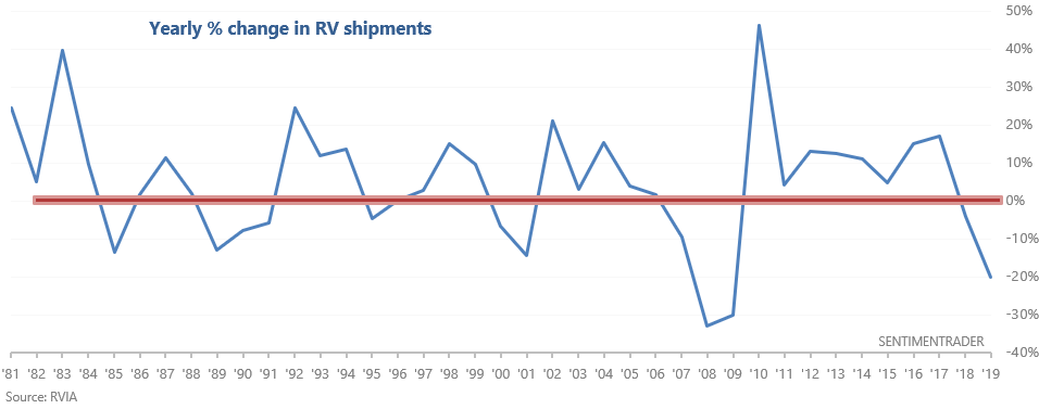
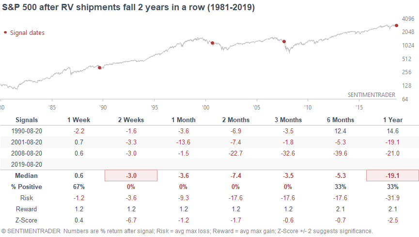
Would I be concerned about this? Probably not. I wouldn't use RV shipments to gauge the health of the broad U.S. economy, especially when there are plenty of other more encompassing economic indicators. Nevertheless, an interesting indicator.