
What I'm looking at - VIX Put/Call, ISM vs S&P, USD trend, small cap earnings
With stocks having fallen over the past 2 days, here's what I'm looking at:
VIX Put/Call
As the stock market tanked yesterday, VIX and its Put/Call ratio spiked.
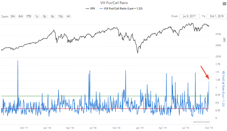
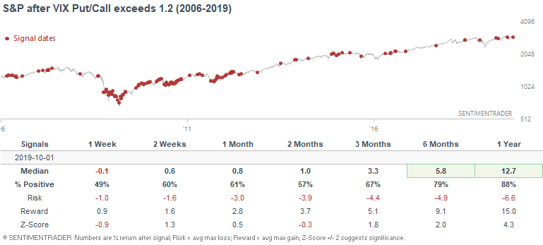
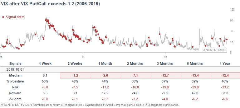
If we just look at all 134 historical cases in which the VIX Put/Call ratio exceeded 1.2, the S&P's 6-12 month forward returns were more bullish than random, and VIX's forward returns were more bearish than random on almost every single time frame.
*I have hidden the historical cases to shrink the size of this image (134 rows). If you want to see the historical cases, please click here.
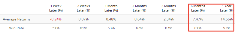
Here's what happened next to the S&P:
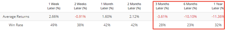
Here's what happened next to VIX:
In his description, Jason suggested that it's better to apply an average to the VIX Put/Call ratio. I.e. it's a more consistent sign when the VIX Put/Call ratio is consistently high. And it has been. Here's a 5 day average of the VIX Put/Call ratio:
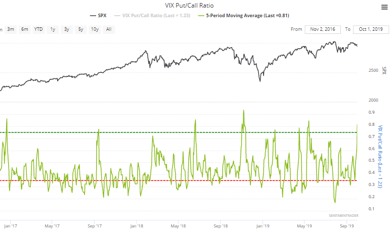
If we look at cases in which the 5 day average crossed above 0.8 (e.g. right now), the S&P's returns become more bullish, and VIX's returns become more bearish.
Here's what happened next to the S&P:
Here's what happened next to VIX:
ISM manufacturing vs SPX
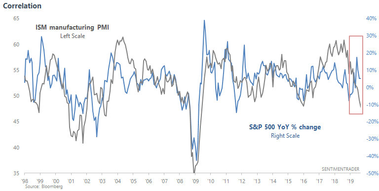
Plenty of market watchers like to compare the ISM manufacturing PMI with the S&P 500's X-month rate-of-change. For example, some will compare ISM against the S&P's 6 month rate-of-change, others will compare the ISM against the S&P's 9 month rate-of-change. The end result is the same: the tight correlation between these 2 data series should "prove" that the S&P is about to crash because the ISM manufacturing PMI has tanked. Here's an example:
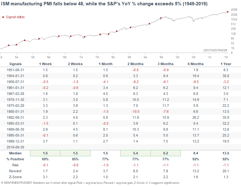
Let's take a look at the data. The following table illustrates what happened next when the ISM manufacturing PMI fell below 48, while the S&P's YoY change exceeded 5%:
As you can see, this divergence in no way "proves" that the S&P is about to crash. So what's the problem with these correlation-based charts?
- Correlations work until they don't, which is to say that correlation is not causation.
- Specifically, this correlation has existed post-1998 because the S&P 500 has been much more choppy post-1998 than pre-1998. The ISM manufacturing PMI is meant to hover above/below 50 (i.e. it's meant to be choppy). From 1998-present, we had a 2000-2002 bear market, a slow 2003-2007 bull market, a 2007-2009 bear market, and another choppy 2009-present bull market. Hence, the S&P's YoY % change is choppy, which makes it closely correlated with range-bound indicators like the ISM manufacturing PMI.
- However, the stock market was much less choppy in previous decades e.g. 1950s, 1980s, 1990s. This correlation does not exist in a market that's trending strongly.
Moral of the story: zoom out on charts. Beware of correlations, especially if the correlation is fitted to a specific period in time that supports recency bias (e.g. 2000-2019 has been much different from 1980-2000, 1980-2000 was very different in terms of price action from 1960-1970). "Recency bias" doesn't just include the past 1-2 years. It includes the past 10-20 years. Hence why it is so hard to detect. "Recency bias" over 10-20 years doesn't quite feel "recent", because 20 years is half a person's career.
Anyways, here's a longer term look at this chart. Do you spot the correlation pre-1998?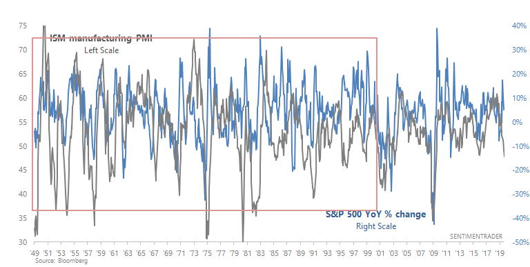
In case you haven't already, I highly suggest you read Jason's take on the ISM manufacturing report.
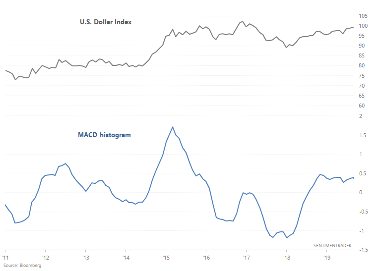
U.S. Dollar
The U.S. Dollar continues to grind higher. Possible reasons include:
- Interest rate differentials (between the U.S. and other countries)
- Trade war
- Relative economic strength (between the U.S. and other countries)
Regardless of the reason, the U.S. Dollar Index's MACD histogram has been positive for 14 consecutive months. In other words, a nonstop uptrend.
*I always find the fundamentals of currencies hard to understand, since there's no clear driver
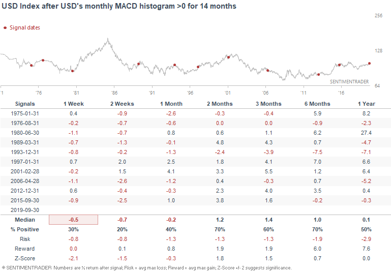
 When the dollar's long term trend was consistently upwards in the past, it could face short term weakness, but then usually preceded to push higher over the next 2 months:
Small caps earnings
And lastly, a word on small caps. Many market watchers continue to look at small cap underperformance (or indices which include more small caps), and think that their weakness represents a lack of "confirmation" to the large cap S&P 500. To me, this isn't a matter of "lack of confirmation", but moreso a problem with small caps' earnings expectations.
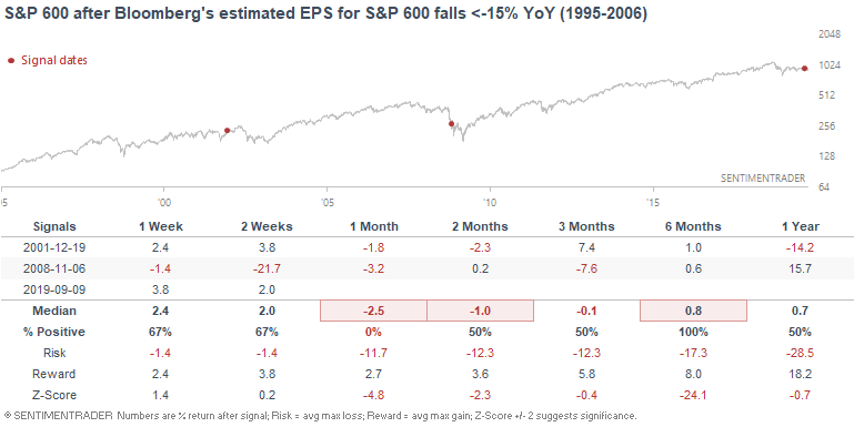
The following chart looks at the S&P 600 against its estimated EPS from Bloomberg:
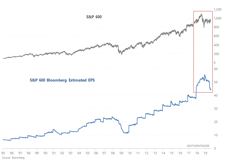
Estimated EPS are now down -15% YoY, which is a massive decline. From 1995-present, this has only happened 2 other times: 2001 and 2008. Both cases occurred within the context of an economic and earnings recession.
Here's what the S&P 600 did next:
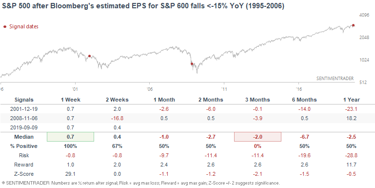
Here's what the S&P 500 did next:
Overall, the decline in earnings estimates does not paint a positive long term picture for small caps. If we look at earnings estimates for the Russell 2000, such a large decline occurred in 2002, 2008, and *1999*. So at least this isn't a guaranteed "RECESSION" sign. (Stocks went up after the 1999 signal)
As I mentioned in August, it's far better to buy small cap stocks when earning estimates are trending up than when earnings estimates are trending down. This strategy is on a SELL for small caps right now.
If you have any questions or comments, please feel free to email me at [email protected]