
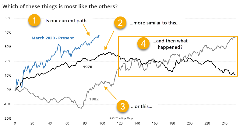
The last 100 days are the most like...1970?

We last looked at price analogs back in May, and the behavior of the S&P 500 and its sectors supported the idea we were embarking on a new bull market instead of just a bear market rally, as did the thrusts and quick price retracement. Unlike most of the historical comparisons, we didn't get much of a rest before taking off again.
Price comparisons are becoming popular again as we've reached the 100-day mark of the rally. More and more analogs are being drawn to 2009 and other major lows - rightly so, in many respects - because the rally has been so persistent, and so large.
An analog, or comparing one period of time to another, tries to answer some simple questions - are the past x number of days more similar to some historical stretches versus others? And if so, what happened after the most similar ones?
The trouble with analogs is that they can be easily abused. We can find whatever we want to find.
As a guard against that, when we show analogs, we only do so objectively, with clear rules and with all available history. Most of the time, they're useless and don't support whatever cherry-picked example is popular at the moment. Rarely, they can help support other factors, but even then they're a tertiary guide.
If we look objectively at the past 100 sessions and go back to 1928 to look for other 100-day periods with the highest correlations (all of which were above +0.95 on a scale from -1.0 to +1.0), then we get the following.
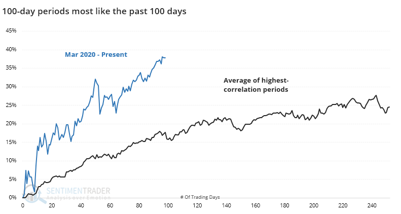
Clearly, the rally from March has exceeded the average, but the price path is very similar by definition. Going forward, the average rally maybe saw some plateau in the gains over the next 50 days or so, but the general trend was still higher over the medium- to long-term.
The last 100 days weren't the most highly correlated to the rally off the 2009 low. Or 1982. The 100 days with the highest correlation ended in April 1971, with the post-2009 rally having the 2nd-highest correlation.
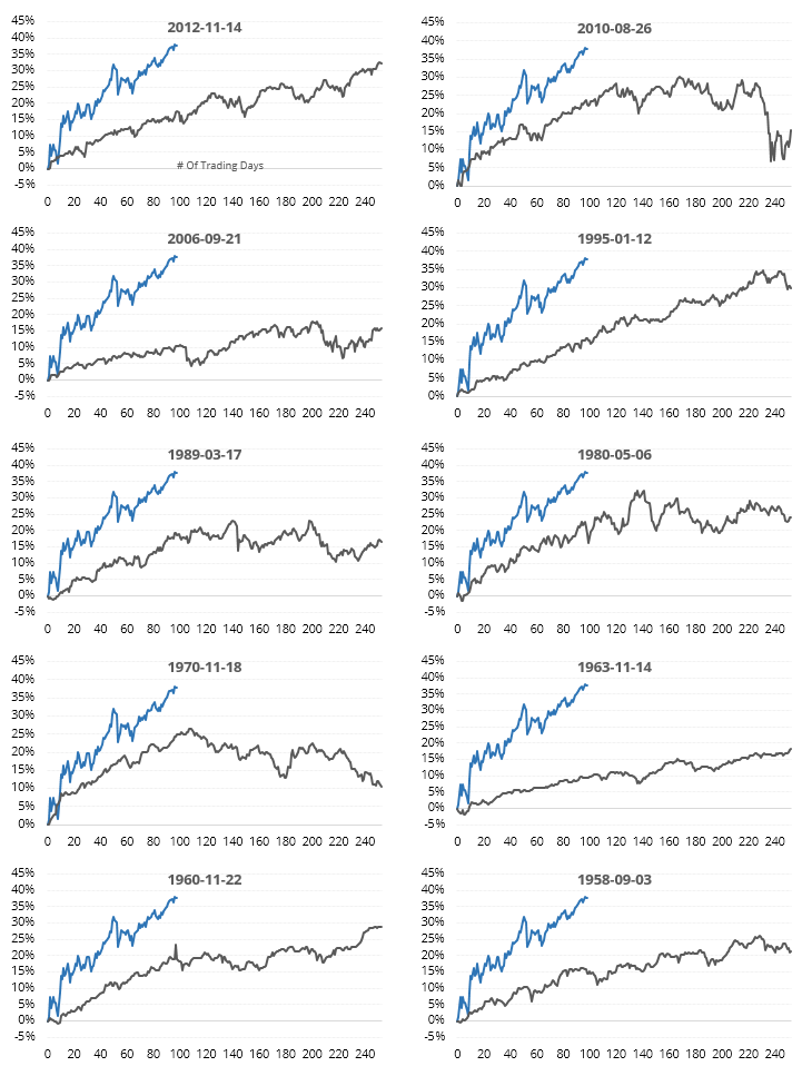
Below, we can see thumbnails of the most recent signals (the dates show the start of the 100-day comparisons). It's interesting to note how many of them started to run into a little bit of trouble around day #100 - 120. Of course, that was the hint back in May, too, and yet here we are at higher prices.
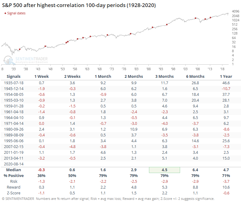
After the 100 days were reached, the table below shows the S&P's forward returns. They were mostly good over the medium- to long-term, with no big failures. Momentum doesn't die easily.
If we focus on the last year instead of just the past 100 days in order to gain some context, then we get the following.
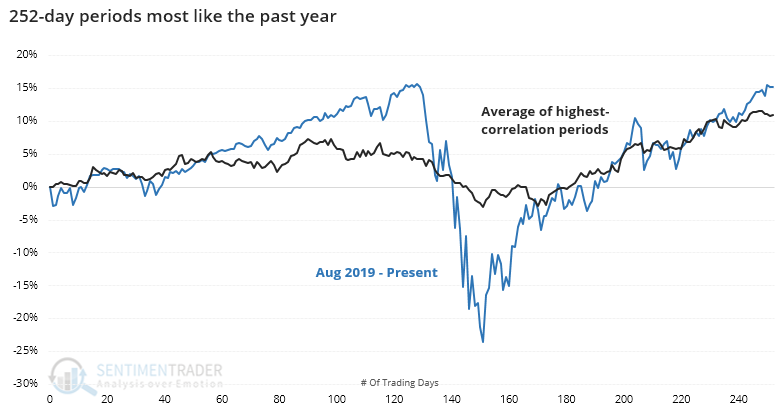
Again, the past year has been an outlier on virtually every level, so the moves were far beyond typical. Even so, the general patterns were the same, with all of the analogs having a correlation of +0.6 or higher.
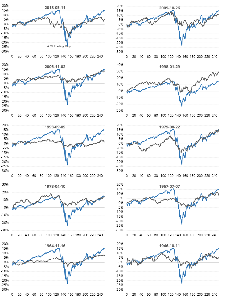
Below, we can see the most recent ones.
After the year ended, then we get the following forward returns in the index.
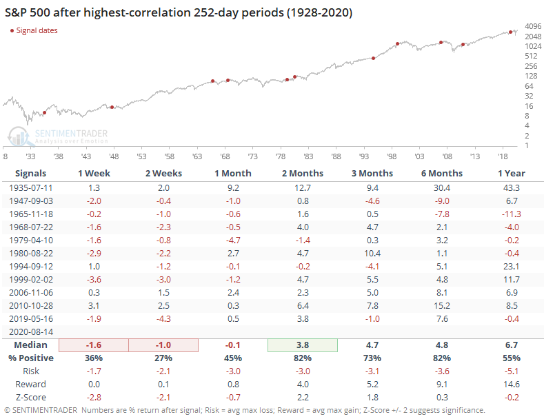
The short-term was pretty miserable, but we wouldn't put a lot of weight on short-term returns when looking at a year-long analog. Medium-term returns were still quite good, though several of them failed longer-term with the gains begin given back.
It's interesting that the highest correlations occurred as stocks dropped and then recovered from peaks, and not from major bear market bottoms. Instead of years like 1982, 2003-04 and 2009-10 popping up, it was years like 1999 and 2006. Not sure how much we can read into that, but it's why we use objective rules instead of relying on eyeballs, cherry-picking, and easily digestible narratives.
Is this immediately actionable? No, probably not. It kind of supports the multitude of breadth thrusts, recoveries, and trend changes that triggered in the spring, with mostly higher prices over the medium-term. And maybe it supports the more recent trend in our indicators and studies, showing a negative risk/reward over the short- to medium-term, which has failed to take hold so far.
Mostly, it's a guard against reading too much into the increasing, and totally subjective, use of comparisons to 2009. There are other periods that are just as highly correlated, and they didn't have remotely similar outcomes.